No Results Found
The page you requested could not be found. Try refining your search, or use the navigation above to locate the post.

Author: Alison Hazel – Updated: January 2026
In this article I’m going to look at how art can become gentle companionship and not just yet another thing on your to-do list.
This is for you if you live alone and some days feel spacious while others feel a little too empty.
Living alone can be a gift.
It can also feel very quiet.
There is no one to notice the small moments of your day. No one to say “Oh that’s lovely” when you place a flower in a jar or make a nice cup of tea. The hours can stretch out, especially in the evenings, and boredom can sneak in wearing the clothes of loneliness.
This is where creativity can become something more than a hobby. It can become gentle company.
When you sit down with your sketchbook, you are not just making something.
You are having a quiet moment with yourself.
I have noticed that even on days when I feel flat, my sketchbook never seems to mind.
I see your sketchbook as something that:
I think there is a kind of comfort in opening the same book each day and knowing something familiar is waiting for me.
When you live alone, I believe that rituals can actually matter more than routines.
Routines can feel heavy.
Rituals feel kinder to me.
Here are some gentle ritual ideas you can try.
These small acts give shape to your quiet time.
They turn “another long evening” into “my creative moment”.
The hardest part of living alone is not the quiet itself, but rather it’s the feeling that no one is witnessing your days.
When you live alone, it is easy to feel like your days blur together.
Your sketchbook can become a quiet witness to your life with a quick sketch of:
Over time, you will see that your life is full of many small moments worth noticing.
Your sketchbook remembers them with you.
Even though you may physically live alone, you are not alone in wanting to create.
There are other women who are:
When you draw, you are quietly joining a wider circle of people doing the same small brave thing. Choosing to create a little life for themselves.
Some days, living alone feels peaceful.
Other days, it feels flat.
On low energy days do this:
That counts.
You showed up for yourself.
Creativity does not have to be loud to be meaningful. Sometimes it is just a soft whispered “I’m here”.
Over time, something subtle happens.
Your sketchbook starts to feel like:
You begin to look forward to your own company and that is not a small thing.
This is not about becoming more creative. It is about letting creativity keep you company.
If you live alone and feel a bit bored, flat, or disconnected today, then try this tonight:
That is enough for today.
You are not filling time, but rather you are keeping yourself company in a kind creative way.
This kind of gentle creativity is something I return to again and again and it lives throughout this space.
#quietcreativity
The page you requested could not be found. Try refining your search, or use the navigation above to locate the post.
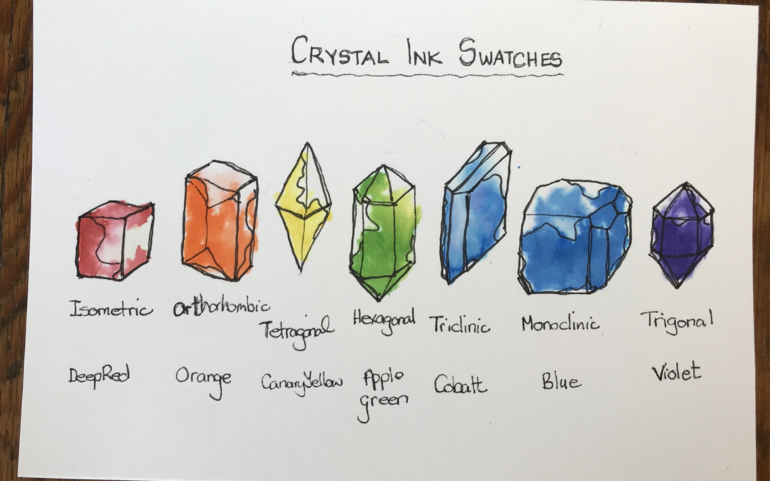
Create a crystal ink swatch for your Windsor and Newton drawing inks.
Get organized with some fun quarterly, monthly and weekly creative projects for aspiring artists getting started.
The page you requested could not be found. Try refining your search, or use the navigation above to locate the post.
Author: Alison Hazel – Updated: January 2026
💚 This article is part of my Art as Self-care category.
I’ve always liked maps. In fact, I have a small collection of maps from places I’ve been. I enjoy drawing maps and usually in my travel journal, but also as fantasy maps in my sketchbooks. In this article I’m sharing how I source maps and draw them in my sketchbooks. I’m also going to be showing you some of my map books and a couple of special maps as well. Alison
Sketchbooks and journals are often thought of as places for words, words and more words but some of the most revealing pages don’t read like sentences at all. They look more like maps.
Maps in sketchbooks, journals and travel journals, offer a way to explore your thoughts, emotions and ideas about a place or time without forcing them into neat lines. They allow for wandering, circling back, layering and taking a moment to pause.
For artists especially, to map or mapping can feel more honest than writing things out “properly.”
Some experiences are hard to explain but easy to place. A map lets you show what feels close, what feels distant, what overlaps and what remains undefined. Instead of describing your inner world, you can draw it with a map.
Thoughts don’t arrive in paragraphs. They cluster, drift in, repeat and interrupt each other. I believe that mapping mirrors this non-linear way of thinking, making it easier to notice patterns and relationships without overanalyzing them.
Maps invite symbols, color, texture and gesture alongside language. A single shape can hold more meaning than a sentence. A line can suggest movement, tension, or connection without explanation.
A map doesn’t need to be tidy or finished. You can add to it over time, cross things out, redraw it, or abandon it halfway through. There’s no correct outcome, but rather only further exploration.
Returning to the same kind of map weeks or months later can be revealing.
Maps quietly record change without judgment.
When I draw the map of my city, Vancouver, I go to Google maps. I open the map and stretch it to fit the screen and make it the size I want.
Then I take a screenshot which becomes my reference drawing. At this stage I’m just looking for the main coastline and any important roads or landmarks.
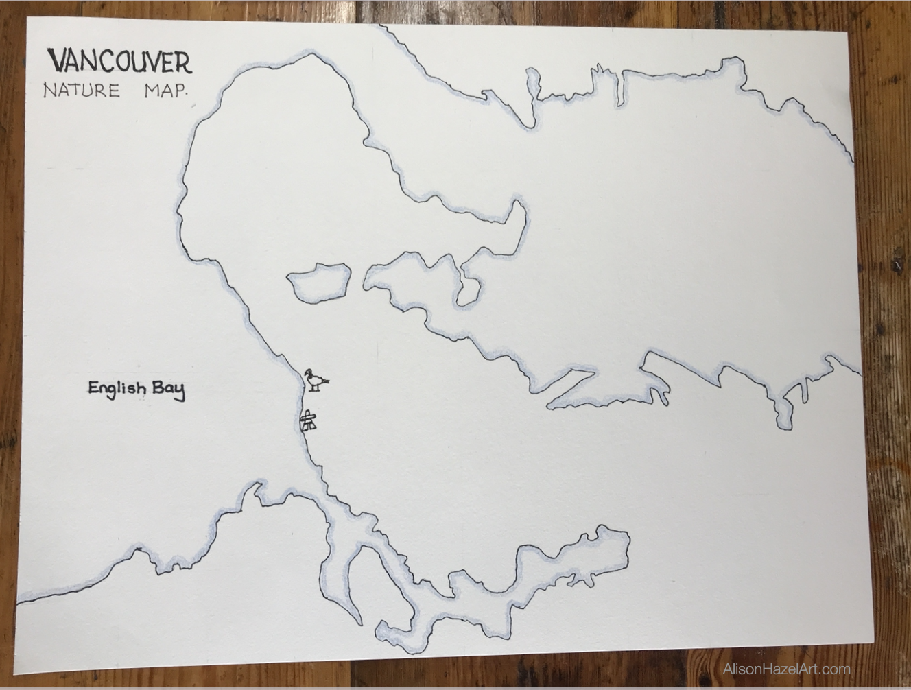
In this example, I’m drawing my Vancouver Art Map, which is a map of the places I have already been to for some sketching in my city. On this map you can see the Canada Geese and the Inukshuk which I sketched last year.
As I continue with my urban sketching in and around my city, I’ll mark the spots on the map where I’ve gone for an art date with myself to sketch.
I lightly sketch the coastline and anything else I need to start. At this point there is not much on the page.
Once I’m happy with the layout I’ll go over it with a 0.3mm black pen.
I use a colored pencil in blue to shade the edge of the coast where the sea is. I usually do about 5mm from the black line. I don’t usually color all the water in blue, but rather just the edge.
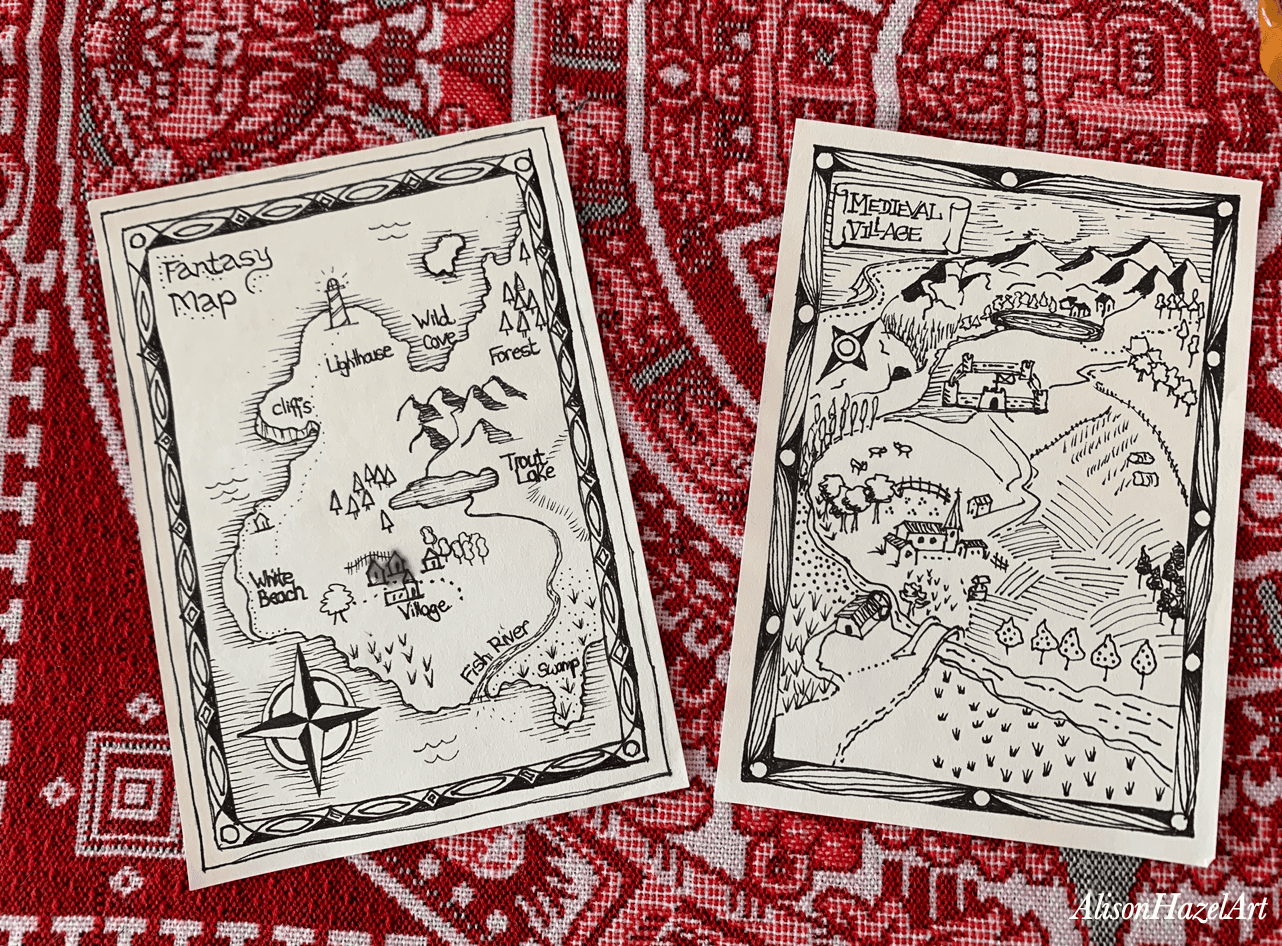
This is a fantasy map I drew of a place I’m calling “Treasure Island.” I started with a loose island outline in pencil. Next comes the black pen.
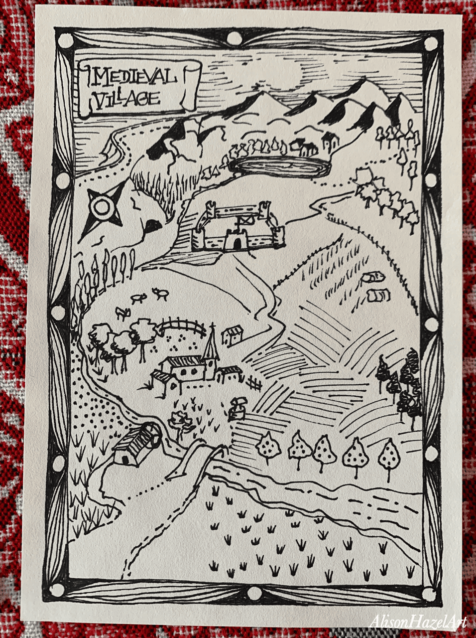
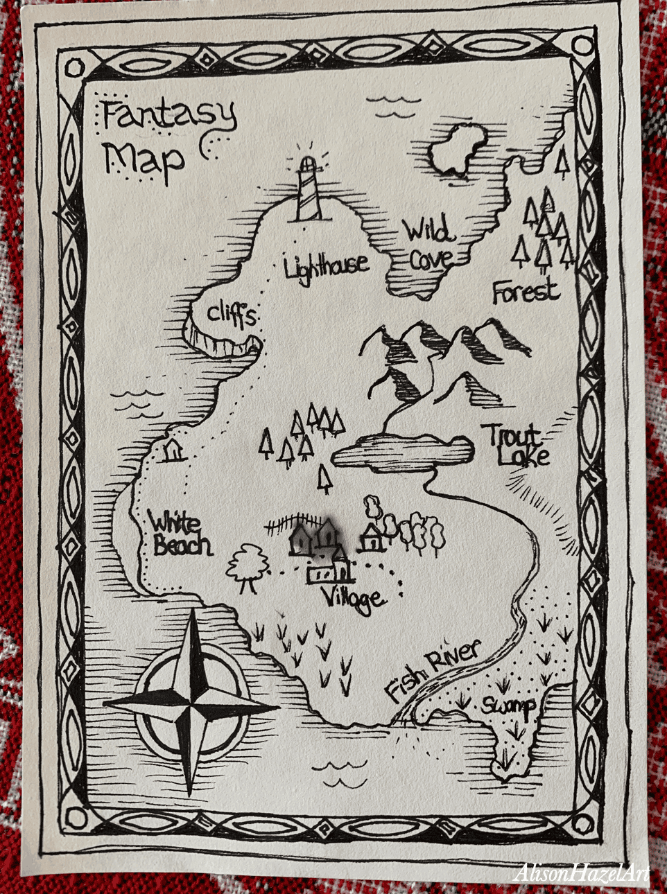
I noted some things on the map. Some features are just me tinkering, like the little houses, and some are more traditional map symbols.
I like to fill some empty space in the sea with a compass rose. This points north and is found on many maps.
I usually draw a title block for the map in one corner. This information block can get fancy with a flourishing font if you like. Here you can add the cartographer’s name and the date and other interesting facts.
Maps always benefit from a border around the outside. Your borders can be single line of a more complex affair. It’s up to you.
There always seems to be a need for a lighthouse perched on some craggy rock either on land or on a rocky knoll.
Dotted footpaths show where things are on the island. Roads are usually a straight line. Railways have marks on them like train tracks.
Sometimes I’ll add a cave as perhaps the buried treasure in hidden in there. Who knows?
Now and then around the island you can add a deeper sandy beach perhaps with some cliffs overlooking it.
In a black and white pen-and-ink map I like to suggest the sea with parallel lines running around the coast. I usually do three lines slightly further out from each other and the last line often is broken up with dashes and dots here and there.
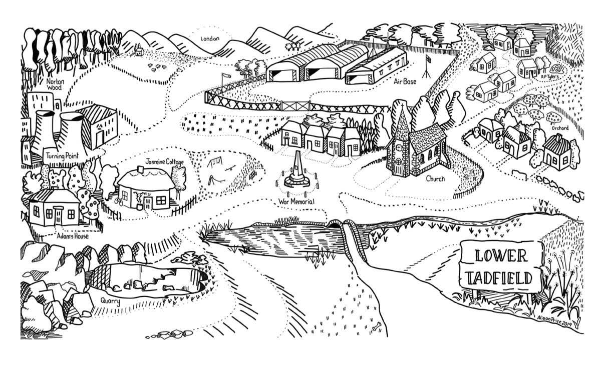
Good Omens: The Nice and Accurate Prophecies of Agnes Nutter, Witch, is a book by Neil Gaiman and Terry Pratchett. The story has been made into a TV mini-series as well. I’m a huge fan of this fantasy work. So for my fan art for this story I drew a map of Lower Tadfield, which is the imaginary village where the story is set. This piece I created as a digital artwork and you can see my copy below.
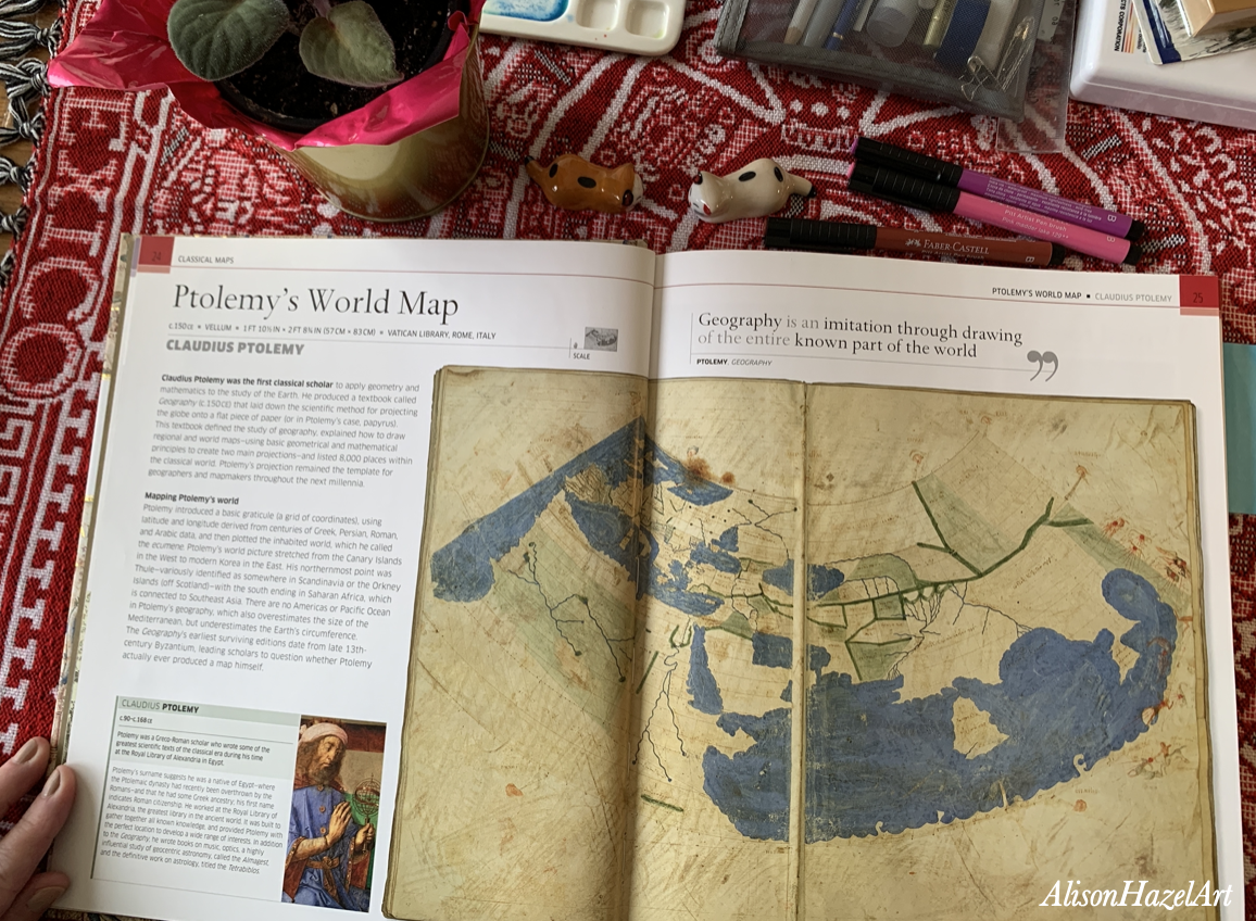
Ancient maps are fascinating subjects. They offer a window into how people once understood the world around them. Claudius Ptolemy, who lived from around 90 to 168 CE, worked at the great Library of Alexandria in Egypt.
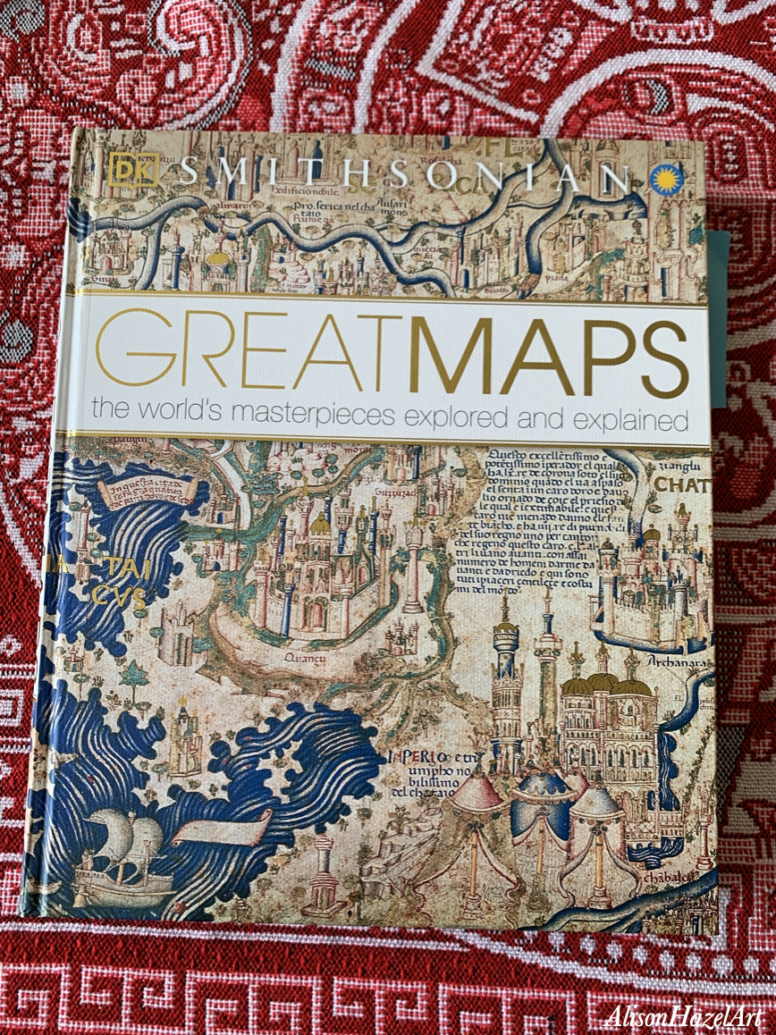
Below is a photo of Ptolemy’s map in my favorite map book called Great Maps: The world’s masterpiece explored and explained by Jerry Brotton.
Ptolemy’s World map is centered on the Mediterranean Sea and shows all the lands known to the classical world at that time.
The dymaxion map by Buckminster Fuller is a brilliant design which shows the whole of the Earth as an icosahedron.
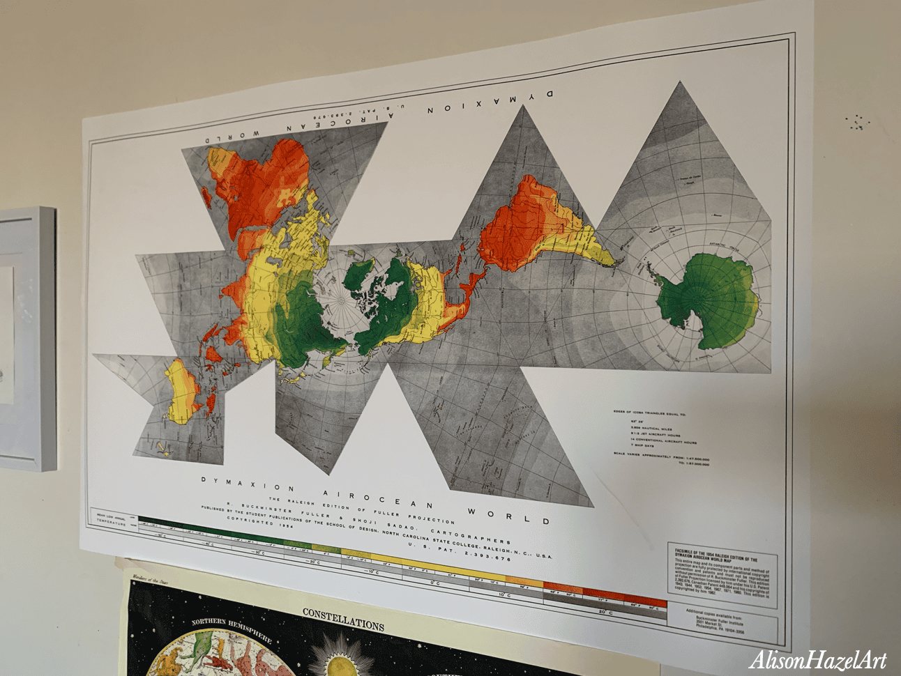
An icosahedron is a solid with 20 triangular faces. Fuller projected the Earth onto this shape and then unfolded it into a flat layout.
When opened out it looks like a connected pattern of triangles rather than a rectangle. If you draw it out carefully and cut it out you can make your own 3D globe map which I find so very interesting. Fuller’s idea was to show the world with much less distortion and without putting any continent at the top or bottom.
The dymaxion map can be folded in different ways which was part of Fuller’s point which is that there is no single correct orientation of the world north/south wise.
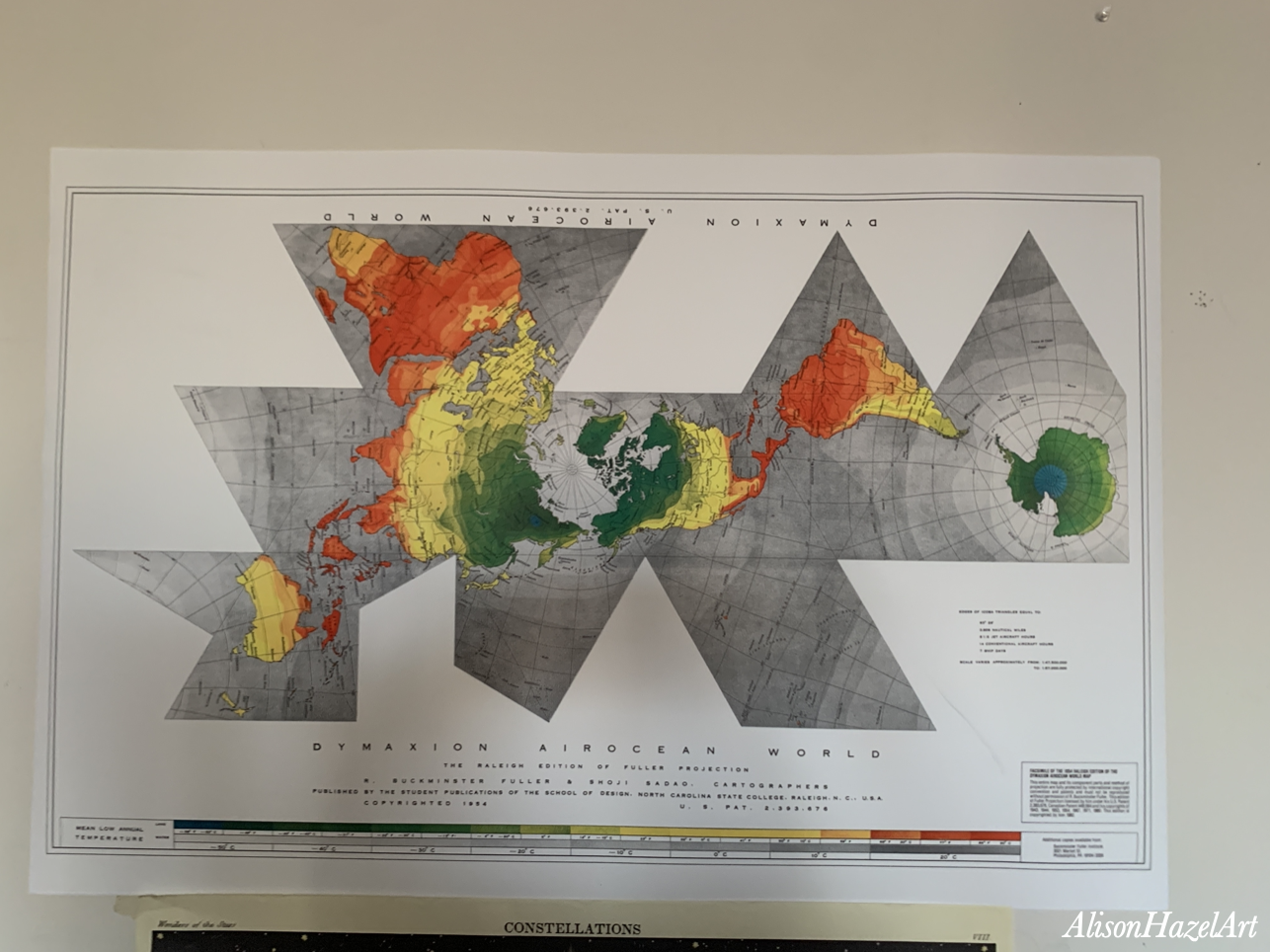
Above is the dymaxion map I ordered and which now adorns the wall in my art studio (lounge). I love it and I spend frequent moments looking at the details in this drawing.
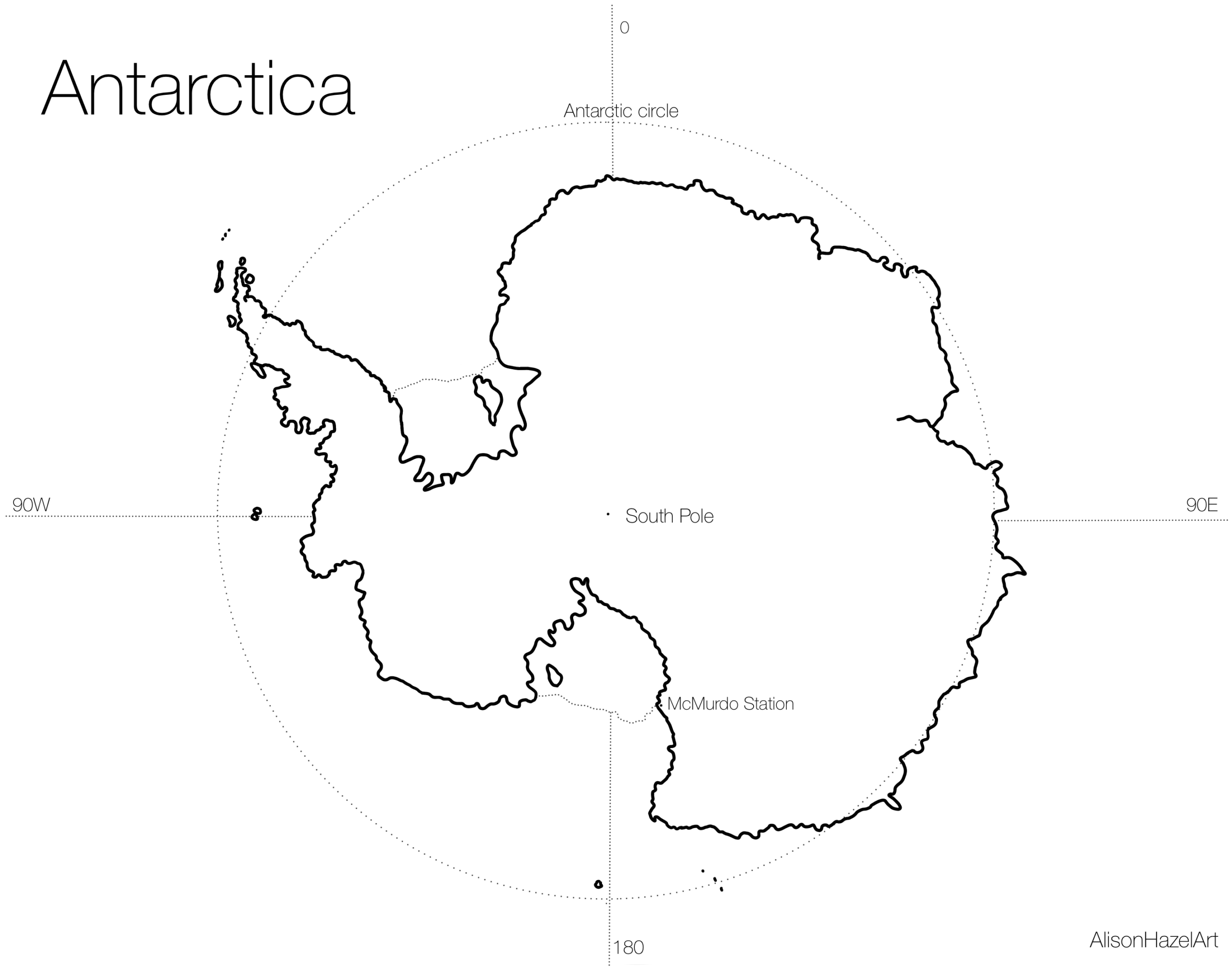
A while ago I had a phase of drawing all the continents on Earth and this is my Antarctica map. I simply made it by opening Google Maps, zooming Antarctica into the frame and taking a screenshot.
Next, I copied the screenshot into Procreate, where I do my digital art, and here I simply drew the outline of the continent and added just one or two of the major features. The most important of which is, of course, the South Pole and the fact that all the lines of latitude emerge from this point.
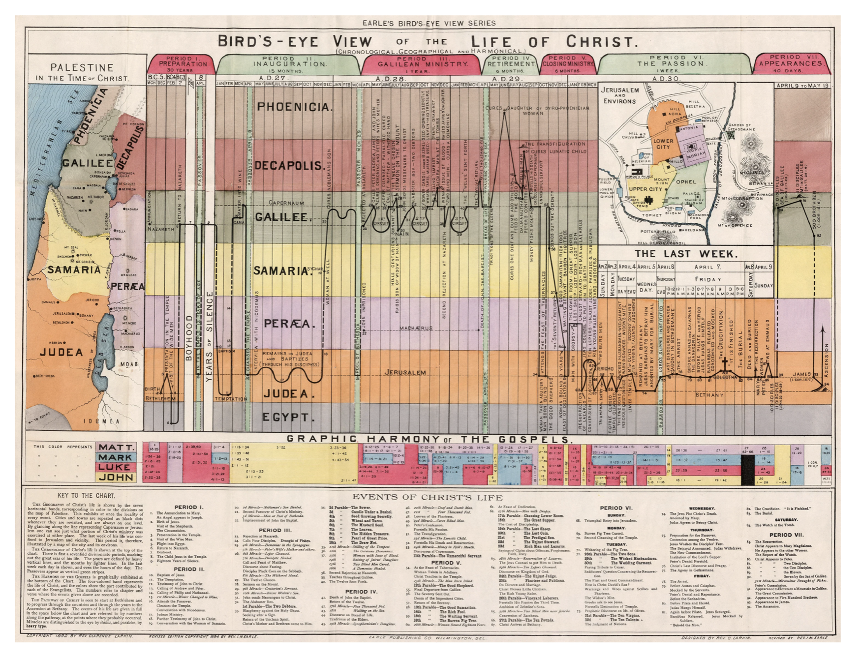
This is a particularly interesting map. It was originally drawn by Reverend Clarence Larkin way back in 1892 and this is a revised Copyright edition 1894 by the Reverend I.N. Earl.
This is a combination of map and a chart, and it shows, by the black line where Christ went in his lifetime. It’s the path he took throughout his life and the main people and places he visited.
As a combination chart, there is the map of Palestine at the time, there is also the timeline, literally, of where Jesus went from his birth to his death and resurrection.
There is a more detailed inserted sketch map of Jerusalem depicting the city during the last week of his life.
Below is a table the four gospels of Matthew, Mark, Luke and John showing at which periods in his life they wrote about by time.
At the bottom is a details key to the chart highlighting all the major events of Christ’s life.
I was put onto this chart by Matt Baker from Useful Charts on YouTube and he, too, lives here in Vancouver. You can check out his video about this particular map and the life of Jesus.
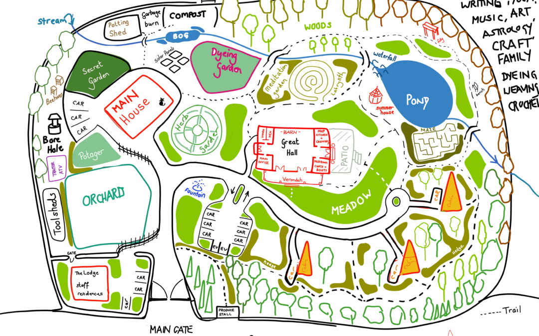
My dream residence is a map of how I would like to perhaps live my life one day. My idea was if I came into money or won the lottery, I would like to buy a piece of ground somewhere within 100 km of Vancouver, perhaps in Kelowna or somewhere, or up in Horseshoe Bay.
If I had enough land probably an acre or two, I would be able to establish my dream residence.
If I had a dream home, it would contain a main house where I live with my cat. It will also have a place to be as a retreat, perhaps for as a writing retreat, a yoga retreat, music, art or astrology retreat or some kind of craft family retreat.
This retreat would be as a place where people (just like you) could come perhaps for the weekend and do some creative or artistic endeavors.
I had an idea to create some A-frame cabins. I think I’ve got three there highlighted in yellow. These cabins would be where my guests would drive up, come and stay and there’s room to park your car with slight privacy from the hedges.
We would then have the Great Hall where things could get done, where events could be held and this build includes a kitchen and so on, so lunches could be served and whatnot.
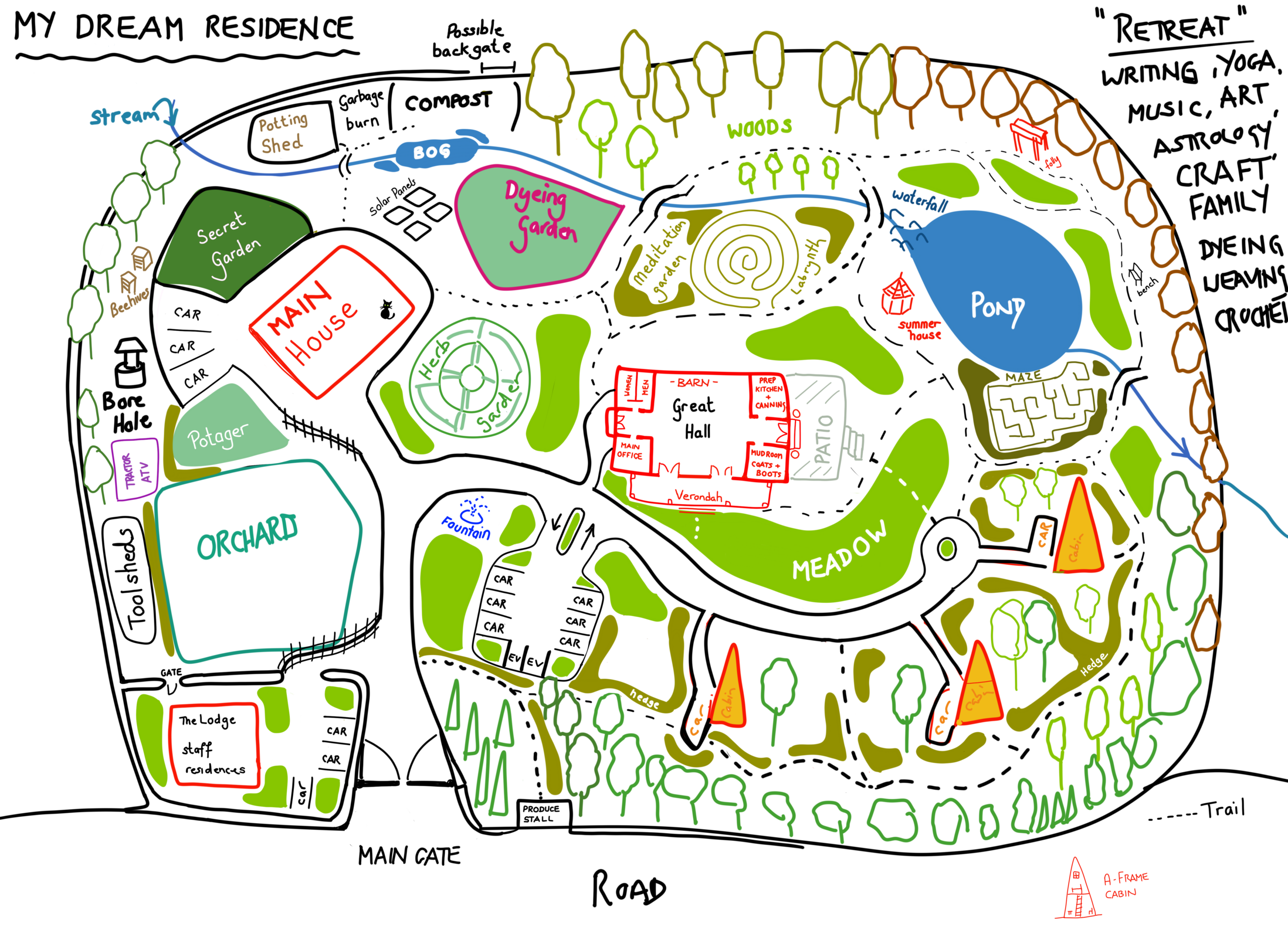
Additionally, on this map. I have an herb garden which I love.
I’ve got a labyrinth garden as well as a maze.
There’s a small pond. I would assume there’s fish in there or is it a wildlife pond? I’m not quite sure.
I’m also planning to grow a dying garden and what that means is growing plants so I could use their colours to dye yarn with. These would be plants like indigo and woad to dye yarns and fabrics. You could grow the plants and then work them down and create actual natural dyes, and or inks which could be used in the local craft industry as well.
And because I dream big, I’ve also got what I’m calling The Lodge for staff residences. I see this as a place where, perhaps, the cleaning staff or the cooks, or the gardeners where could stay and attend to the whole residence.
Yeah, this is a dream residence I have in my mind. It would be ideal. A place where I could live, my children could live, my extended family could come and visit.
It would also be a way that I could give back to the artistic and creative community. This is my dream with family and community, and this is the map I drew so I could visualize it as well.
I’m sharing these maps with you to give you some inspiration. Many of these maps I drew myself. Some are from the real world which I copied straight from Google Maps and others are fantasy ideas from my head. There are also the travel maps I did when we went to Mexico and to Tofino and you could check those out as well.
I like maps because they don’t have to be massive, they don’t have to be highly detailed. They could be a short, small little vignette, if you will, on your sketchbook page. Just to clue everybody in as to where you were and what you did.
Let me know if you’d like me to share any of these maps with you in greater detail and whether they are worthy of their own independent article.
The page you requested could not be found. Try refining your search, or use the navigation above to locate the post.
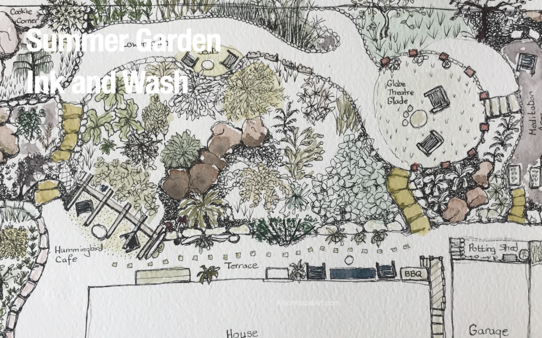
How to draw an interesting plan/elevation view of an artist’s visit to a friends’ delightful private garden with pen and wash.
The page you requested could not be found. Try refining your search, or use the navigation above to locate the post.

Author: Alison Hazel – Updated: January 2026
This article is part of my Third Age Art series where I celebrate the joy of making art later in life. These posts are all about starting fresh or continuing your creative journey as a mature artist with curiosity confidence and plenty of heart.
In a recent interview, Clint Eastwood, now 95 years old, said that every morning as he woke up and felt a little creak or twinge in his body that he says to himself, “Don’t let the old man in.” This refers to how easy it would be to just give up and let the old man in.
The old man is who you can easily turn into if you are not careful.
As a woman, I see this phrase from my perspective. Not the old man, but the old woman or as we are now saying, the old lady. The old lady may try to come in to me on some days, not all the time, but certainly on some days.
Those are the days that the old lady comes in.
The days I let the old lady in.
As a hobby artist you may feel that you’re not very good at art. You may think what’s the point of doing art because even your children poke fun at you. You feel your grandkids can draw better than you.
Fear not. It is your God given right to be creative and make something every day. To create something that was not there when you woke up, but which you created, by yourself, during the course of that day.
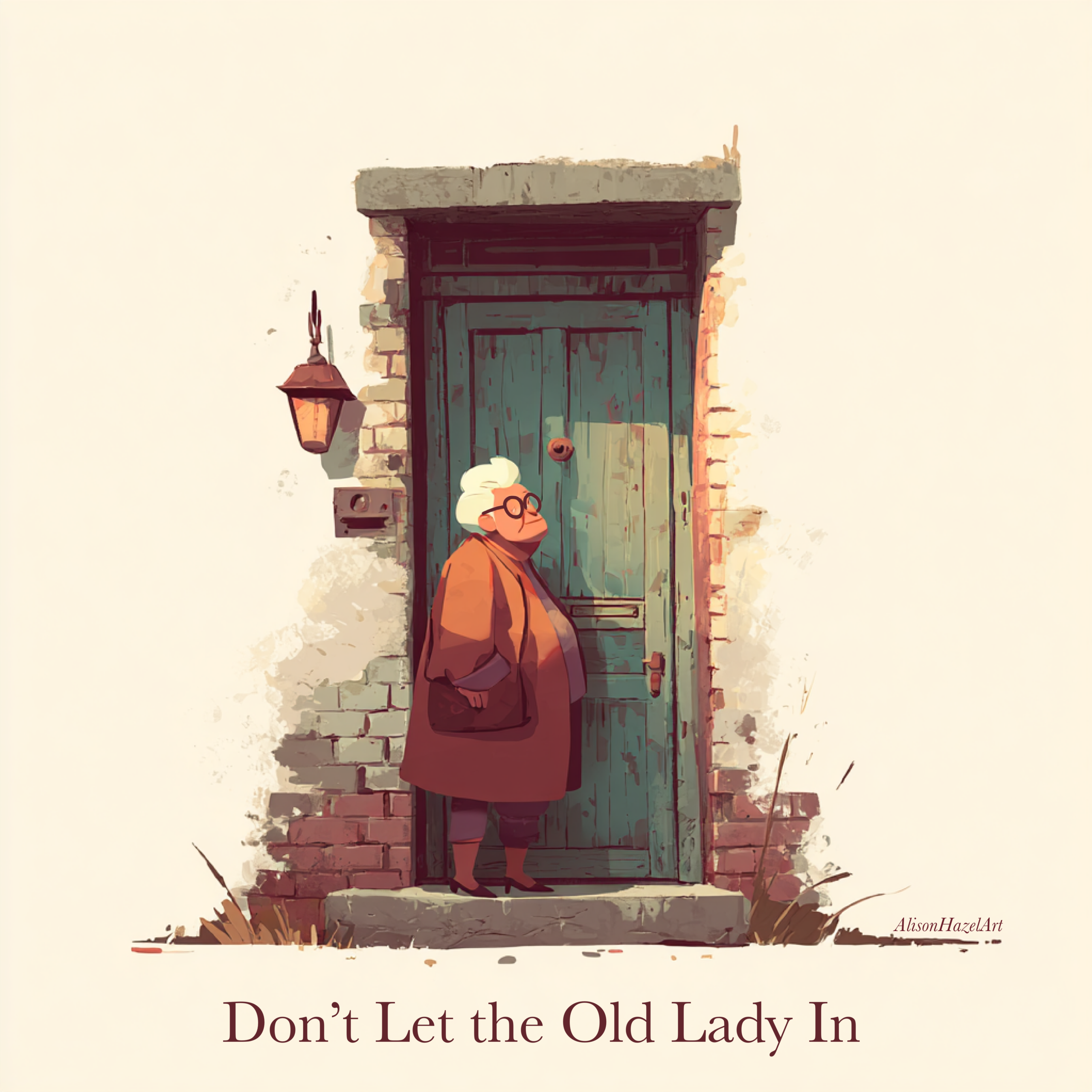
Do not let a single day pass without touching your art in some small way. It does not have to be big or impressive. It only has to be done.
⠀
The list goes on.
⠀
The habit to focus on right now is simply showing up. Pick up your pen brush hammer needle or hook and do a little art. That is enough for today. Neuroscientist Andrew Huberman reminds us that our brains are flexible and always learning. Through simple daily habits we gently create pathways that support being the kind of person we want to be such as an artist.
It takes 29 days to establish a habit. That is how long the Moon takes to orbit the Earth. When you were born, you could not tie a shoelace, but with practice you learned. Now you can whip out a bow lickety-split without even thinking about it because you’ve created the learned pathway in your brain.
When you let the old lady in a few things may happen:
⠀
⠀
There may be other things which happen to you specifically, but these are the things I am wrangling with all the time.
Will you be the person who stays on the couch barely moving through the day? Or will you be the person who goes to bed and can softly say, “Yes, today I created, I am an artist and I did not let the old lady in.” Then you can sleep. The deep satisfying sleep of the creator
If you are reading this then please let me tell you what I wish for you.
I want you to create every day.
God is a creator. The first sentence in the Bible says, “In the beginning God created the heaven and earth.” We are made in his image and so we are naturally creative beings.
Lean into your creative side.
Your cat or dog are not creative. The chimp in the zoo, who has the closest DNA to us humans, is not creative, but we are. We are inherently creative.
It is your talent to be creative every day.
As we move through life there are times when people drift away, routines change or the days feel a little quieter. Creativity does not leave.
Your art can be like a steady companion who meets you exactly where you are without judgement or expectation. It does not care how old you are, how fast you work or how good the outcome is. It simply sits with you hopes you will begin and it keeps you company while you do.
On days when the world feels cold, hard and distant, your creative practice can feel like a trusted friend reminding you that you are still here, still capable and still creating.
Before you reach the end imagine yourself a few months from now. Perhaps there is a small pile of sketches, pages, rows or finished pieces beside you. These gorgeous creations exist only because you kept showing up.
That future version of you feels calmer, steadier and quietly proud. She is cheering you on reminding you that every small creative act you did mattered.
Have you let the old lady in? When you let her in does she hang about for days at a time? Or do you consciously not let the old lady in?
You don’t have to do everything at once. As you go about your day, be creative in some way, so you can tell yourself, when you tuck yourself in tonight, “Yes, today I created.”
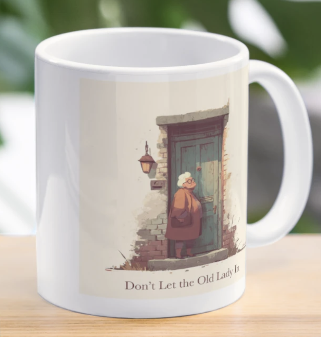
Enjoy a Don’t Let the Old Lady In mug featuring my original artwork. Each art piece is created by me and printed on everyday items you can actually use and enjoy. It is a simple way to bring a little Don’t Let the Old Lady In energy and handmade art into your daily life. Alison
Alison Hazel is a hobby artist and she shares her ongoing journey about becoming an artist later in life. She creates simple art that anyone can make. She hopes to inspire you to reach your creative potential in the area that suits you.
The page you requested could not be found. Try refining your search, or use the navigation above to locate the post.
How to draw an interesting plan/elevation view of an artist’s visit to a friends’ delightful private garden with pen and wash.
The page you requested could not be found. Try refining your search, or use the navigation above to locate the post.
Author: Alison Hazel – Published: December 2025
Today I want to share some gentle reflections from my year as a hobby artist. As the days grew quieter between Christmas and New Year, I found myself slowing down and giving my creativity the space it needed to breathe. These pause days always help me look back on what the year taught me and look ahead to what I hope to shape in the next one.
This past year brought surprises, lessons and plenty of small shifts that guided my art life in steady, meaningful ways. What follows is a look at what I learned, what I’m leaving behind and what I’m carrying forward into a new creative season. 🎨 Alison
In my art life I like to take the days off between Christmas and New Year without self-imposed deadlines, clients and meetings. It used to be that I’d push on through, but nowadays I gleefully color out the time in my calendar as days in which I’m to do nothing. This gives me time to think. To think about what I have been doing and what I’d like to be doing next year.
If you are not careful, a year can easily just become a carbon copy of the last year’s creative work. I try to move forward with some clear thoughts about what I’m going to be doing and, perhaps more importantly, what I’m definitely leaving behind in the old year. This year was a full, shifting, surprising year and sometimes gentle, sometimes challenging, but always creative.
When I look back, I can see how my creative process guided me, nudged me and occasionally demanded that I change direction entirely. Here are the lessons this year taught me as hobby artist.
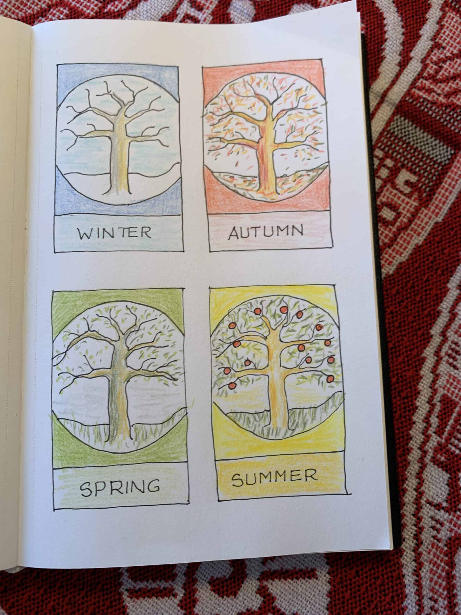
This year, I truly embraced organizing my creativity seasonally.
Each season has three months.
If you live south of the equator, as I did for thirty years in Africa, then the seasons are reversed. On a side note, I actually follow the solar year as the Sun moves from one solstice to the next equinox and back. Using the four seasons of the year I chopped by year up into chunks of about 90 days of creative hobby artwork. But let’s be clear here I did not know exactly what I was going to be doing at the state, but as opportunities arose, I took them.
Winter became a time of inward focus, sharpening pencils, journaling with morning pages, and plotting and planning.
Spring brought experimentation and a fabulous writing retreat with my good friend.
The warmer summer days offered expression, expansion and more grid artwork.
Autumn encouraged pushing through. My focus was on handmade Christmas cards for my children. Additionally, I had my daughter’s destination wedding in Tofino.
Instead of resisting the natural ebb and flow of my energy, I learned to trust it.
Being in tune with the seasons helped me avoid burnout, stay more closely accountable to my goals and maintain a more sustainable creative rhythm.
In the past, I waited for inspiration to strike. This year, I made a shift and I began showing up whether I felt inspired or not and surprisingly, inspiration often followed.
I worked from my freshly hatched content calendar. The plan was one article every two weeks. I began writing my Artzlife newsletter in January 2025 and I almost got a newsletter out every fortnight. I say almost because I did miss once and if you were following closely, you’d have noticed that too.
The real problem with missing one little Friday posting is that it is ever so easy to miss another, and another and before you know it it’s all over bar the shouting.
I learned that creativity is a practice, not a mood. Some days, all I could manage was a doodle, a sketch, a color test, or a written idea, but those small acts were like it kept my artistic door open.
I do have a life and there are many other things on the go at the same time. I have four grown children, friends to see and other craft and creative project interests.
In 2025 I slowed down. I gave articles more space to develop, sit, rest and evolve. Letting ideas “age” for a few days before finishing them helped me see my thoughts with fresh eyes. I believe the work became more thoughtful, layered and emotionally grounded. And clearly, creativity doesn’t always respond well to being harried along or rushed.
I experimented with new materials this year: different papers, brushes, digital tools and color palettes. I learned that while new toys in my art box of tricks won’t fix a weak idea, they can open doors to new techniques and textures. I also learned that I don’t need every color in my pencil box, but rather just the ones that spark curiosity or support the direction I’m already heading.
I leant into caput mortem by purchasing just one colored pencil this year in the purple brownish color. I still love this color.
Living near the coast and getting down to the beach now and then reminds me of subtle shifts in color, light and mood. This year, I used more of these natural elements like shells, pebbles and sed pods into my work. The practice of simply observing nature (often with a sketchbook in hand) became a grounding art date with myself, especially in moments when I felt creatively scattered. I did often draw the same things again and again, particularily in my grid art sketchbook, but now I call in my “art practice.”
This year I got the notion that people connect with the process, and not just finished pieces. When I shared my works-in-progress, studio notes or small personal reflections, readers just like you responded warmly. This reminded me that art is a form of communication and that by opening my cretor studio door a crack it can create community.
Some years of life bring dramatic, obvious artistic leaps and for me this year felt a bit more subtle. But beneath the surface, I was learning to:
Growth isn’t always loud, but rather it’s like a gentle hum which you only notice at the end of the year.
What I will take into 2026 is a renewed appreciation for slow growth, thoughtful creation and working with the seasons rather than against them. I feel steadier in my process than ever before.
Winter will soon begin, on December 21st, and with it a fresh creative season. I’m ready to welcome it with curiosity, intention, a sharp pencil and an open sketchbook. And to you, reading this I wish to thank you for being here.
Thank you for supporting my work, following along and sharing this creative journey as a hobby artist in later life with me. Your presence truly matters and I’m grateful for every reply, email, comment and quiet moment you spend with my art.
Here’s to another year of growth, beauty and of making things that matter.
Some of my gentle deas and practices for living your life with a “create first” mindset to help you, as a hobby artist, keep going.
The page you requested could not be found. Try refining your search, or use the navigation above to locate the post.
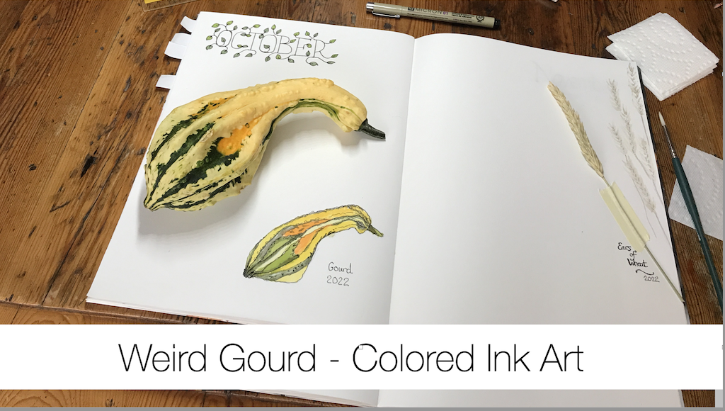
Join me as I sketch, draw and paint a weird autumn themed knobby gourd using colored ink as a hobby artist.
The page you requested could not be found. Try refining your search, or use the navigation above to locate the post.
Author: Alison Hazel – Updated: December 2025
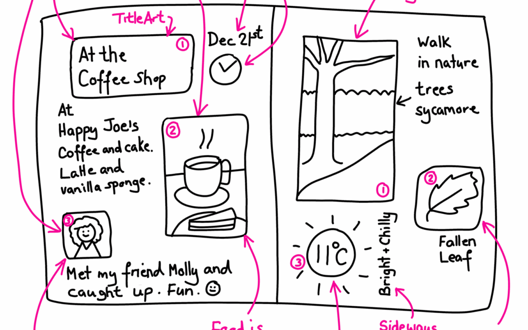
Recently, one of my readers posed the simple question, “How do I start with sketch journaling?” It was at this time that I realized that whilst many of you read my writing for the ideas to put into your journals and sketchbooks, there are still many people who just need a little guidance on how to get going in the first place. So, today I’m going to share my thought with you on getting started with sketch journaling. – Alison
Sketch journaling is a simple practice that blends small drawings with a few thoughtful words. It gives you a quiet place in your sketchbook to notice what is happening around you and inside you. When you put pen to paper with both images and text you slow down. You become more present. You let your mind and hand move together in a calm and natural way.
This approach matters because it helps you see your life with fresh eyes. A quick sketch anchors a moment. A short note captures a feeling. Together they form a gentle creative space where your ideas can grow and your inner voice can settle. Sketch journaling is not about perfect art. It is about paying attention, building awareness and enjoying the process.
Let’s first talk about who sketch journaling is for. I believe that it is for everyone. You do not have to be a great artist, I’m certainly not, nor do you nedd to be a trained artist and have been to art school or college for art lessons.
No, sketch journaling is for anyone who wants to bring a creative component into their lives. I think it maybe you. If you are reading this then you probably have an interest in sketch journaling to start with and that is all you need.
If you’ve been told that “your art is rubbish” or “you can’t draw” then you may have an inner dialogue which prevents you from doing any type of art at all.
Let me disabuse you of that notion and give you permission right here and now to start creating art today.
Pick up that pencil find your journal and start sketching by sunset.
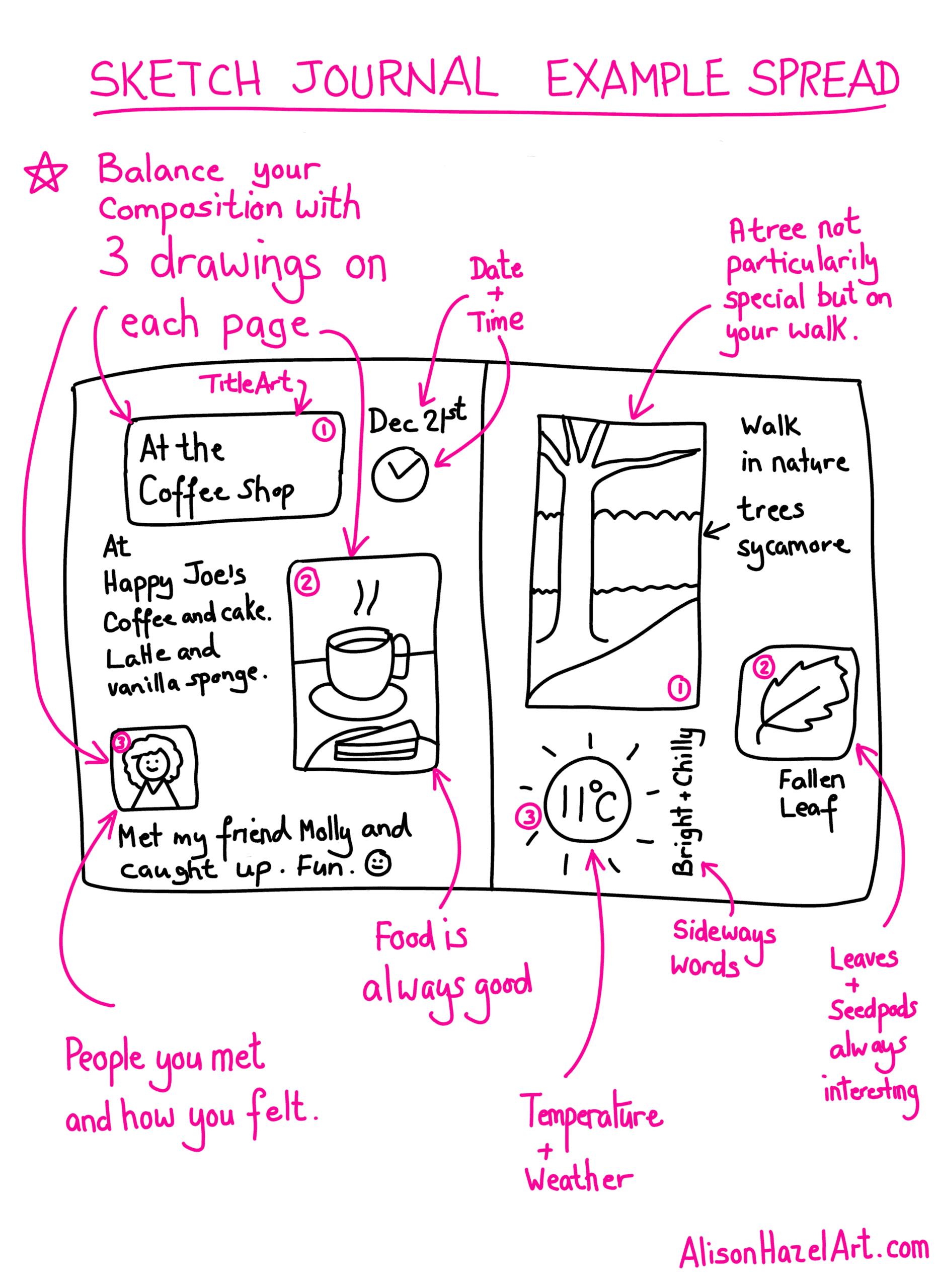
Noting your day-to-day activities can give your brain a steady lift because it offers small or micro moments of reward. Each time you jot down something you did, your mind gets a clear signal that you followed through on an action. This sense of completion sparks a gentle rise in dopamine which supports your motivation and feelings of wellbeing.
Documenting your day with sketch journaling also helps you notice progress that you might otherwise miss. When you see small steps written down you feel encouraged to keep going. You can go back and see how your art was at the beginning of the month and see the improvement. This builds a positive feedback loop which keeps your creative energy steady.
Another benefit is that regular sketch journaling and daily recording brings is structure to your thoughts. Your brain likes patterns and clear steps. When your day is set out on the page you feel more grounded and your nervous system can settle. This calm focus will help your brain chemicals work in a natural and balanced way.
Overall, capturing your daily life in a simple sketch journal or written note supports a kinder internal relationship with yourself. It gives your mind little wins and keeps your creative spirit engaged.
You already have what you need to begin. Most people think they must gather a pile of special tools and go on an art supply mega haul before they can start creating, but that activity can grind the whole process to a stop. Your creativity does not depend on perfect art supplies. It depends on your willingness to show up.
A small notebook a pen or a pencil is enough. If you have a few colored pencils even better, but they are not required. What matters is the moment you sit down and make a mark. Simple tools help you stay present and keep the practice easy. They also remove the pressure to produce something polished.
When you trust that what you have is enough you free yourself to explore. You focus on the experience and not the equipment. This gentle approach keeps the door open for your ideas to flow and lets you enjoy the process from the very first page.
Now it’s your turn. Sketch journaling is not about rules or perfect results, but rather it’s about discovering the way that art feels right for you. Some days you may want to write more, letting words carry your thoughts and feelings. Other days you might be drawn to colour, texture, or a few simple doodles to capture a mood or moment.
The heart of this practice is personal expression. There is no right or wrong way to do sketch journaling. Your pages can be loose and playful, quiet and reflective, or a mix of everything. By experimenting with different approaches, you will learn what nourishes you creatively and keeps you engaged.
Trust your instincts. Let your hand move freely, follow your curiosity, and allow each page to be a reflection of your own unique expression. This is your space, your process, and your creative voice so I urge you to embrace it fully.
Alison Hazel is a hobby artist and she shares her ongoing journey about becoming an artist later in life. She creates simple art that anyone can make. She hopes to inspire you to reach your creative potential in the area that suits you.
The page you requested could not be found. Try refining your search, or use the navigation above to locate the post.
Create a crystal ink swatch for your Windsor and Newton drawing inks.
The page you requested could not be found. Try refining your search, or use the navigation above to locate the post.
Author: Alison Hazel – Updated: November 2025
This time I am sharing with you my simple seven-day grid art practice as a guide for you toward a creating a slower creative rhythm in your life. With just one small square a day you can build a soothing habit which nurtures both your art and your inner world. I hope you can let this be a peaceful invitation for you to pause, notice and create with a soft heart. Alison
I want to consider now as we are in Autumn that as the days shift and the season settles around us this is a lovely time to slow down and to make some space in life for gentle creativity. I believe that your sketchbook can hold more than drawings, but rather it can hold from in your day of calm, reflection and joy.
It is as thought that when you create in small daily pieces, you almost invite ease into your art practice which can open the door to mindful noticing. To pay attention to the small details around you.

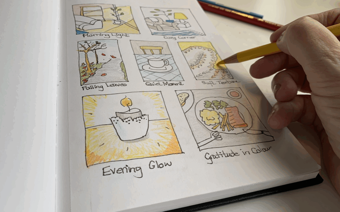
Grid art sketching is a simple and mindful creative practice that I often share with my readers. It begins by dividing your sketchbook page into small squares, often in a grid, which offers a gentle structure for the art to come. Each square becomes a mini canvas for an idea, some colour, a few lines or to explore texture.
The grid holds your ideas in a calm and organized way so the blank page feels less intimidation and overwhelming. This micro approach to daily sketching encourages you to show up for just a few minutes at a time and notice the small details of your day.
Over time the filled grid can tell a beautiful visual story of your creative journey for that week or months depending on how many squares you have..
With a grid page there are no rules and no need to hurry. You can give yourself permission to move slowly and with ease. Let each small block become a tiny window for one moment from your day. It may be a colour that caught your eye a soft pattern you noticed or a feeling you want to remember.
Keep your marks simple. Soft colour gentle lines or loose abstract shapes are all welcome. As you draw take a few slow breaths and let your mind to settle. This is your time for you to connect with your creativity in a light and peaceful way.
By the end of the week your page will possibly hold a tender visual story of your days. Each square will carry presence and meaning and together they will form a light record of your mindful creative journey for that week.
Here are my gentle grid art prompts I compiled for myself, and for you, to do a sketchbook page in Autumn. These prompts lean into the seasonal changes and natural outdoorsy changes that we can all see.
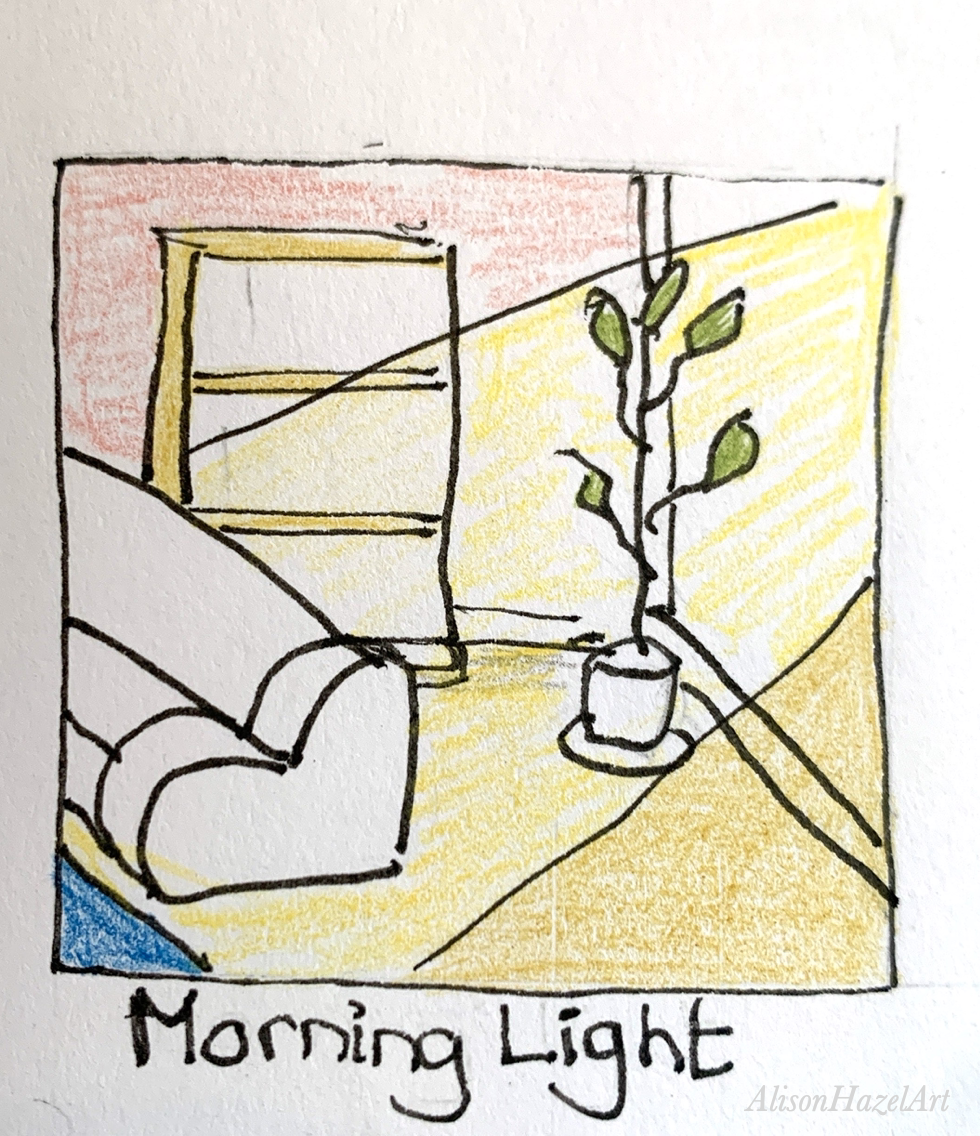
Notice how the early light enters your space through your windows. Capture its warmth or glow or the feeling it brings. Let the colours you choose clearly reflect the mood of your morning.
Sketch or lightly suggest your favorite resting spot. It could be a comfy chair by a window or a bench in your garden. Think about the textures or colours that say comfort to you and let them guide the marks you make.
Take a moment outdoors or by an open door if its really chilly. Watch the leaves in motion as the twirl down or study one up close. Slow down and record what you truly see.
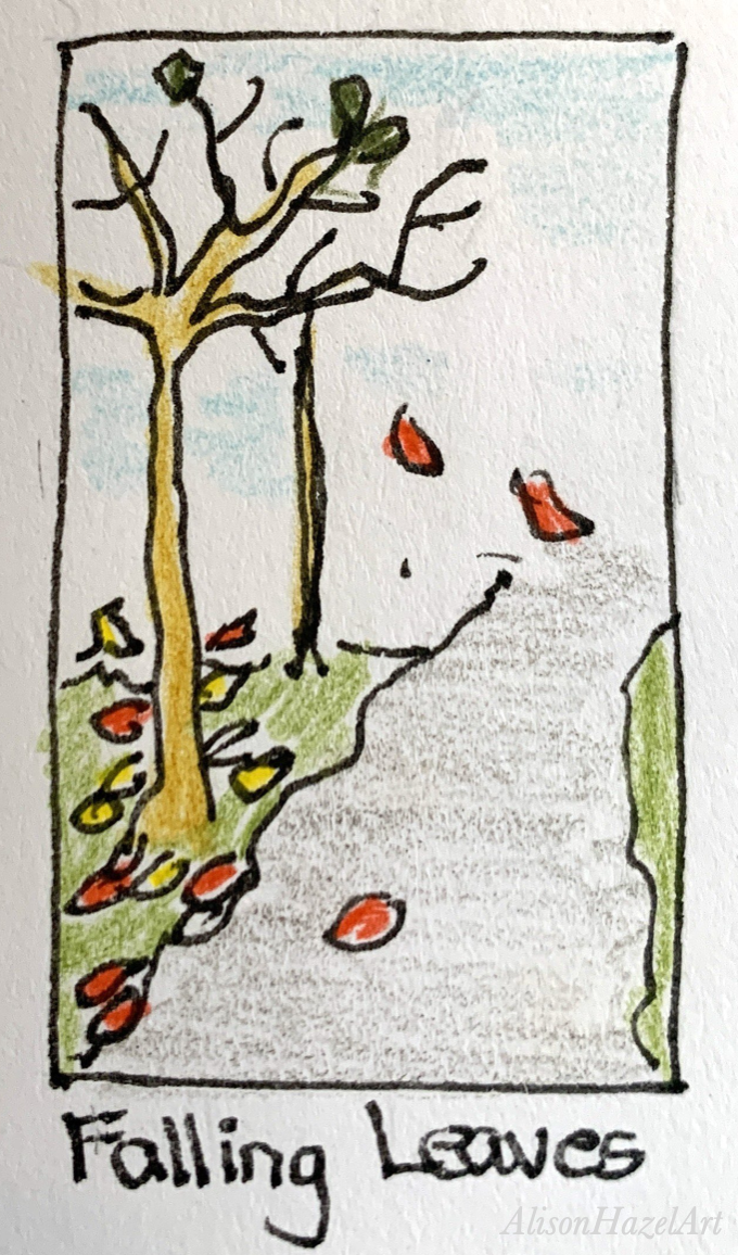
Illustrate a touch of calm from your day. It could be a warm cup of tea, a candle, a breath of silence or even a mindful pause. Draw where you found peace today.
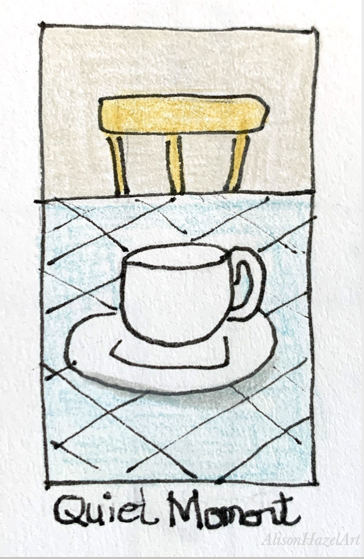
Consider texture. Wool, like knitting or crochet blankies, mist, clouds or anything that feels gentle to the touch or to the heart. Notice how soft things influence your colour choices and line work.
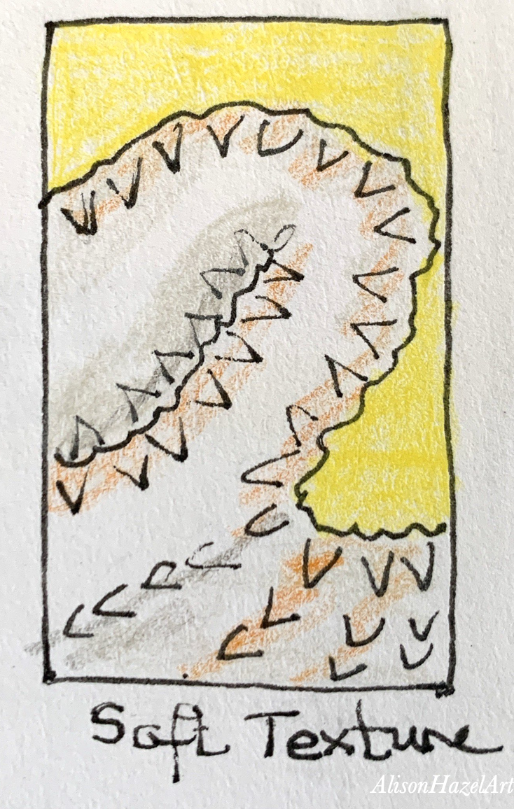
Later in the day you can observe how the world softens as the day ends. Sketch the twilight colors, a warm lamp, or the glow of a home candle. Let the evening mood shape your color palette.
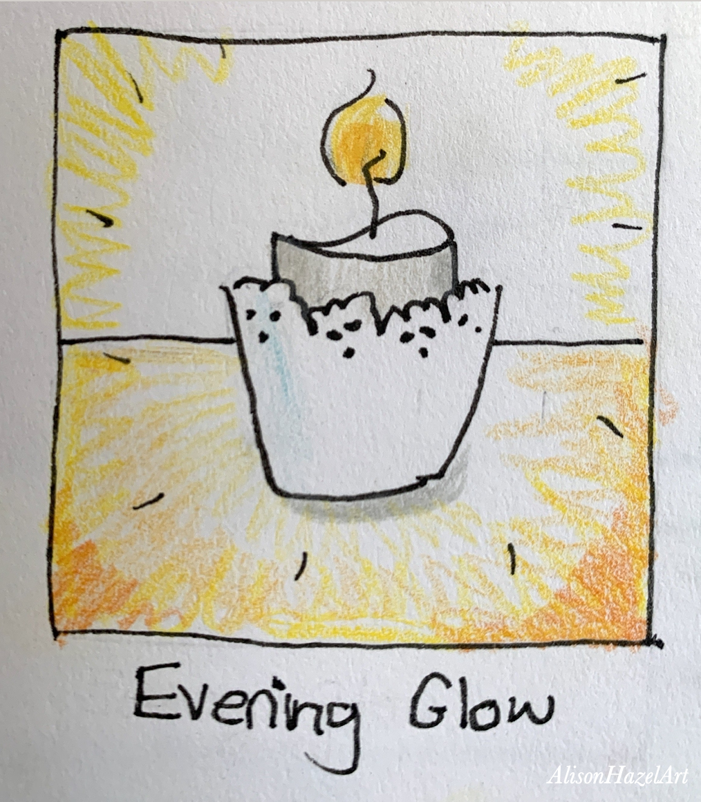
For your final square of the week choose one thing which you are thankful for this week and express it through colour. Notice the emotion that your colour choices carry and let it fill the square space.
You can start this practice every week in Autumn if you like. And if you do, your sketchbook will reflect the slowly changing season and your mood as well. These pages can serve you as a reminder of one week, one season or, if you continue for all 52 weeks, for the whole year. This simple seven-day practice can help you create a calmer rhythm and reconnect with your creative heart. With one small square at a time you can build a gentle habit which nourishes your art and your wellbeing.
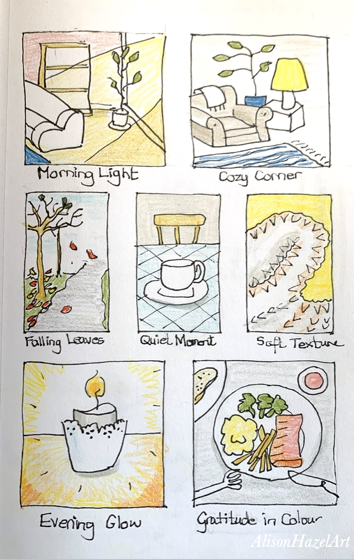
My gift to you is a simple 7-day grid art journal page. Download your free 7-Day Grid Art page here.
My seven-day grid art practice is a gentle way to slow down and let you connect to your creativity. By filling in just one small rectangle a day you give yourself space to notice the beauty in simple moments and you can express them with softness. There is no pressure to produce perfect art, but rather I see this as an invitation to show up with presence and joy. Over the week your grid will become a visual story of your days and also a reminder that small creative acts can bring a certain grounding and peace to your life. I hope that this practice will support your art your wellbeing as you develop the quiet magic of mindful making.
Send me pics of your finished grid to alisonhazelart@gmail.com. I’d love to see how your week unfolded.
Alison Hazel is a hobby artist and she shares her ongoing journey about becoming an artist later in life. She creates simple art that anyone can make. She hopes to inspire you to reach your creative potential in the area that suits you.
The page you requested could not be found. Try refining your search, or use the navigation above to locate the post.
Join me as I sketch, draw and paint a weird autumn themed knobby gourd using colored ink as a hobby artist.
The page you requested could not be found. Try refining your search, or use the navigation above to locate the post.
Author: Alison Hazel – Updated: October 2025
I’ve often said that I don’t travel very much, yet here I am again on my second weekend getaway this year. Earlier I spent a few days in Whistler and shared that experience with you, and now another adventure has found its way into my sketchbook. This time I’m opening my travel art sketchbook from a weekend getaway which I took in October 2025 to Tofino.
I traveled with some close family members in their cars. The journey began in downtown Vancouver, where we made our way to Horseshoe Bay to catch the ferry to Vancouver Island. We docked at Nanaimo, and from there the road carried us across the island’s width until we reached the little coastal village of Tofino, perched halfway up the coast and looking out over the wild Pacific Ocean.
Because I knew I was travelling from Vancouver over to Tofino. I was able to prepare the map beforehand. I open Google Maps and set the image to display both Vancouver and Tofino so that I could capture the coastline as a silhouette beforehand. Because it’s basically a horizontal trip, if you will, I decided to put it all horizontally across the bottom of a two-page spread slap bang on the first page of my Tofino weekend sketchbook.
Once I’d lightly sketched out the coastline in pencil, I went over it with my 0.3mm black pen just to get an idea of the shape of Vancouver Island and the mainland as well. I put the path we’re actually going to take in red, because we’re going to be driving in the car, going down to the ferry at Horseshoe Bay, catching the ferry across the sea to arrive in Nanaimo and then back driving in the car all the way on the drive across the island to Tofino.
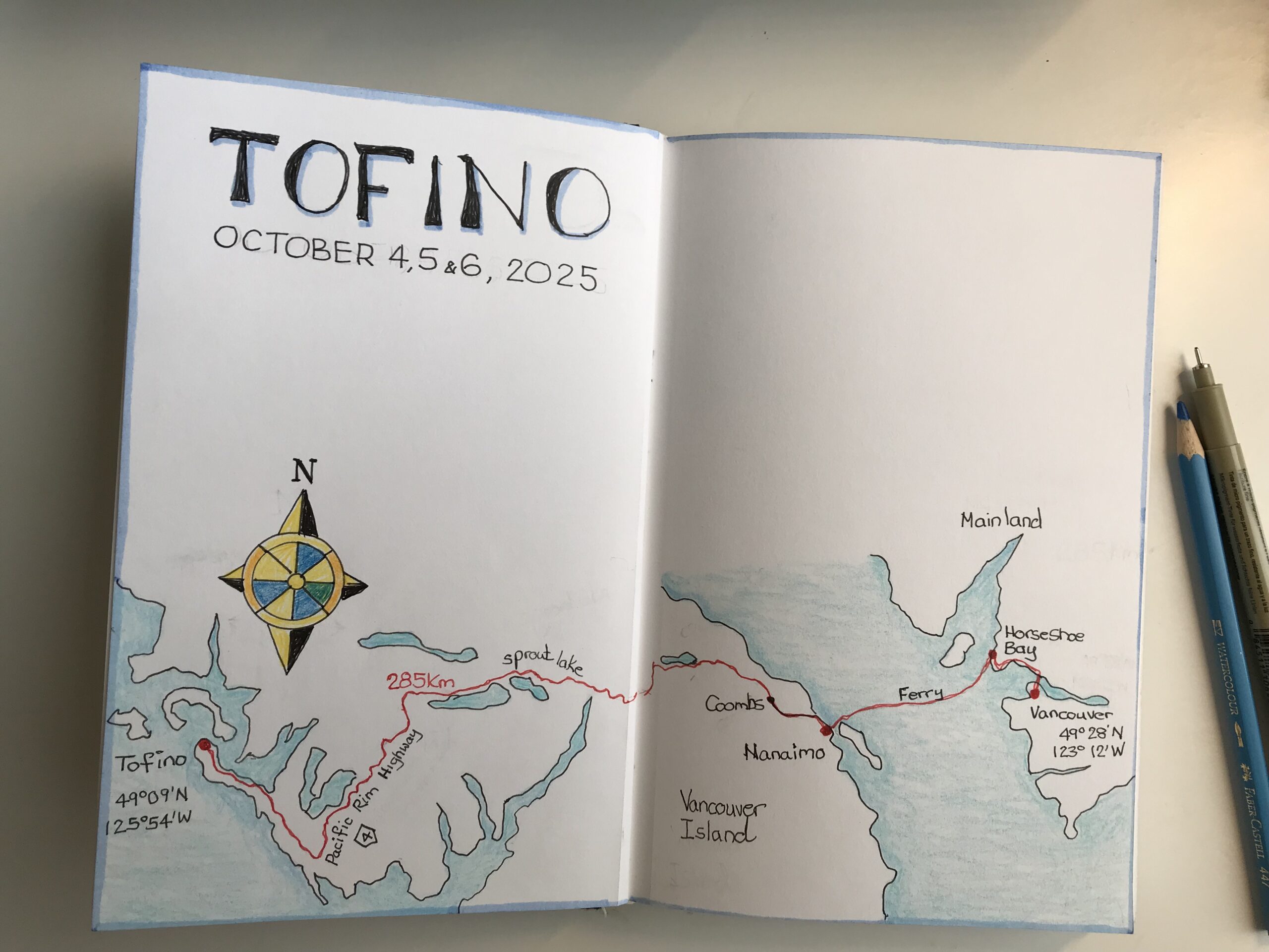
I added a couple of the lakes that were quite big on the map. And really, I haven’t traveled this road so I’m not exactly sure, but it seems that the road runs along the side of a couple of lakes, so the big lakes like Sprott Lake I put in.
Now this map is only a guide because I haven’t left home yet, but if we stop at some of the villages along the way I can mark them on the map. I note what we did, or the snacks we had, or if we had coffee, at these places and I can do this because I’ve already got the map laid out. You really can only put the map in if you are exactly sure which route you’re going to be taking before you leave home. I always love to put a map in my travel journal because you can put so much information into this type of chart. And it makes a great addition to your travel journal pages.
As I spent a couple of hours working on this map, I realized that the distance from Vancouver to Tofino is actually going to be 285 kilometres (177 miles). Additionally, I noticed the longitude in Vancouver is 123°12′ West. Whereas Tofino is 125°54′ West and this was interesting because when I visit Tofino, it will be the most westerly I have ever been on Earth in my life, so I thought that was interesting as well.
Many maps have a compass rose which is the circular pointer that points north. If you look at old maps, they have very ornate and stylized compass roses and I like to do this myself. You could just simply put in an arrow with an “N” below it pointing to north, but I thought this time I do something a little fancier because I can. I created a more lavish compass rose on this particular map to Tofino.
When I tucked my sketchbook into my bag that morning, I promised myself I’d try to capture more than just what I saw. I wanted to record the mood of the day, the rhythm of the streets, and those fleeting little details that slip away too quickly.
With a few pencils, a couple of pens, some colored pencils, an eraser, some beach themed washi tape and a small pair of scissors, I set off feeling both curious and ready to let the pages unfold like a quiet companion to my journey.
Once we were settled into our log cabin we went exploring and down to the nearest beach. This was at about noon and the Sun was beaming down highlighting the trees and the ocean.
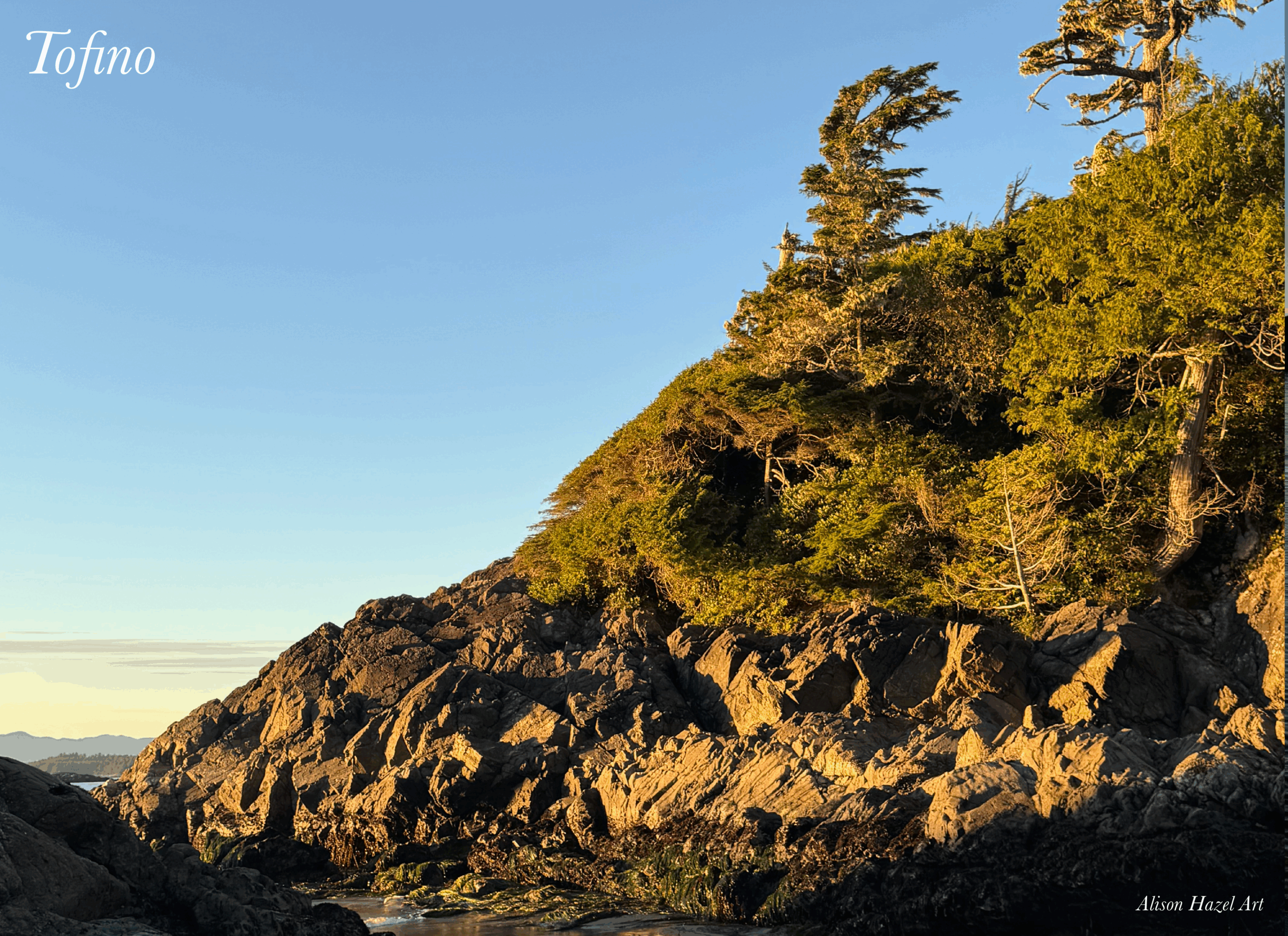
The beaches were a definite draw for me.
Not only did they draw me in, but I attempted to draw them as well.
Bear in mind that I was travelling with several family members and the days were pretty filled up with brunches, lunches and dinners all together, although I did manage to get some pics of the beaches.
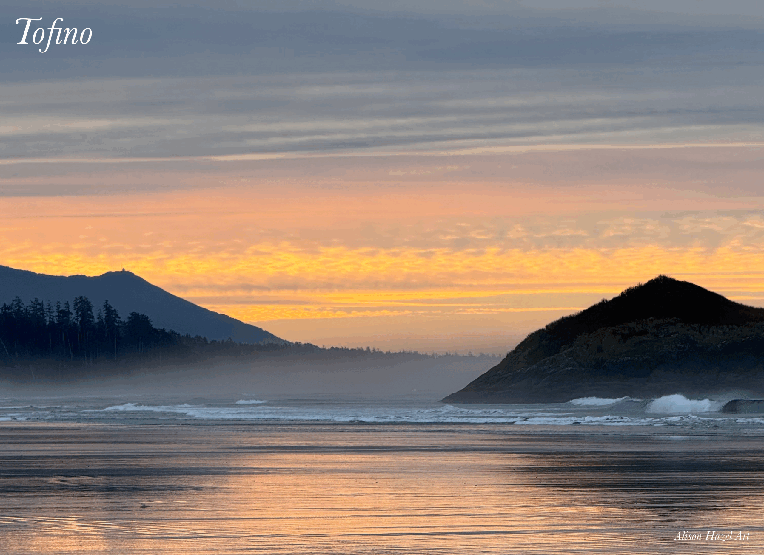
This image shows a little fog starting to roll in from the Pacific Ocean at Chesterman Beach.
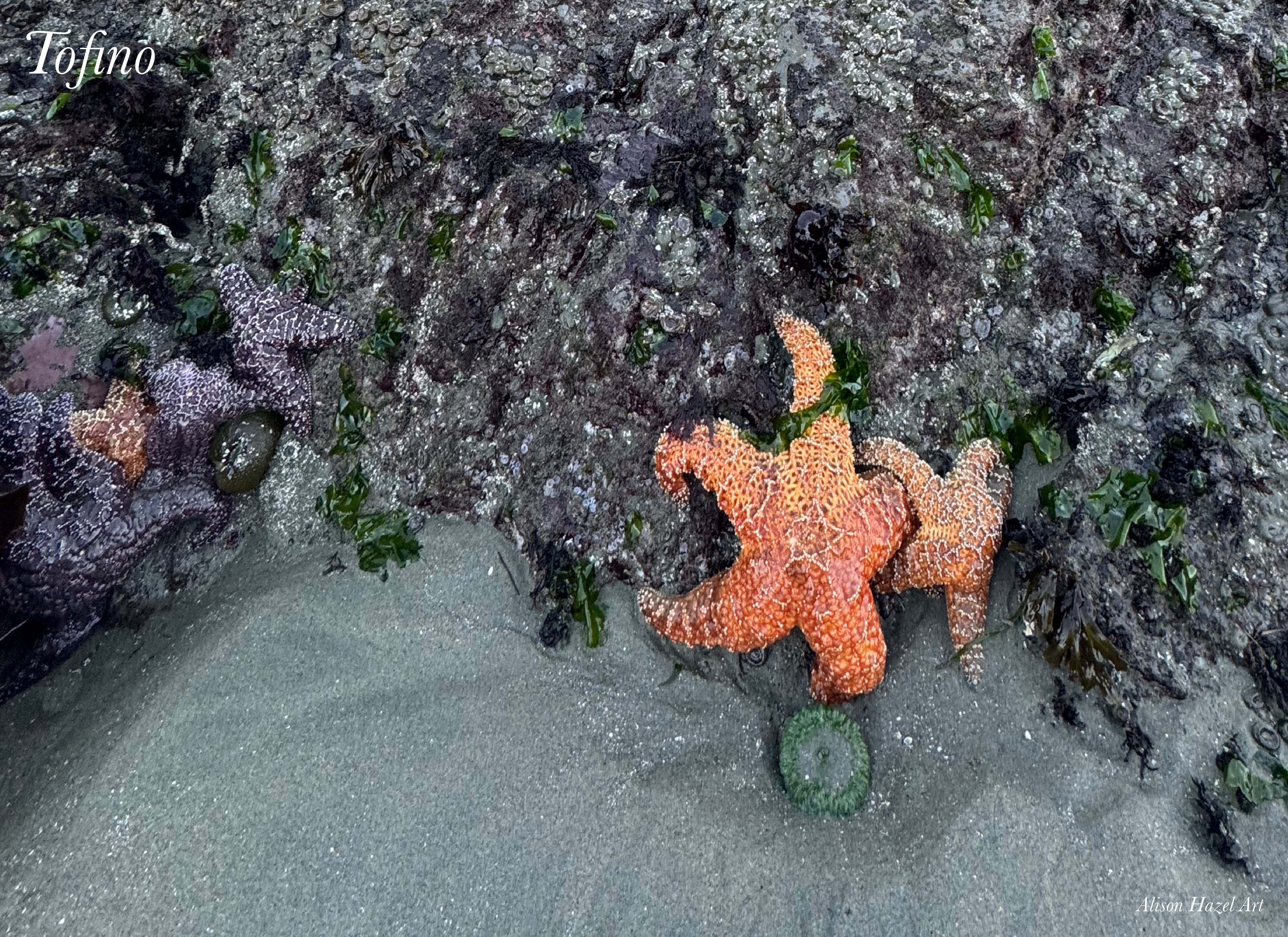
I was fortunate to happen upon this couple of bright orange sea stars clinging to the lower rocks just after the tide had gone out.
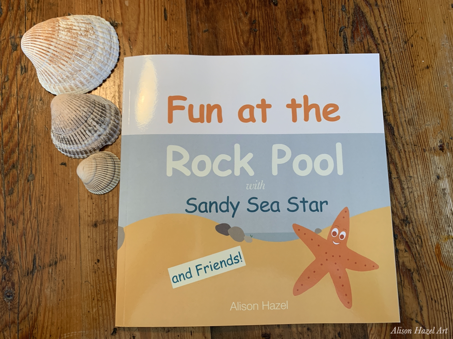
Sea stars always interests me and you may know I wrote and illustrated a whole children’s book titled “Fun at the Rock Pool with Sandy Sea Star and Friends” for ages 3-7 years which is available on Amazon.
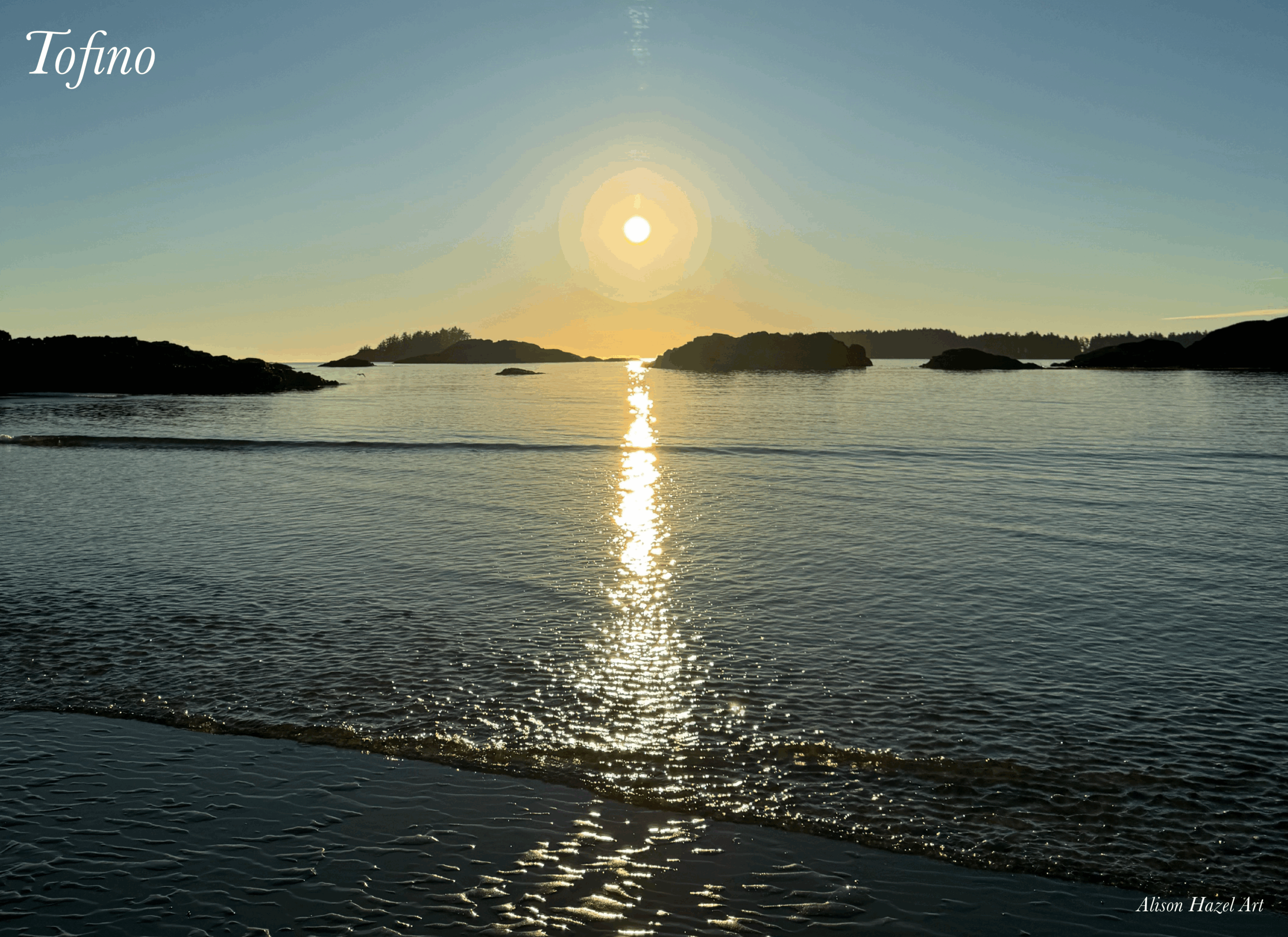
Because Tofino faces west you get to see the sunset every evening. Here is a shot of the sun setting at Long Beach.
Let’s face it, this isn’t a travel article per se, but I’m meant to be focusing on the travel sketchbook pages which I created while I was there and completed once I got home, so enough with the nature shots.
For me, this was not just me going away on a sketching weekend, or a writing weekend, as I did with my friend when we went up to Whistler recently. It was a family escape weekend where there was actually a beautiful wedding-on-the-beach involved. The days were bursting with activities and although I took lots of family photos, they are not suitable for here. So, it was really only when I got into bed at night that I was able to whip out my sketchbook and sketch what happened that day.
I started with the first day which was the actual journey to get to Tofino from Vancouver, with my 2H pencil I lightly sketched out the double spread that was to be for Day 1.
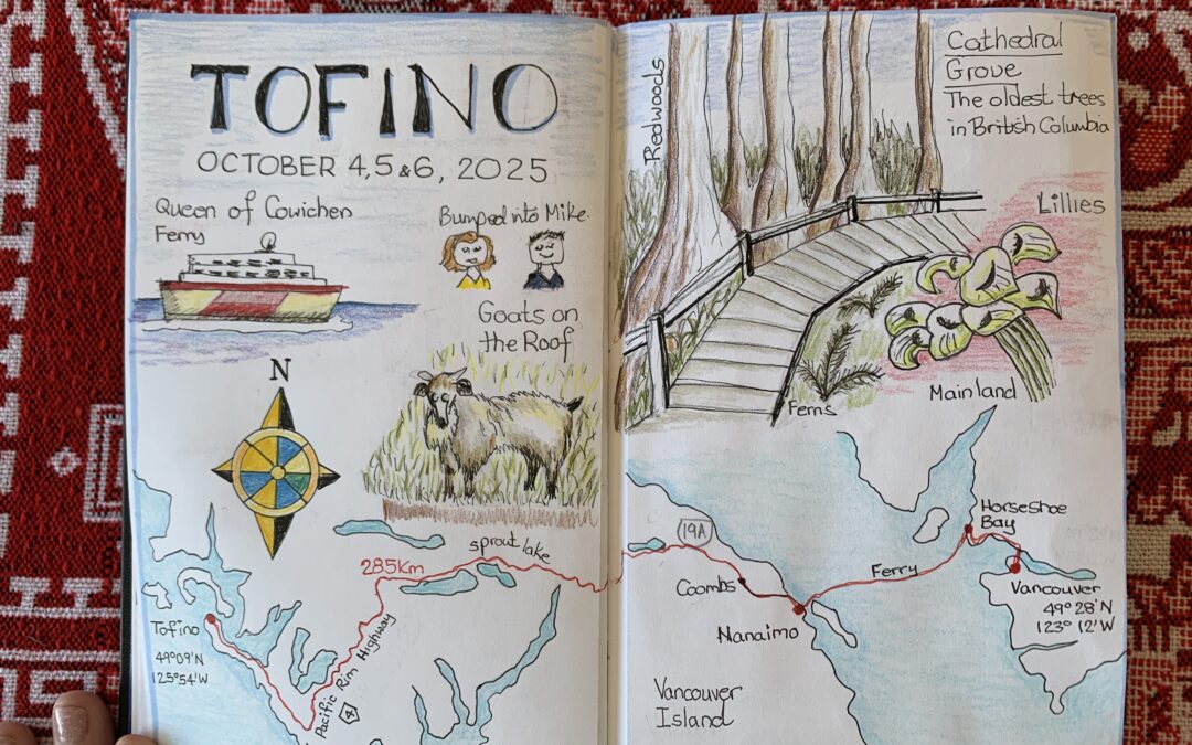
I noted the ferryboat’s name, Queen of Cowichan, and that I unexpectedly bumped into a friend from work, Mike, who was travelling to Vancouver Island that day too.
At the village of Coombs, we stopped to explore the “Goats on the Roof” Old Country Market and general store which was a fun place to stop and pick up a souvenir. Their slogan is, “If you don’t need it, we have it!” Who knew I needed a goat ornament for my tree this year? 🐐
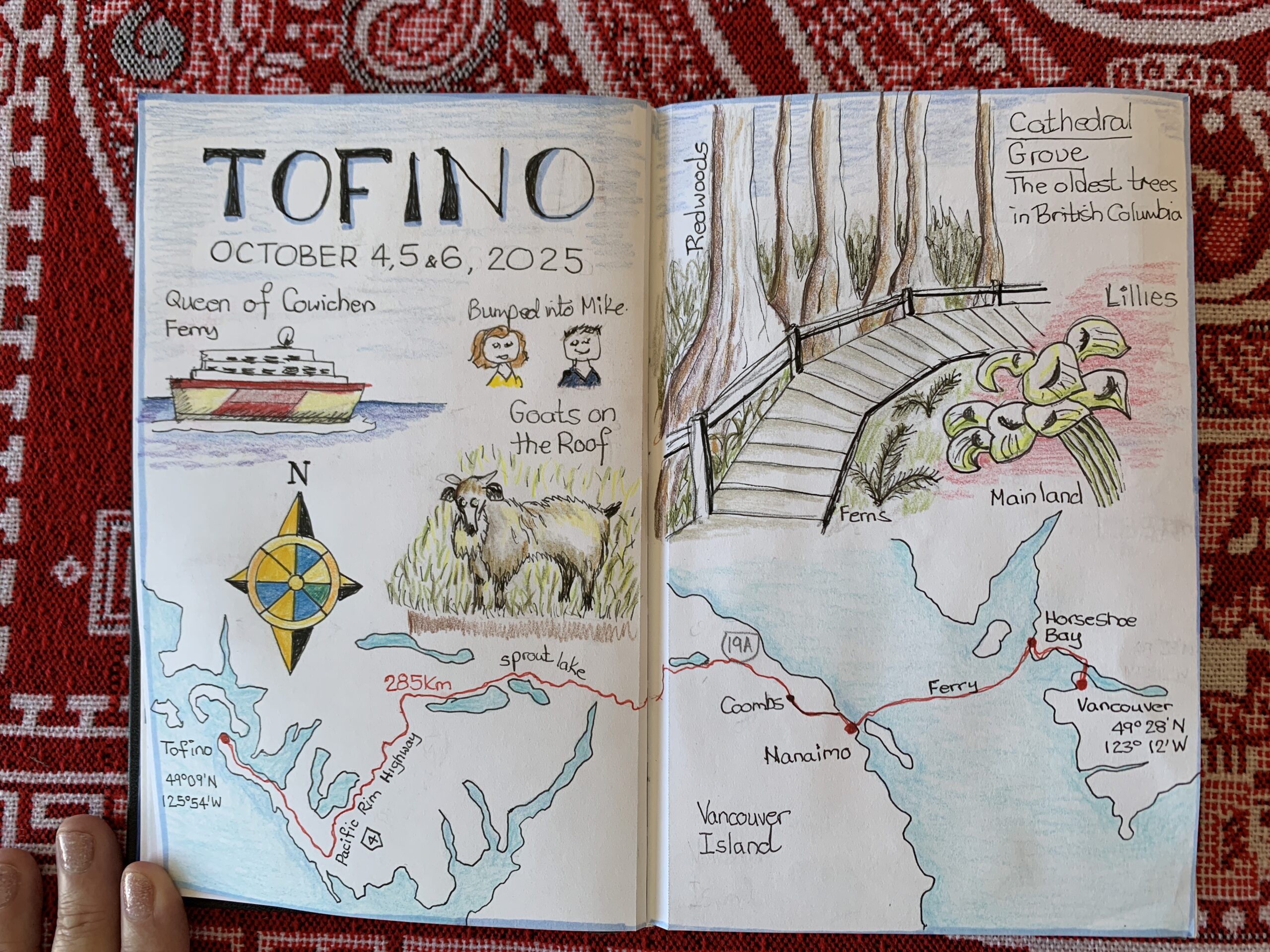
The journey in the car continued and we stopped for a break at Cathedral Grove. This is a protected park which boasts the oldest trees in British Columbia. Some of the redwood specimens are over 300 years old. Their diameter was around 4m (13 feet) for the big ones and possible more. You walk over a raised boardwalk to preserve the nature and not stomp on the undergrowth.
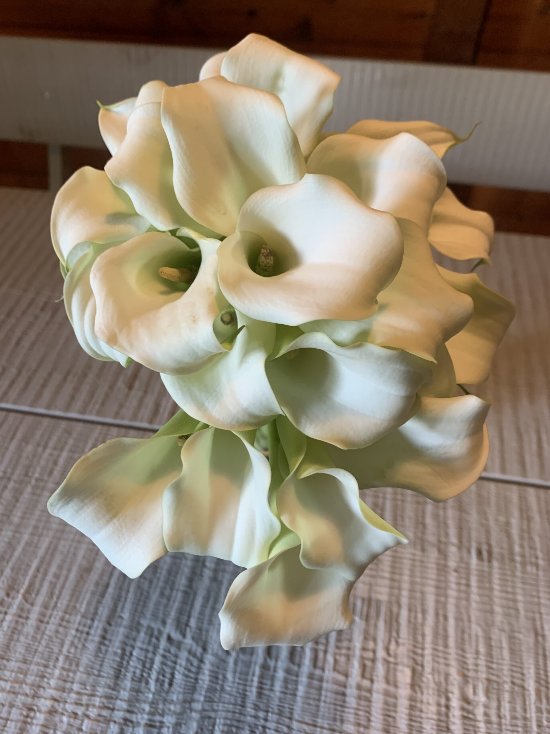
Once we arrived at the cabin the bride-to-be placed some lilies in a vase on the rustic table which I captured in my sketchbook. Technically as an artist, this subject is a bit trickly as the blooms are white, so you tend to need a light green or pistachio color to bring forth the beauty in these flowers.
First evening and dinner at the patio of “The Shed” burger bar.
I sketched the Shed Burger which I had with fries.
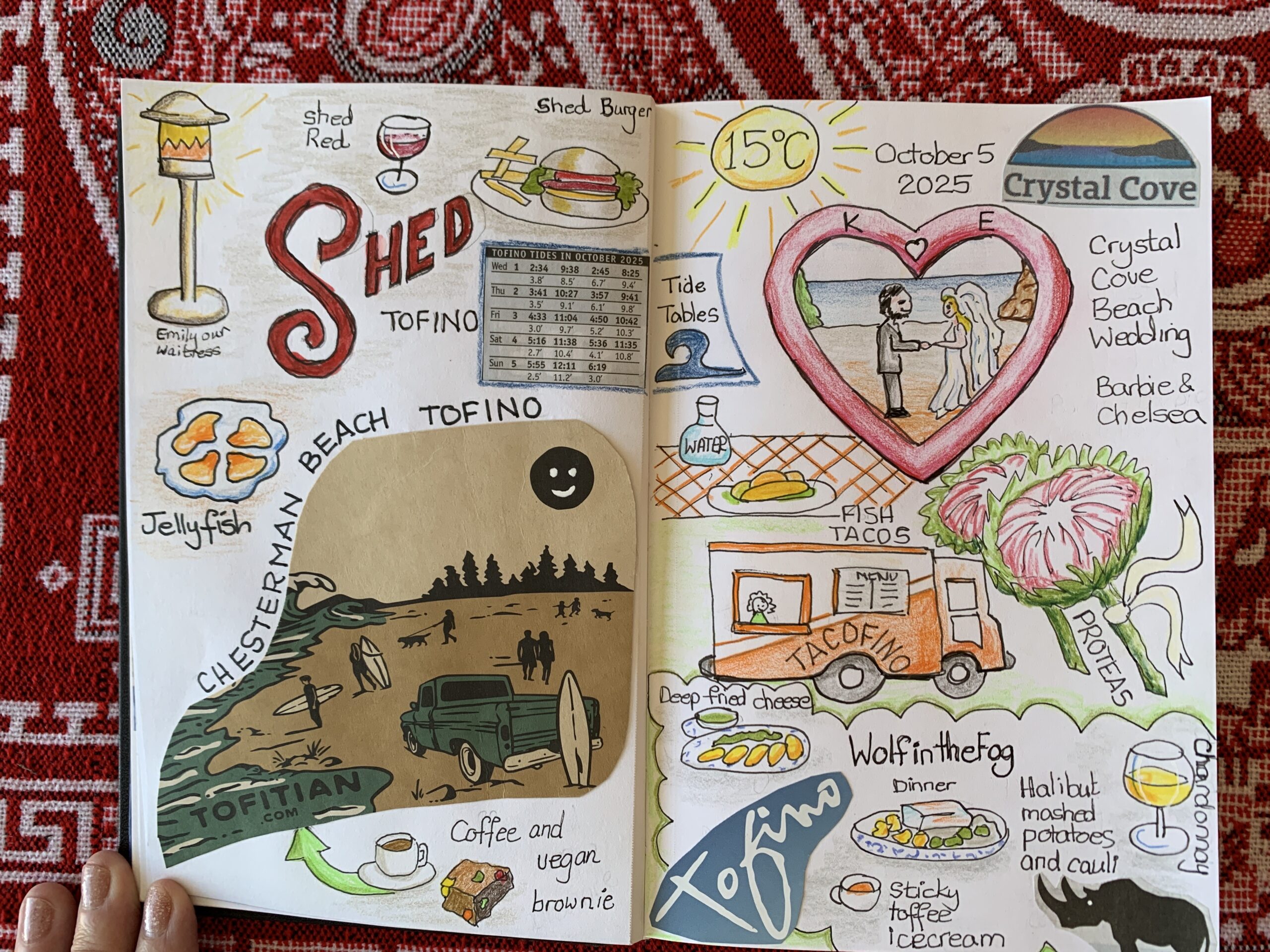
The “Shed Red” is a red wine that comes in a can and it was quite good. I’ll be looking out for canned wines when I get back to the big city. Next to our table was a massive outdoor heater that became scorching during the evening fortunately our lovely waitress, Emily, turned the blast down for us.
There are countless surfers at Chesterman beach as shown on the coffee cup side which I glued into my sketchbook. I always travel with a glue stick to add receipts or papers, or now coffee cup sides, into my travel sketchbook.
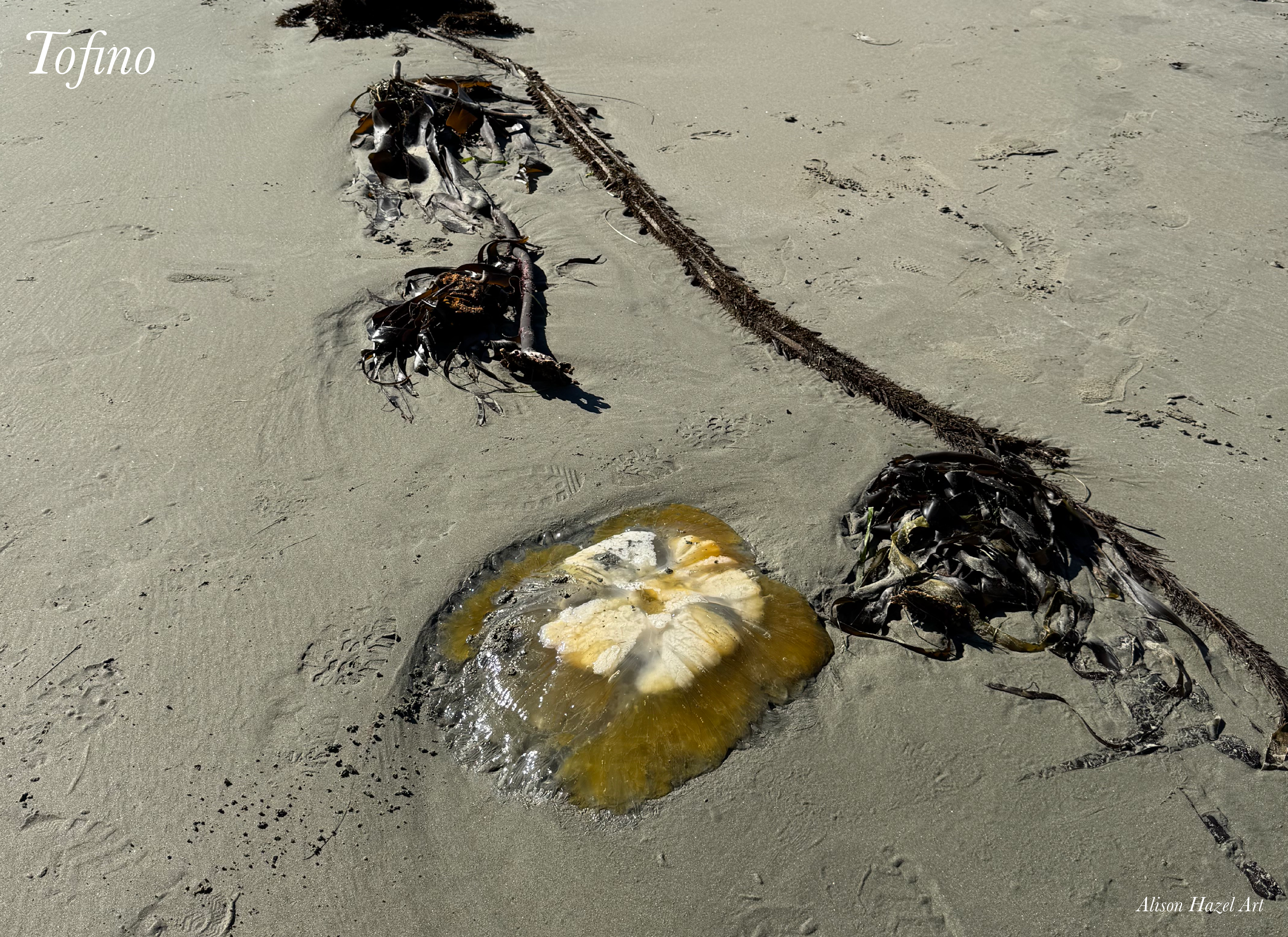
Strolling for a long time on the beach we came across a large translucent jellyfish. It had four milky main chambers which and been beached. The creature was clearly waiting for the next tide to whisk it away. The jellyfish was about 40cm across (15″) and glistening with moisture in the sunlight. I believe they can still sting, so we just took photos.
On the next day, and after the wedding, the other women and I drove and to have a snack at the Tofitian café. I sketched a simple latte in a cup and saucer and the vegan brownie which I chose for my snack. This brownie had large chunks of beets, carrots and fruits which made it quite substantial and chewy indeed.
It’s always a good idea to note the temperature when you develop the pages in a travel journal. For the weekend the temperature was a high of 15°C (59°F) which I drew in a circle like the sun. For an autumn day it was not too hot nor was it freezing either.
To commemorate why I went to Tofino I the first place, and it was not just for a travel journal piece, I did a small heart shaped sketch of the happy couple. I’m not naming them either. I don’t want to give away anymore than that, as it is their place to share their wedding experience with the world, and not mine.
The wedding was presided over by Barbie the local marriage commissioner. We got to meet a fabulous photographer, Chelsea Gray who was great and gave positive direction for the multiple groups shots, poses and lineups against varied backgrounds, in the waves, at the beach and surrounds. She captured the important details like the rings, the family dog and the special moment when the couple tied the knot. It was a pleasure to have met her.
The pink, green and white bouquet combined king proteas and olive sprigs to commemorate the combining of the two families. I sketched this with quite a close up to add interest.
One lunch was at the famous Tacofino hut where you can line up for half an hour before you get to place your order. I sketched my fish tacos and water bottle which we consumed outdoors at wrought iron tables painted in their signature orange.
The main family celebration dinner was held at Wolf in the Fog restaurant in the heart of Tofino village. It seems the top predators in the area are wolves, not bears, so that was something of interest in itself.
The fog refers to the grey thick fogs which roll in from the cold Pacific Ocean and creep into the village at certain times of the year. I mean, imagine seeing a wolf in the fog as you go about your day. Something to think about right there.
The restaurant’s mantra is fish, forage and feast and it was fantastic. I’ve tried to capture the meal in my sketchbook. We wolfed down (see what I did there), deep-fried cheese balls with toasty bread, firm and meaty catch-of-the-day halibut, creamy mashed potatoes and garden-fresh greens, followed by sticky toffee pudding ice-cream. I sipped on a rich golden chardonnay which was smooth and exquisite. Simple food but fabulously prepared and presented. I recommend this restaurant.
Start with a light pencil sketch. Draw the title of the pages. In my case the page heading was “Tofino” which I created in an interesting font.
Look at the composition of your page and try to have an odd number of mini sketches on each page. Five or seven is a great start so the images can be staggered across the page and not just plonked in a grid.
Glue in small cutouts, receipts and images whch relate to the page. For example, I added the sea tides table for the days we were in Tofino. This detail made sense because we explored the beaches.
If possible, add something natural. Perhaps a leaf, petal, seeds or flower head to the page for interest. Alternatively, glue in some ribbon or colored string which relates to the visit.
Always draw a map to set the stage because maps provide context to your journey. Simple diagrams can show where you came from and where you are going. Charts could be of the area, or the inside the place in which you stayed or even of your room.
In travel journals it’s always fun to add the daily high temperature for the time you were there. Noticing the weather forever adds interest to your spreads. If it was snowing or sunny you’d want to include those details as well.
Make sure to add the dates which you arrived and the days when you travelled somewhere on the page. As a legacy, your travel sketchbook will give so much information surrounding what you were doing at that particular time in your life. Others who come after you will have the opportunity to understand more about you and your life during these years.
Food and drinks are always a suitable topic for your travel journal. When you look at the pages later, the plates and glasses will remind you what you ate and perhaps more importantly, with whom you shared the feast.
Mention how you got there, was it by car, plane, ferry or train? One day I hope to travel in a hot air balloon and then I’ll indicate how I got there. If possible, add the road number, flight number and carrier, or the train company details as a reminder.
Mention anyone you meet on your trip. Like as in the case of me bumping into Mike, who is a person I see at work. State anyone who stood out as someone with whom you shared a meaningful interaction. This individual could be a server, a concierge or someone living locally.
Consider the mood of the journey. Was it exhilarating, fun or soothing for your soul? How did you feel when you left? Will you go back?
Try to capture your feelings about the trip. The best time to do this is the last evening which you are there. This is when you’ve experienced most of the good stuff and you only have a long travel-day to face on the morrow.
If you bought things knick-knacks and so on, then add them to your spreads. Tokens or little crystals are always good items for a journal.
Mementoes are physical reminders of how the holiday or weekend went to remind you after you get home.
I believe that objects carry the energy of their places. If I buy books when I’m away from home I’ll draw the cover of the book as a reminder of when and where I got it.
Similarly with artworks. If I pick up an art print I’ll sketch a small image of it in my travel sketchbook as a reminder. I’ll also mention the artist’s name and perhaps even the shop or gallery where it came from.
Be grateful for the experience. Acknowledge who or what enabled you to experience your weekend away. If someone else paid then note them. If someone drove you in their car mention them. If you scrimped and saved for 12 months to be able to pay for the trip, then say so. Gratitude for the experience is good for your soul.
Closing my Tofino Sketchbook feels a little bittersweet. Each sketch brings back a moment like the shifting tide, soft mist on the trees and that quiet feeling of being small beside the ocean. I didn’t set out to make perfect drawings, just to notice more and enjoy the process.
Looking back, I can see how these pages became a record of calm days, gentle color and slowing down. It’s a reminder that art doesn’t always have to be grand but rather sometimes it’s enough to simply sit, watch and sketch what’s in front of you.
I loved my visit to Tofino and since I’ve been home I’ve been looking at real estate in the village and considering if I should get myself a place there.
Alison Hazel is a hobby artist and she shares her ongoing journey about becoming an artist later in life. She creates simple art that anyone can make. She hopes to inspire you to reach your creative potential in the area that suits you.
The page you requested could not be found. Try refining your search, or use the navigation above to locate the post.
Author: Alison Hazel - Updated: October 2025 Introduction I’ve often said that I don’t travel very much, yet here I am again on my second weekend getaway this year. Earlier I spent a few days in Whistler and shared that experience with you, and now another...
The page you requested could not be found. Try refining your search, or use the navigation above to locate the post.
Author: Alison Hazel – Updated: August 2025
This week I’m going to show you my travel sketchbook for a recent weekend we did away this summer in Whistler, BC, Canada.
I only began my travel journal back in 2022 when I started with a weekend in Toronto. From there I did a few little visits here and there, so this is about my eighth entry into my travel sketchbook.
This really means that I’m a beginner, or dare I say a hobby travel sketch-booker person sharing my journey with you as I developed my skills with travel sketch booking.
If you haven’t got a travel sketchbook yet, I urge you to start one the next time you go away for a weekend. Get yourself a travel sketchbook and start recording your adventures.
The sketchbook I’m using is an A5 from Peter Pauper Press their premium sketchbook small. The pages are quite thick, but not completely watercolor quality.
It’s a nice handy journal with plain pages and a black cover.
I have a nylon see-through grey pencil bag from Muji and I carry all of my travel drawing supplies in there. I like this one because I can clearly see what I’ve got in the bag.
I take, two Staedtler pencils they come in many hardnesses, but I like the HB and 2H. A selection of my Faber Castell polychromos coloured pencils in neutral shades of greens, browns and grays.
I don’t take all the colors, it’s just too much to cart about. You can check out my What to Pack for a Writing Retreat article for the full details of everything that I took with me on this trip.
Coloured markers about five, in brights like red, blue, yellow, orange and turquoise.
An eraser. A pencil sharpener. A roll of washi tape. A compass. A ruler.
I did take a few photos with my phone as we were out and about this weekend. I could have taken more.
It occurs to me that maybe a need a GoPro which is a light camera that is more adaptable for the outdoors, but I’m still thinking about that. I do have a Canon M50 mirrorless camera which I use for videos, but I didn’t even take it out of the bag on this weekend.
I like to have little sketch of things big and small. or near and far. Like the micro and the macro.
Regarding the layout of the items, I first eyeballed them and then decided what I’d draw where. This took quite a bit of time.
With a 2H pencil I sketched out each little drawing.
For the black pen work I used my Pigma Micron 0.3mm pen mainly. This is the best way to get the ink over the pencil. Afterwards I gently erase the pencil marks.
Using some of my travel colored pencils I added highlights and lightly laid down some color.
Here are the details of the page. It can be viewed individually or as a whole. I’ve highlighted the feature that I added to my travel journal page as these are some of the things that you can add in your travel journal.
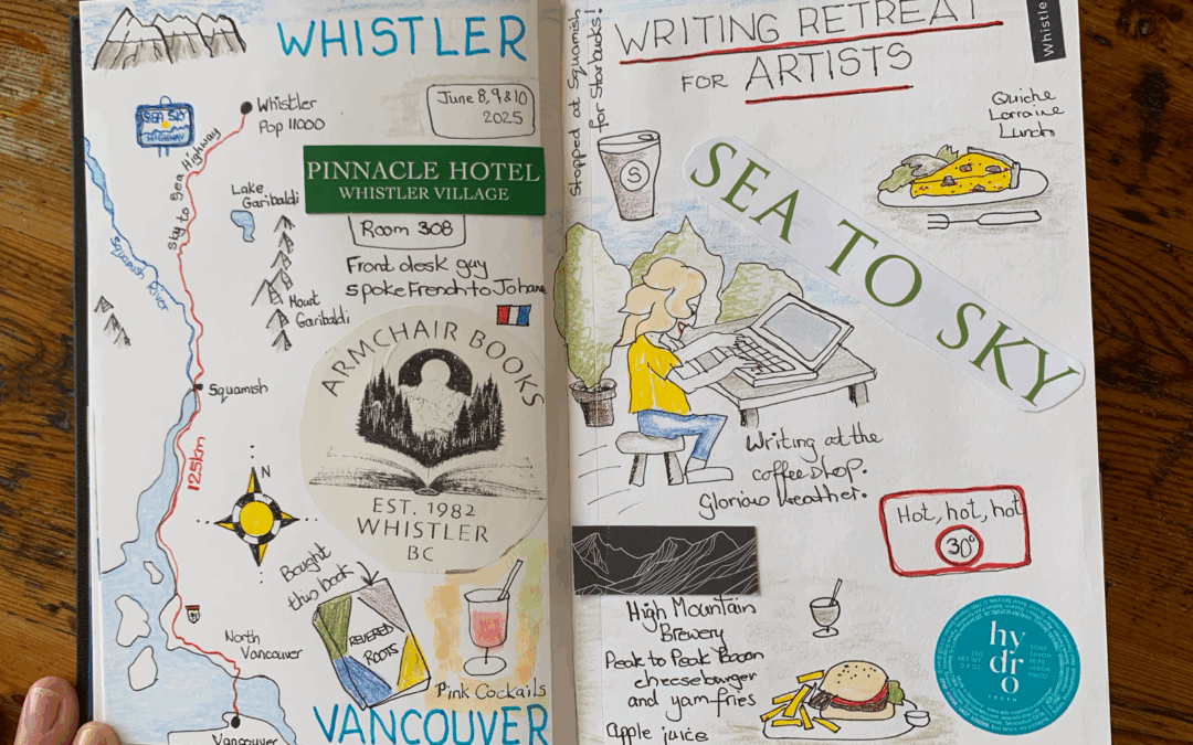
Map
On the left-hand page, I drew a little map of our journey from Vancouver up to Whistler. Actually, I had prepared this at home by pulling it from Google Maps and then tracing it into the book.
Dates
I noted the date of our trip in June 2025.
Hotel
There is a cut out from the Pinnacle Hotel, Whistler Village flyer and I noted my room as number 308.
Sticker
A sticker from the Armchair books where I bought the book I talk about below.
Cocktails
Mini sketch of the pink cocktails which Johanne and I enjoyed in our rooms before going out to dinner on Monday evening.
Title
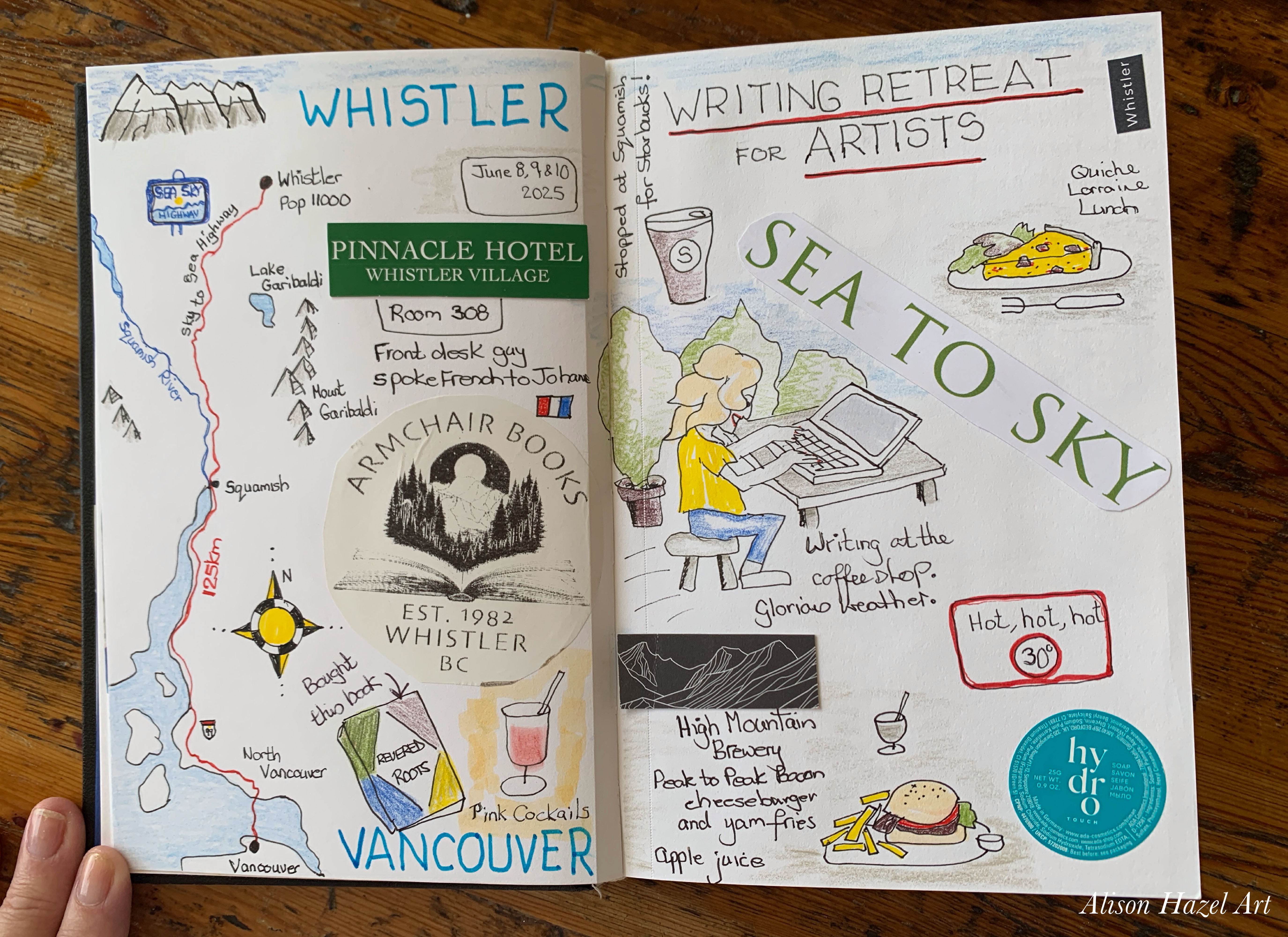
I put the weekend title Writing Retreat for Artists across the top of the page as a reminder of why we went away on our weekend in the first place. Sometimes you look back at travel pages years later and things can get a little blurry in your mind, or at least I find it’s so.
Food and Drink
Sketched in a little bit about the Starbucks coffee and a lunch plate.
Activity
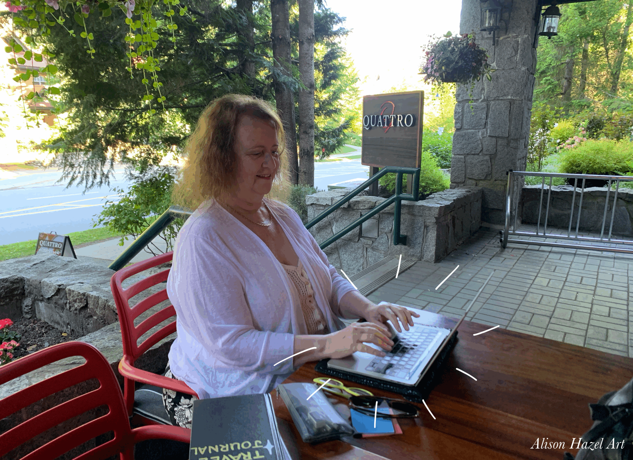
Next a little sketch of me typing outdoors at the coffee shop patio, in amongst the trees and bushes and whatnot.
Temperature
I added the temperature because it was scorching hot 30°C.
Meal
And highlighted our Peak-to-Peak cheeseburger and yam fries with apple juice which we had at a meal.
Library
The library details where I went and did an online class.
Tea
Green Tea at Squamish on the journey home.
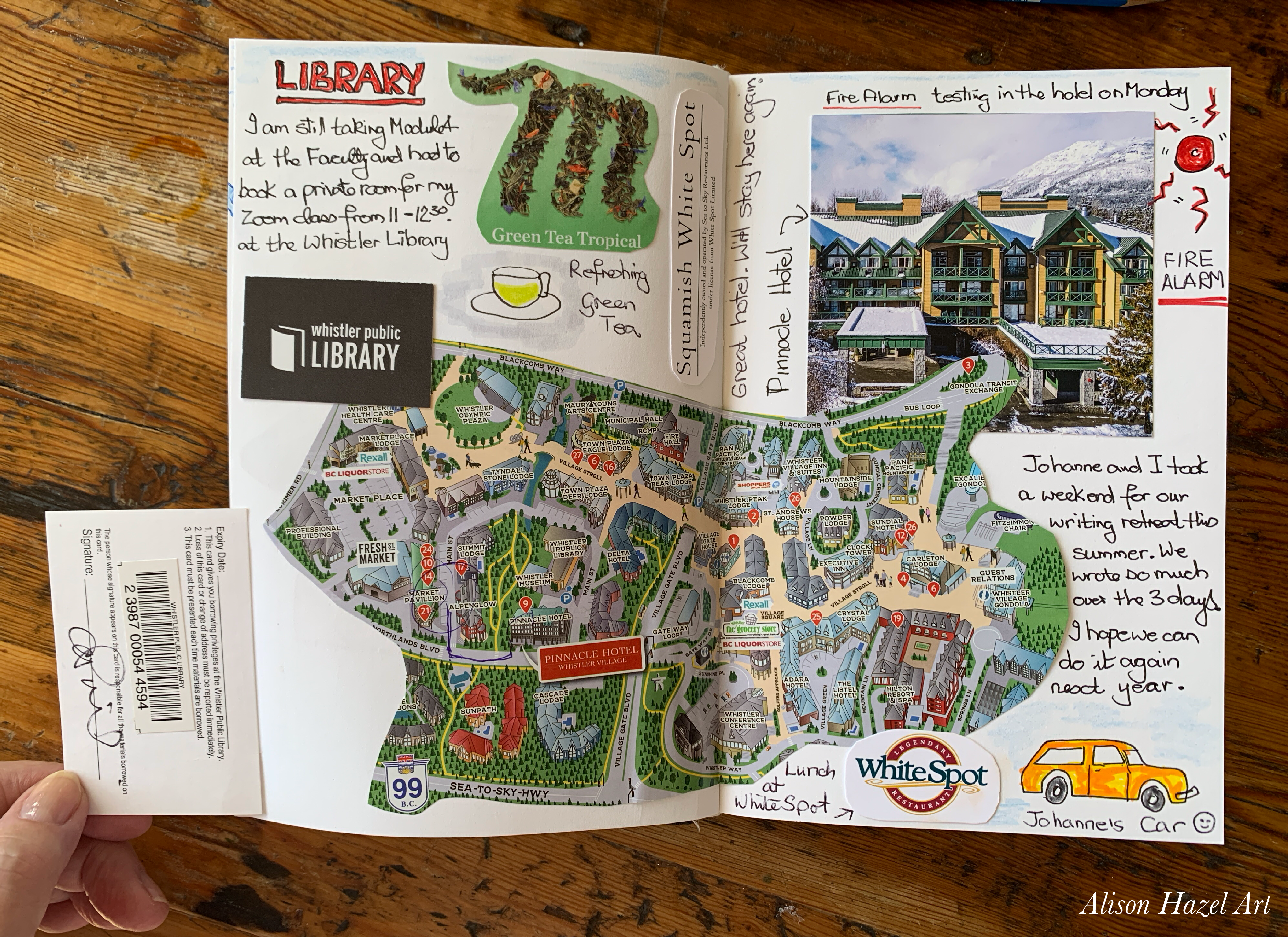
Map
A large map of the Whistler village given to me by the hotel concierge. I do like to have a map on my travel sketch book. Maps really provide an overview of other features in the area that perhaps I didn’t see, and they could encourage another trip back there one day.
Hotel
Picture cut out of the Pinnacle Hotel and also a note that they were doing a fire alarm testing the Monday morning which you just could not ignore!
Logo
The logo from the White Spot restaurant where we had lunch on the drive home.
Transport
Johanne’s fabulous burnt orange car.
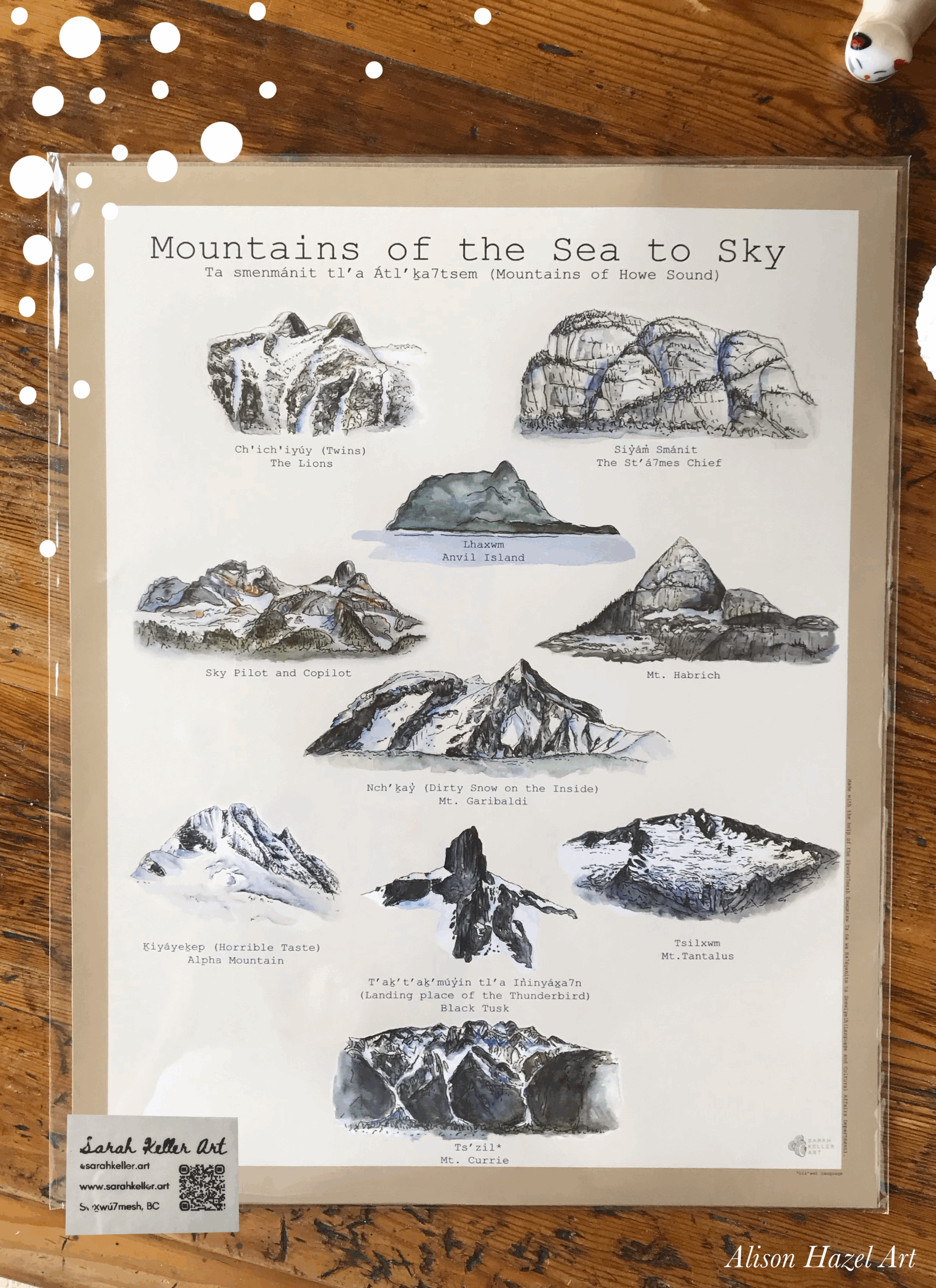
We went to the Armchair Books in the upper part of Whistler village. After spending a lovely half-hour browsing the goods in the friendly shop, I plumped on a book titled Revered Roots: Ancestral teachings and wisdom of wild edible and medicinal plants by Lori Ann Bird an indigenous Métis author, herbalist and educator.
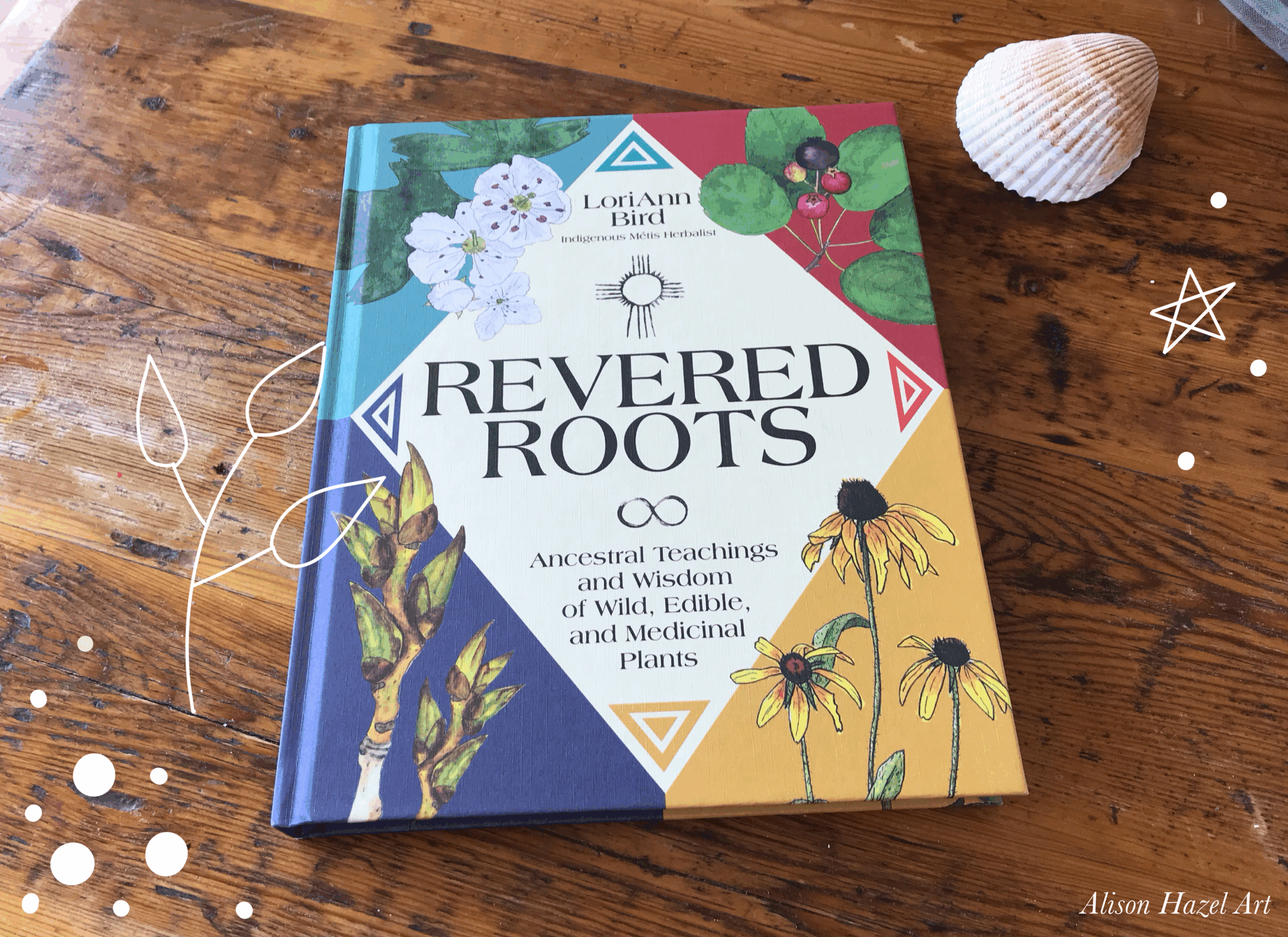
It documents the indigenous peoples of the areas and how they use plants as food and medicines down the ages. I was particularly drawn to this book because. I am really interested in plants as medicine and I have other herbal books in my collection like Culpeper’s Complete Herbal.
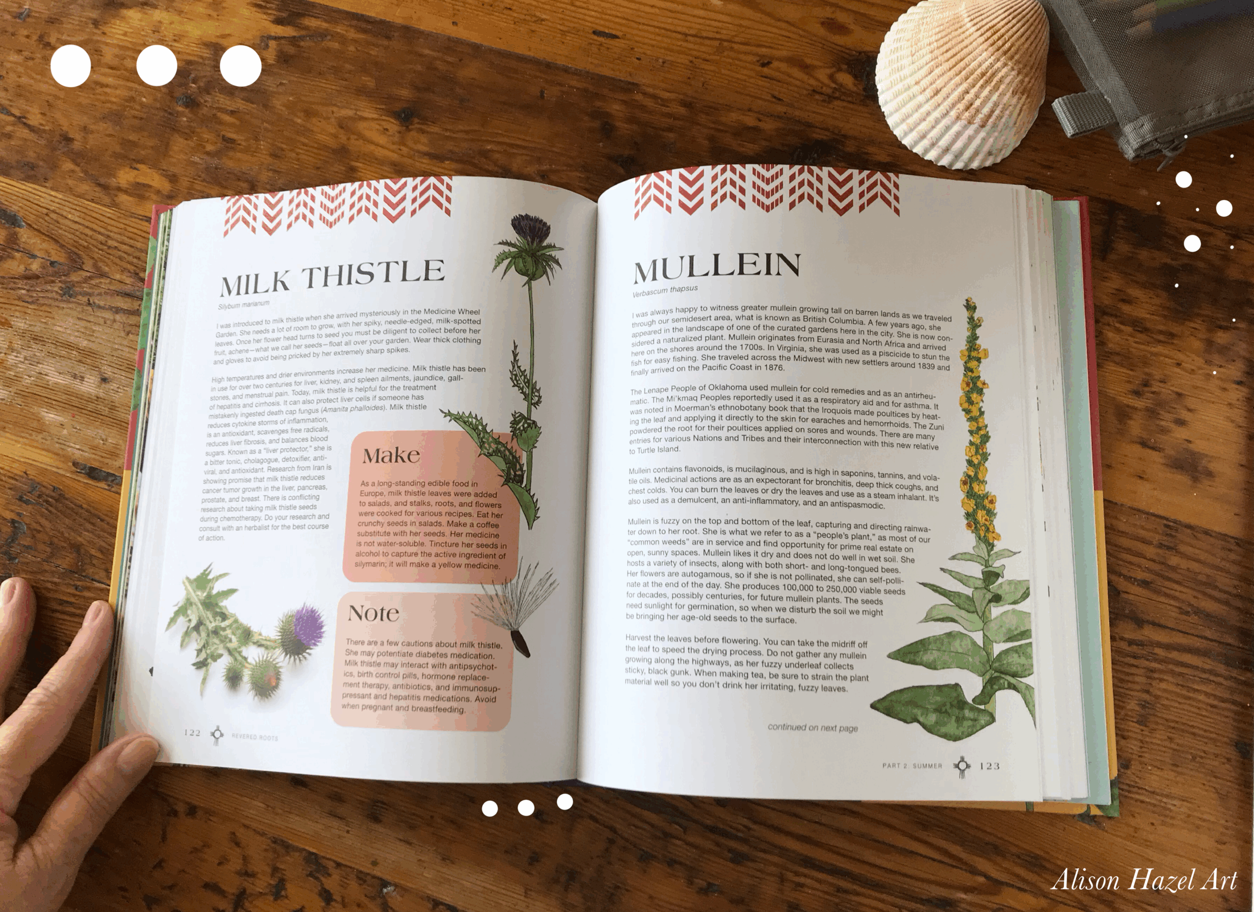
As an artist at heart, I felt I couldn’t come away without supporting a local artist in some fashion. I managed to pick up a poster titled Mountains of the Sea to Sky which is by local artist Sarah Keller who lives in Squamish. This is a pen and ink wash print featuring ten mountains surrounding the Howe Sound and the Whistler area. It’s such a great memento of my trip to Whistler and I get to hang it on my art wall.
It was quite a rush to create these two travel journal pages. I did a little throughout the day so as not to forget what really happened.
Next time I travel, I may draw more and detail more events, like the places we went, meals we consumed and the things we did. I tended to leave my travel sketchbook in the hotel if we went out to lunch, dinner or for a walk through the village.
For no particular reason, I just did.
Not a good move on my part.
Really, I should have taken my sketchbook with me, so I could have done a little quick doodle type sketch to capture the mood like when we stopped for coffee, picked up an ice cream or browsed in a gift shop. I think the moral of the story is that you need to always have your travel sketchbook with you. As they say, “Never leave home without it.”
Next time I will take more photos. And not just photos, I’d like to take a few more videos as well. I was traveling around seeing some breathtaking panoramic views of the actual beauty of the place, the mountains, the trees and the nature in which we immersed ourselves. I probably took twelve photos this whole weekend and it really is just not enough.
The thing is, I get so caught up with what I’m doing and the interesting conversations I’m having, the writing I’m doing, the art I’m doing and what I’m looking at, that it goes out of my mind to snap a photo. I must do this better. If I’m going to document my journeys, I need more photos and I definitely need more videos.
I would have liked another full day. We traveled one day, stayed overnight, had a full day in Whistler, stayed overnight and left the next day. So technically we were really only there for one full day and two half days. Admittedly, this is the first time we’ve been to Whistler or to that particular hotel. But how had we had another full day, so staying three nights, I do feel that a lot more could have been achieved.
I would have appreciated what the place had to offer a lot more. I feel that I skimmed the surface and Whistler village is certainly a place I would like to return to. There were some art galleries that I would have loved to have explored and a museum which I never got a chance to enter.
So, if we decide to do Writing Retreat for Artists again next summer, I would definitely push to get a three night stay so that we can make the most of the environment which is very beautiful.
Otherwise, I might as well have checked into a hotel in downtown Vancouver, shut the door, done my writing and then come home. I know this trip was a first and foremost a writing retreat, but I feel remiss not seeing more that the place had to offer.
I really liked creating these pages in my travel journal. The journal itself is slowly building up with places I’ve visited recently. If I’d started it ten years ago it would be bursting by now, but I only began my travel journal the year before last.
As I said before, I’m not much of a traveler and I have only been away for a weekend twice this year. Also, I don’t have any plans to go away later in the year either.
I’ll let you into a secret that I’m planning a trip next September to visit my daughters who live in Ontario. That is something Im already looking forward to. And so far it’s the only thing in my travel calendar.
I hope you enjoyed seeing how I create my travel pages. It was a lot of fun.
Remember you can see more about this particular Whistler trip I took in my mini-series, see below.
Here are a few travel journal ideas books which you may enjoy.
Author: Alison Hazel - Updated: July 2025 Catchup Recently I have been talking about our writing retreat for artists which we organized this summer. If you haven't been following along, you can go back and read: Part 1: What to pack for a writing retreat. Part 2:...
Join me as I sketch, draw and paint a weird autumn themed knobby gourd using colored ink as a hobby artist.
The page you requested could not be found. Try refining your search, or use the navigation above to locate the post.
Author: Alison Hazel – Updated: August 2025
Recently I have been talking about our writing retreat for artists which we organized this summer.
If you haven’t been following along, you can go back and read:
So just as a reminder. I’m talking about a writing retreat for artists. I myself am a hobby artist, but that doesn’t mean I only do art as there is also writing associated with being a hobby artist. Pieces of writing have to be done for my website at alisonhazelart.com.
I also have to write this newsletter, which I love doing, but it’s still writing for artists. And then if you do, or do not do, social media, which I have a love hate relationship with, you will need to do some writing for that as well.
Additionally, as an artist and particularly on my online art shop, I have to write about my artwork and about my pieces and about my process. So as an artist, don’t think you will never do writing. You absolutely will do writing and in a way, this is under the category of the business of being an artist because it really applies to all the paperwork and documentation that you have to do as well.
Overall, we had a great time. The drive out to Whistler was seamless. It was a glorious sunny day and we took our time to stop halfway and pick up a Starbucks coffee which was great. Also that gave us some time to stretch our legs. We arrived at the hotel just after lunch time.
We were able to check in immediately, which was wonderful and the concierge was able to converse with my friend in her native language of French, which was lovely. This touch made her feel very welcome as well. We managed to get rooms on the same floor, but not adjacent which was ideal.
The hotel had a coffee shop, a restaurant and a pool. My friend did use the pool over the weekend and even though I’d taken my swimming costume (swimsuit), I never quite managed to take the plunge.
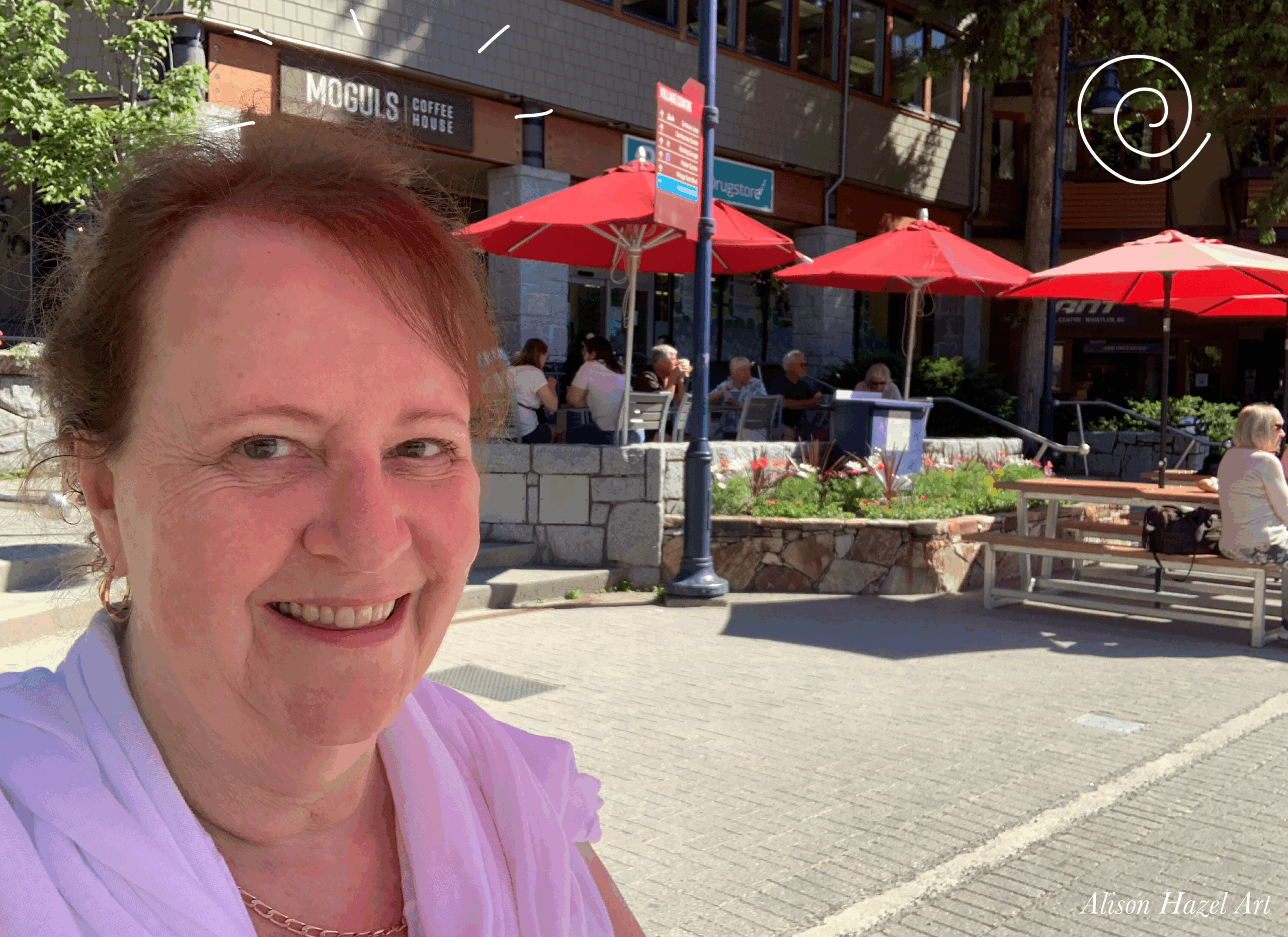
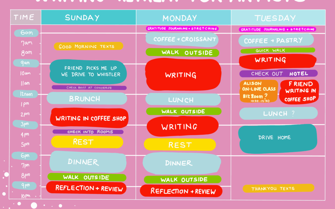
We loosely followed the timetable which I had laid out beforehand and we did adapt it to suit our needs as well. What really happened was that we were able to get multiple chunks of time to get to the writing we needed to do.
For instance, the writing on the Sunday afternoon was scheduled for between 2:00 and 4:00 PM. We definitely started at 2:00 PM but having that end time would great thing because. On the occasions when I felt I had nothing else to give at that point, I was able to stop and feel fine.
However, if I was in the zone with my writing, I would push through the scheduled end time and finish off the thoughts I had in my head or whatever it was I was doing. The point being that the timetable helped because it did give us a structure to the writing, otherwise we would have started in at sunrise and finished at sunset.
You just can’t do that.
You get drained.
Anyone who does writing will know that or any creative activity you only have so much at a time. The timetable did help because it gave the option to say, okay, I’m done for now and I’ll come back to this writing in my next writing segment later in the day or tomorrow morning and at the same time I could push through if I wanted to. So yes, the timetable was a great thing.

Of course, when you’re away, you still have to eat. So personally, I’m not much of a breakfast person and I was quite happy to just go with coffee and a croissant which worked well for me.
At lunchtime we tended to walk into the Whistler Village and find a little pavement cafe, where we could pick up a light lunch salad or quiche Lorraine or something like that. That was great because we’re out in the fresh air, we could see the mountains, there was lots of people there, but Whistler is a place that is geared up for tourists, so they were organized.
Dinner was far more exciting. Having done our afternoon writing sessions and maybe had a bit of a lie down, we rendezvoused in the lobby at 6:00. We took a slow stroll up to the main village to find a finer dining restaurant.
As we were only having dinner on the two nights, the Sunday and the Monday it seemed a good idea to invest in ourselves and get a worthwhile meal. Our first dinner was at a place called the High Mountain Brewery. We both chose the Peak-to-Peak bacon cheeseburger with yam fries (yes, I know not quite fine dining).
I believe the name Peak-to-Peak is a reference to all the mountain ranges which surround Whistler, where summer hikers trek, or even winter skiers, from one mountain peak into the valley then up to the next peak. I had apple juice and normally I would have had wine, but it was so darn hot.
The second evening we found a restaurant closer to the hotel so there wasn’t as much walking, but it had far superior cuisine. We had a glorious meal there with some exceptional wine.
I’ve been taking an online class with a college in London, England. It spans 10 weeks every Tuesday at 10:30 AM. As we were actually in Whistler on the Tuesday morning, I wanted to organize a space where I could have this online Zoom class. I didn’t want to miss out because it’s essential to attend most of the lessons to get the credit for the course.
I had originally thought that I could get a business room in the hotel or even extend our checkout time from 11:00 AM to 4:00 PM, which would have been covered this time, but unfortunately the hotel had neither a business room nor would they allow an extension because they were at 103% occupation already.
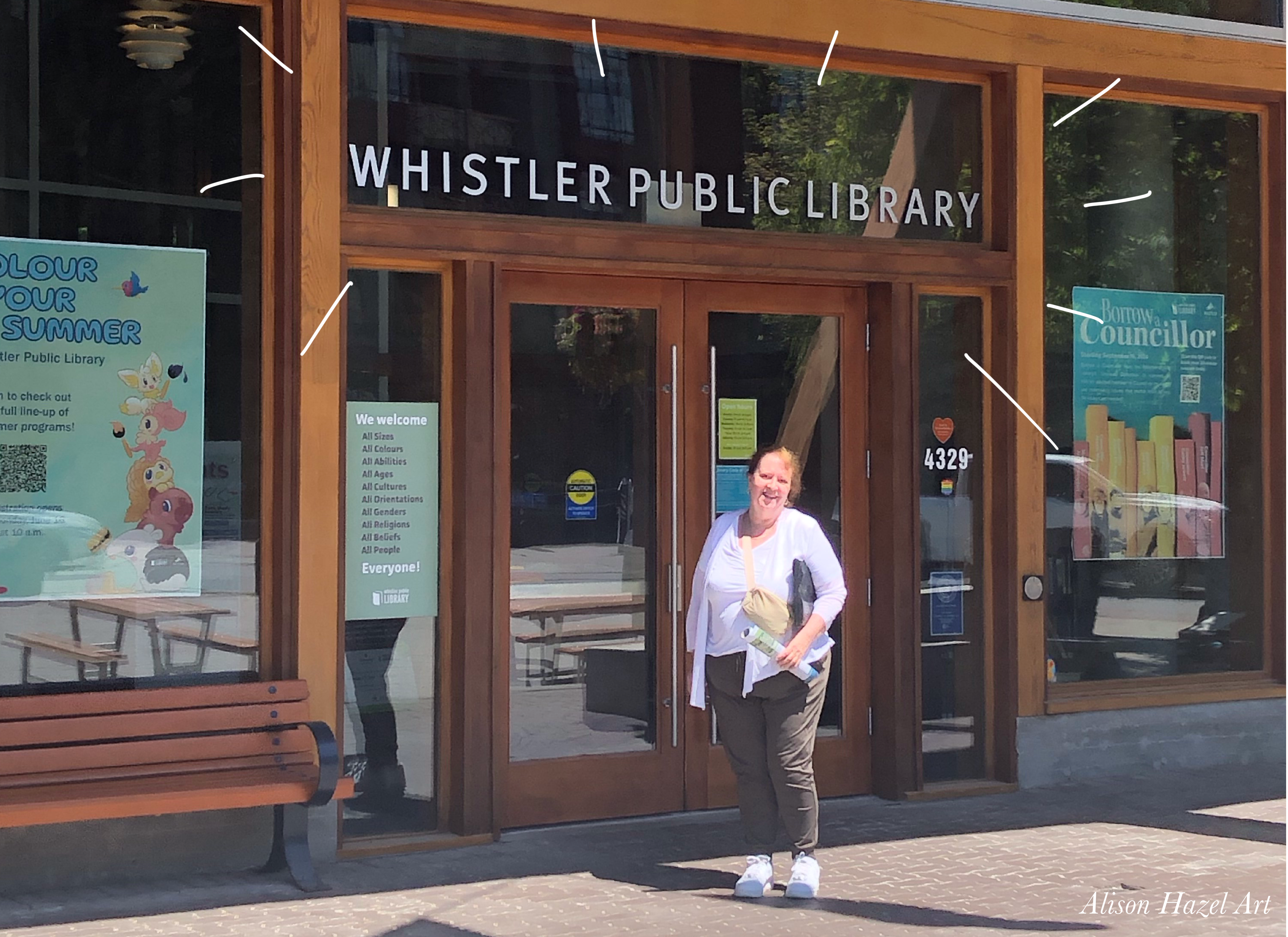
So, conveniently for us, the Whistler Library was across the road from the hotel. I decided to check it out the first day I arrived when I realized I couldn’t get a room in the hotel for my online class. I entered Whistler’s Library to see if they had a space which I could rent or borrow for the period for my class.
To be honest, coming from the big city where the libraries quite substantially over eight floors and massive, Whistler library was delightfully quaint, super modern, but still delightfully quaint.
The librarian on the inquiries counter was happy to say that I could book one of their study rooms, but only from 11:00 AM on the Tuesday. Do so I would have to become a member of the library and so that’s what I did. I joined up the Whistler Library, I’m now a member, then I was able to book the study room and I would only miss the first half hour of my online class, because the class started at 10:30 and could I only get the room from 11am when the library opened.
I did inform my online tutor, Mark, that I would be arriving late to his class and that I would be in a public space for the lecture and I would have to end at eleven sharp, as he tends to overrun a lot of the time. Mark said that was all OK.
On the Tuesday morning, we checked out the hotel and put the bags in the car. My chum took a walk through the Whistler village and I went into the library and had my online class. The library staff were amazing, the air conditioning was marvellous and all went well. I felt fortunate that I was able to continue doing this online studying through my college without having to miss a beat. Just because I went away in a writing retreat for artists I did not have to miss out.
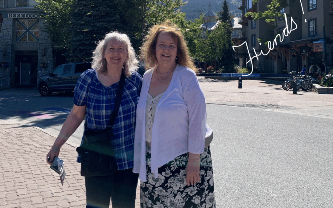
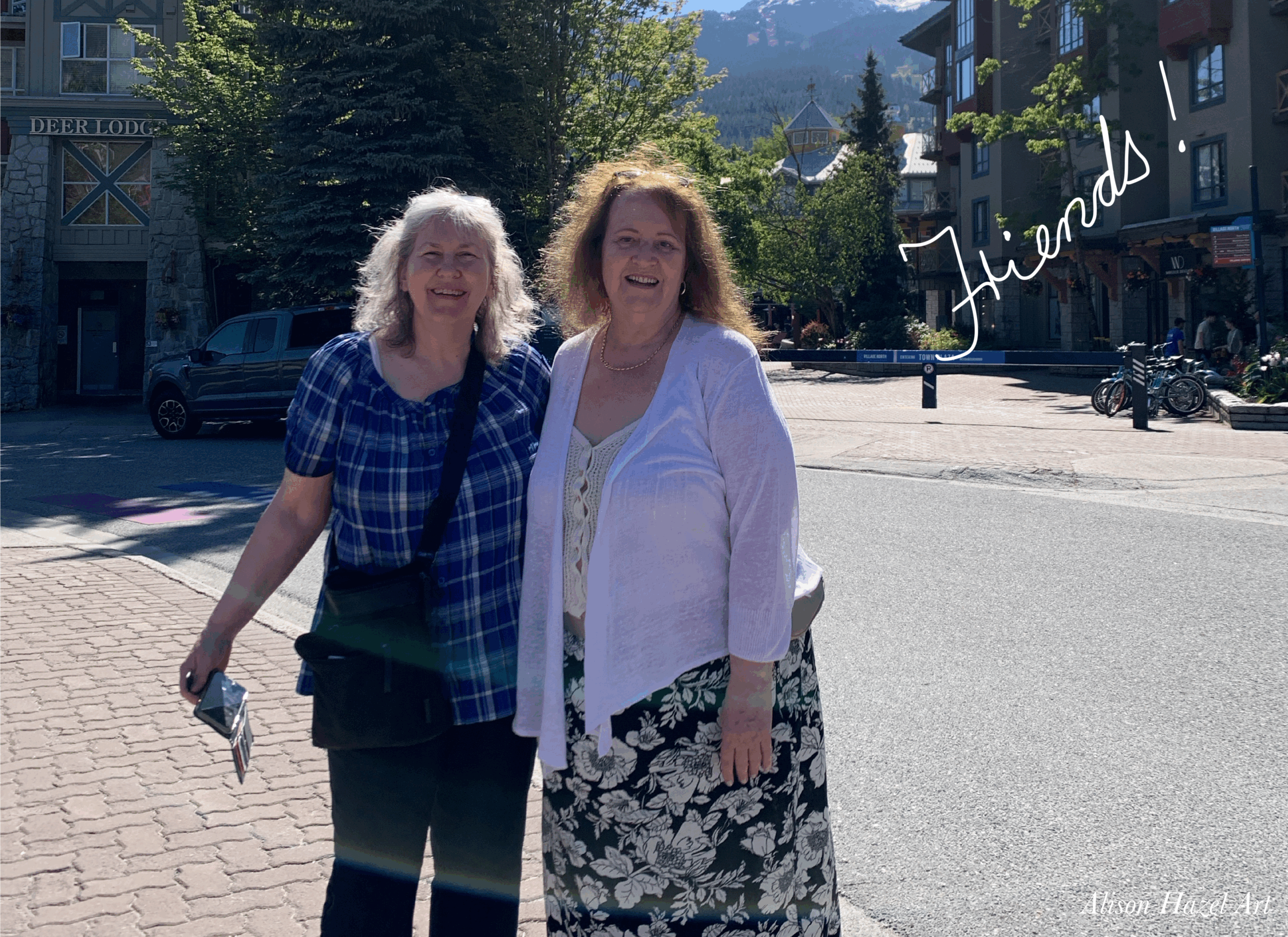
Before we went away, we had never spent much time together. In fact, I have only known her for six months, so we weren’t really quite sure how well we were going to get on as we would spend quite a lot of time in each other’s company over the three days.
But I am delighted to say that we really got to know each other. We found we had numerous things in common with our families and our life histories. I feel I really understand her a lot better and, more importantly, the writing project she’s working on.
Now I have somewhat of a grasp about how she’s wrangling away with her novel. Whereas previously I had no idea the struggle of corralling characters in a book, because I don’t do fiction writing, I do just do blog writing.
I’m pleased to say that coming away from the weekend, yes, we are still good friends and yes, we’ve seen each other subsequently and had other exciting adventures. It’s not always easy to make friends in later life, so I cherish this friendship which has sprung up between myself and my new friend. She sent me her perspective on how good our writing retreat was for her, and you can read it below.
Our writing retreat in Whistler accomplished two main goals for me: it gave me a chance to relax and help me organize my thoughts into a more structured synopsis. It was the first time I’d created a visual synopsis, and it really helped me define each part and chapter of my book.
For historical fiction, there’s a lot of information to gather, and when it comes time to put it on the page, you don’t want to just dump it into any scene. Instead, you want to work it in naturally, so the reader doesn’t really notice that these details are being shared along the way.
The days I spent with Alison helped me refine the synopsis of a major section of the novel, work on scenes that included a lot of historical detail and dialogue, and prepare another set of visual aids—family trees, a map of main my main character’s actions, and a layout of the setting where the novel takes place in the 1930s.
I came back rejuvenated and full of ideas for how to structure my novel. I’m so grateful for the time spent with Alison and for the chance to benefit from her organizational and artistic skills.
I sincerely hope this was the first of many writing retreats for us, and that it’s just the beginning of a long creative journey we’ll share together.
If you are a hobby artist, and you do a little bit of writing, then I would urge you to plan yourself a writing retreat. You could approach this in two ways either:
Of course, there are many organized writing retreats with fifteen or so people that go away together and enjoy yoga in the morning and meditative chanting in the evening, but those gatherings that have never quite interested me.
Clearly, you don’t both have to be artist to go on a writing retreat. I do art and writing on the side, but my friend is crafting her historical novel. If any of this interests you, my question then is, “What are you waiting for?”
I hope these posts have inspired you to consider doing a writing retreat for yourself as an artist. It does occur to me, of course, that this writing retreat which we went on this summer could have very easily been an artist’s retreat as well. Now that would be something interesting which I may consider doing in autumn. Clearly, the difference between an artist retreat is that you’re doing art everyday whereas with a writing retreat, you’re doing writing every day.
I love the idea of a weekend retreat away with friends. To get away from your normal life, where you can concentrate for a couple of days to move your project forward, whatever your current undertaking happens to be.
Here are a few more articles I wrote about our experiences on a writing retreat for artists which I took with my friend in the spring.
Alison Hazel is a hobby artist and she shares her ongoing journey about becoming an artist later in life. She creates simple art that anyone can make. She hopes to inspire you to reach your creative potential in the area that suits you.
Relections on our Wrirng Retreat for Artists taken in the summer in Whistler, BC, Canada with friend. Alison Hazel Art.
Join me as I sketch, draw and paint a weird autumn themed knobby gourd using colored ink as a hobby artist.
The page you requested could not be found. Try refining your search, or use the navigation above to locate the post.
Author: Alison Hazel – Updated: July 2025
Recently I have been talking about our writing retreat for artists which we organized this summer.
If you haven’t been following along, you can go back and read:
I have been working as a hobby artist for about three years now. And along with being a hobby artist, I post some things on social media, not so much to be honest, but I also run a this website and a blog which you may know.
The idea of a retreat is that you go away for a few days, maybe to a hotel, perhaps to the woods and go to a cabin and work on your art. This sounds like the perfect weekend to me.
I have a friend who is a writer and she’s working on her novel. Often when we get together, writing is what we end up talking about. All the writing she’s doing and all the writing I’m doing. The writing I’m doing is really the blog articles and this newsletter, so even though I’m a hobby artist and I’m creating artworks with paints and colours and so on, I also have to produce some writing each week for my audience.
To be honest, writing is not really my strength, but it’s something that I’ve been practicing and trying to get better at recently. This winter I took a grammar course at our local university and also a course about writing for the web as well. I have to say, it wasn’t easy.
At that level, they do assume you know a lot and I struggled to catch up, to keep up, but I pushed on. I’m in no position to take a writing exam whatsoever, or language, or grammar or comprehension, but it did help me to solidify some of my writing techniques for the web and for newsletters in 2025. Because the way we communicate now is different to what it was 50 years ago. Back then my father would you buy a daily newspaper and read it at the breakfast table and he had another edition in the evening for after dinner. Then at the weekend there were the massive Saturday and Sunday bonus editions to keep him busy as well.
But back to my story.
I had an idea about doing a writing retreat with my friend and I approached her about it and she was pretty keen. We thought we would go to one of these little resorts nearby us where they have some hot springs, but we couldn’t get in for the summer weeks we were thinking of. Originally, back in May, we thought we would go sometime in the summer, so that would be June, July or August time when the weather is really pleasant.
We originally set some ground rules about what we wanted in our writing retreat. Neither of us had been on a writing retreat before, so we were planning it from scratch to suit ourselves.
The criteria that we had were:
Because of her and my work schedules, we decided we would not go on a full weekend, Friday, Saturday and Sunday, but rather we would take a Sunday, Monday and Tuesday. And we’re calling it a weekend, so we would leave home on the Sunday, stay Sunday and Monday night, and return home on the Tuesday. Basically, it was a two night stay away, but we still called it a weekend. We were looking for a hotel, resort or lodge that met all of these criteria.
My friend looked around for places for our writing retreat and a lot of them were full, a lot of them were expensive and a lot of them were too far away. Finally, we plumped on a hotel in Whistler, which is around 125 kilometres from Vancouver. It will take us about one and a half hours to get there by road. We are traveling in her car on highway 99 generally referred to as the “Sea to Sky Highway” up the west coast of British Columbia, Canada.
Once we settled on the dates, she made a booking for herself and sent me the link. That same evening, I made a similar booking for myself. We both got the exact same type of room at the same price. I’m not much of a traveler, so I had to download the Expedia app and fiddle around with that. Finally, I had to phone the helpline, speak to a human and get it all sorted out to make sure that I got my $30 coupon, which I did.
We were six weeks away from the event, so we had time to get organized which was great because we had time to sort things out. There are many things buzzing through my head at this point because there’s a lot to do and a lot to organize. If you’re not careful, you end up not doing anything like the writing we had planned, you’re just sitting by the pool casually sipping your pina colada.
I decided to draft out a timetable showing how I saw the weekend would develop because we hadn’t really spoken about it that much. You never know what people are expecting or even what you’re expecting. So, I just wanted to make things a little clearer in my head as well about what I had in mind for this writing retreat, so I could share my ideas with her as well. By sharing my thoughts on what we would be doing, we could chat about the plan and make sure that we were on the same page.
Literally the same page.
So, I crafted out this timetable.
Sunday started with us each giving each other a good morning text to make sure we are alive and kicking, up and about and ready to get going.
She picks me up from my place and we drive to Whistler.
When we arrive at the hotel we probably have to leave our bags at the reception because we could only check into our rooms at 4:00 PM. The plan is to check the bags with the hotel concierge and circle back around and pick them up later.
Quick brunch and beverage.
Here I see us both with our laptops doing some writing in the coffee shop in the lobby of the hotel. I did check out that they had a coffee shop beforehand. I thought we could start our writing immediately and not get sidetracked with sightseeing.
So now we can pick up our bags from the bag check at the concierge desk and go up to our rooms. We can get things sorted out, unpack and freshen up. At this point I may want to take a rest, but if not, then perhaps an hour of writing in the room before dinner.
Rendezvous in the in the hotel lobby and have dinner together in the little restaurant in the hotel. There will be only two dinners and these I think will be the main meals of the day.
Walk outside, promenade and get some fresh air. Probably take some photos as well. Again, now there is the option of another hour or two writing either on the patio or in the lobby.
Back in my room for some reflection and writing about the day. Maybe some journaling as well. At this point I also want to do some “review” and the review was of the writing that I had done earlier in the day, because we are here for the writing. Additionally, I want to set up in my mind what I would be focussing on the next day, and what my next day’s project and word count goals would be.
It depends on what time I wake up if I may swim.
Obviously, I take a shower, wash my hair and freshen up. I’ll wear some light makeup, jewelry, some comfy clothes and shoes.
Morning Routine: Gratitude Journaling
Most mornings I do a little bit of gratitude journaling. Writing down by hand in my journal what I’m grateful for and these are simple things such as being grateful for my family, my friends, my health, my creativity and so on. I have no doubt that on this morning I’ll be being grateful for having got to go on this writing retreat with my good friend.
Stretching
I sometimes wake up a bit creaky, so I like to do morning stretches. This is not Jane Fonda feel-the-burn type stretching, its gentle stretching of my whole body, backwards, forwards and sideways to ease out any kinks which may have tried to creep in during the night.
Coffee and croissant in the coffee shop. I had no idea if they have croissants, but one would assume they would have here in Canada. I’m not much of a breakfast person, but I definitely enjoy some coffee and maybe a little pastry just to get me going. After the coffee, I would probably take a little walk outside. I would hope there was a verandah or a patio where I could get some fresh air and perhaps even hear the birds chirping and things like that. Take more photos. I may do a little sketch in my travel sketchbook while I’m about it.
This is the main morning writing chunk. It will probably start at 8:00 AM or 9:00 AM, maybe even 7:00 AM it depends on how the morning goes. I would anticipate that we would either be writing in the coffee shop or perhaps on a patio somewhere in the fresh air with our laptops. Maybe by the pool, although it’s hard to see your screen in the sunlight outside. This morning session of writing would go on until noon, so it’s going to be a solid three or four hours of writing.
Meet in the lobby for lunch together in the bistro or restaurant of somewhere for an hour or so.
Another walk outside and it’s not that I’m a big walker, but I want to make sure that I wasn’t stuck in the hotel for the whole three days. I want to get outside, even if I’m just walking in the grounds of the hotel or in the gardens or whatever is available. Just to get a little bit of exercise after eating.
This is the afternoon session of writing. Hopefully we could find a spot to do our writing either together or we can sit somewhere comfortably to do our main afternoon writing. This session will go on until around 4:00 PM, so it’s going to be a good two to two and a half hours of concentrated effort in the afternoon. I also wanted to make the afternoon session of writing slightly shorter than the morning one. In the morning when we’re fresher, you can get three or four hours of writing in. Whereas in the afternoon I may be starting to flag.
Either continue writing for another hour to 5:00 PM or otherwise go back to the room for a rest. I do like to put my feet up in the afternoon. Why not? We’re away from our busy lives and we don’t want to be exhausted. At this point, my friend said she perhaps wouldn’t take a rest. She is likely to push on with her writing and that’s fine. Because to have a rest is on the schedule, I won’t feel bad saying, “I’m going to have a rest now” and doing so. However, if I did feel strong, I could push on with the writing and feel good about doing that.
Rendezvous again in the foyer for our Monday dinner in a restaurant in Whistler. Perhaps a glass of wine.
Once more a promenade or walk outside after eating just to limber up a little better. Let the food digest. This may or may not be what we actually end up doing, but I want it on the timetable to make sure I had the option to do so.
If we’re feeling strong at this point, we can get another hour of writing in from 8:00 till 9:00PM. It just depends.
Back to my room for reflection on the day and to review of the writing that I have done that day. Again, this is also the time when I’ll plan what I’ll be working on the next day writing wise. When I set up the timetable back in May, I didn’t know just how much writing I’m going to get done or whether I’m going to get sidetracked or whether some other ideas are going to come to me and I going to end up doing some different type of writing. I didn’t want to lay a firm structure to what I would write at what each session. I just want to have something loose which I can work with and flex into how I was feeling, how the weekend was going and even what the weather and vibe was like at the hotel.
Shower, dress and makeup. Gratitude journaling and some stretching in the room. Just like yesterday. Pack my bag and leave it in the room.
Coffee and pastry in the coffee shop.
Maybe squeeze in an hour of writing.
Check out of hotel. We only need to check out by 11:00 AM and I am going to ask for an extension for the Tuesday, so that we could check out later at around 2:00 PM. That would give us more time, as you’ll see later. But if we do have to check out at 10:00 AM, I’m going to leave my bags at the bag check at reception for pick up later in the day when we leave.
Presently I’m taking an online course with a college from London. This will be the 6th class out of 10 which I don’t want to miss. I’m going to try and find the business centre where I can get a private space to attend the Zoom class from 10:30 to 12:30, as I don’t want to miss the session. Whilst I’m taking this 2-hour online class, my friend will no doubt be writing in the coffee shop, if we did check out, or she will perhaps be toiling away at her word count on the patio.
Leave the hotel. If we did organize a late checkout do so now or simply get our luggage from the concierge bag check. Load the car and be on our way. We plan to stop at a small town, Squamish, on the way back to the city. We will perhaps find a place for lunch there. There is no rush. We now continue on our journey back home to Vancouver.
Back in the city. My friend drops me off at my home and she drives on to her residence.
We send each other thank you texts and say how much fun our weekend was. We celebrate what a fabulous time we had.
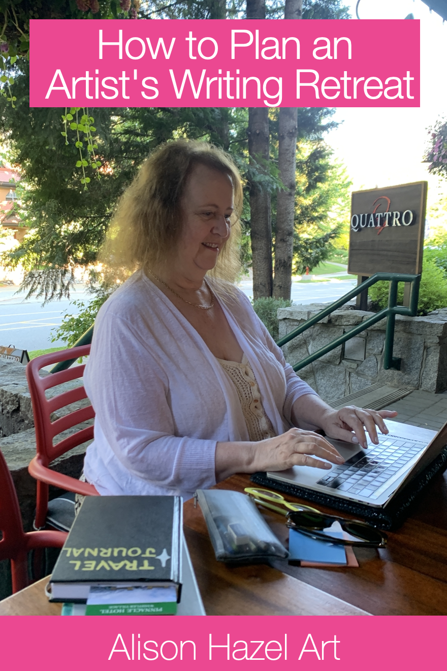
Save this pin to read later.
As a hobby artist you don’t need to do a writing retreat, but if you do decide to. it will enrich your writing for the months to come and probably your art life as well. Let me know if you’ve ever done a writing retreat or perhaps a rt retreat. I’d love to hear from you.
In a future Artzlife newsletter I’ll let you know how it all went and whether my detailed planning was of any use whatsoever. You’ll also get to hear from my friend about her experiences in her own words on our first ever writing retreat for artists.
And in a still later edition, I’ll share some of my travel sketchbook images from our weekend away as well.
Here are a few more articles I wrote about our experiences on a writing retreat for artists which I took with my friend in the spring.
Alison Hazel is a hobby artist and she shares her ongoing journey about becoming an artist later in life. She creates simple art that anyone can make. She hopes to inspire you to reach your creative potential in the area that suits you.
TRAVEL JOURNAL WHISTLER: Create a page of a weekend getaway. It’s a simple and meaningful hobby art practice that helps you stay creative.
Join me as I sketch, draw and paint a weird autumn themed knobby gourd using colored ink as a hobby artist.
The page you requested could not be found. Try refining your search, or use the navigation above to locate the post.