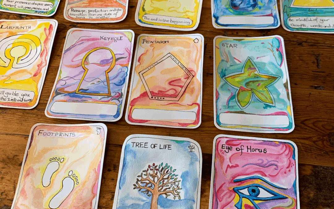
As a hobby artist, working with affirmation cards can be a great way to get your daily art practice in without overwhelm.
Phenomenal Phenology Wheel
Phenology
The science of phenology is the study of the natural world around us and more specifically, it is the study of cyclic and seasonal natural phenomena, especially in relation to climate, plant and animal life.
Phenology is particularly used for environmental studies, nature study and is easy to do with children in your own back garden.
Observations
Phenologists make observations about the natural world, and you can too.
Typical things that would be a good observation would be:
- Temperature
- Weather
- Rainfall
- Snowfall
- First blossoms on trees
- Flowers that are blooming
- Vegetables ripe for picking
- When the leaves start to fall
- How high the rivers are
- Which insects, birds or mammals have been seen
Phenology Wheels
A phenology wheel is a circular diagram portraying all the observations for the time periods chosen.
For example, you could have a phenology wheel with different divisions such as:
- Yearly – 12 monthly divisions
- Monthly – 31-day divisions
- Weekly – 7 daily divisions
- Seasons – four divisions
Time Periods
As can be seen, there are many different time periods which can be used for a phenology wheel.
This year I decided to do a monthly phenology wheel as I have started taking an interest in my Perpetual Nature Journal which has twelve months.
It seemed a logical step to have a monthly phenology wheel as well.
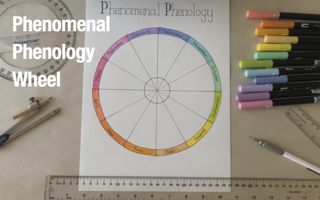
How to Create a Phenology Wheel Diagram
My piece of paper is about 23cm by 30cm (9 by 12 inches).
It doesn’t matter what size page you have.
First with a pencil draw a light diagonal line from corner to corner to find the centre of the page.
Next you will take your compass and put the point in at the middle cross hairs.
Draw a circle as large as you can giving yourself about 1cm (1/2 inch) gap from the edge of the paper.
For my page, my outer circle is 10cm (4 inches) radius that is the first circle.
My second circle is 9cm (3 ½ inches) radius.
My small inner circle has a 2cm (3/4 inch) radius.

Dividing into 12
Line up your ruler with the centre point of the page and draw horizontal line from the outer circle all the way across.
Next take your circular protractor and line it up with the central dot of the protractor where you put in the point of the compass.
Mark out with a pencil and draw a vertical line.
You now have four quarters.
Next divide the four quadrants into three 30-degree segments each and connect each of the angled lines across the circles.
It now looks like a pizza cut into twelve slices.
Months
At this point you have the option of either doing your months clockwise or anticlockwise and consideration needs to be given to where to put January.
In my phenology wheel I placed January on the top left, and I laid out my months anticlockwise all the way around.
The reason I did it this way is because I am aligning it to the Pagan Wheel of the Year where the very top point is December 22nd, the beginning of Yule, which would be mainly be in January.
It doesn’t really matter which way you do it, but have some reason about why you’re doing it the way you are.
You can either have the months going clockwise or anticlockwise.
You can start your year at any point that makes sense to you.

Coloring the Months
As I am a keen follower of new age practices, I wanted to align my months not only with the Wheel of the Year, but also with the zodiac signs.
I used assorted Tombow markers for this part.
In this case April will be red (Aries), August will be yellow (Leo), and December will be blue (Sagittarius).
These are the three primary colours from which you can hang the colour wheel.
The secondary colors will be June as orange, October as green and February as violet.
My full month colours in order are as follows:
- January is purple
- February is violet
- March is magenta
- April is red
- May is tangerine
- June is orange
- July is apricot
- August is yellow
- September is chartreuse (lime green)
- October is green
- November is turquoise
- December is blue
Inner Circle
The small inner 2cm radius circle is where I plan to note the high and low temperatures I experienced in my city each month.

Phenomenal Phenology Wheel Monthly Progress
We are more than halfway through August as I start my phenology wheel.
I may or may not be able to get the August diagram in there, but I’m hoping that I shall and when I do, I’ll post the image below here.
My phenology wheel is an ongoing project that I can add to each month.
As I complete the months I will take a photo and post it below so you can see how much I got finished is my phenology wheel.
Phenomenal Phenology
I’m calling it Phenomenal Phenology because I can and I think it’s a great title for my phenology wheel.
I plan to frame my phenology wheel when it is completed and hang it up in my art studio.
As I’ve said often before, I do believe that every artwork you do should be good enough to frame and it ought be hanging on your wall.

style="display:block; text-align:center;"
data-ad-layout="in-article"
data-ad-format="fluid"
data-ad-client="ca-pub-4471307604888511"
data-ad-slot="7787961343">
Why I’m Doing Phenology
I want to explain to you why I’ve started looking at phenology.
This year I have really tried to work on art as self-care.
This is sometimes through neurographic art or other pen and ink work that I’ve been doing.
But the main idea is to slow down life a little.
I’m trying to uncouple from such a digital world where social media dominates.
I’m trying to bring daily art practice into my life with small art projects which I can work on and that make me happy.
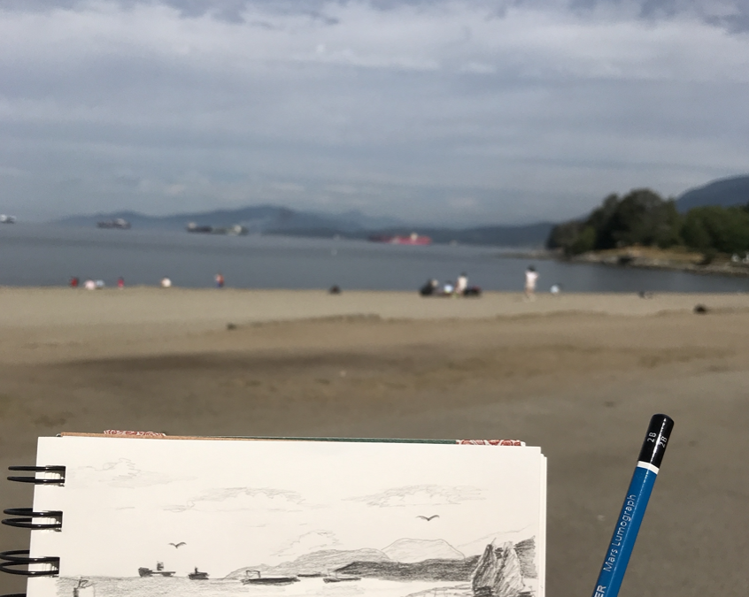
Activities like working on my Perpetual Nature Journal, sketching nature around me at the beaches and so on here in my city, I am really starting to enjoy.
The reason I wanted to try and do a phenology wheel was to add another facet to the type of art that I’m working on now.
Meditative Art
I’m starting my phenology wheel in August, so it’s not at the beginning of the year.
As was not my Perpetual Nature Journal which I only began in May.
But I believe that by having these other options to my art journaling, sketch journaling and other artwork, it gives me options on a day when I really don’t want to do too much.
Daily Art Practice
If I have enough small creative projects on the go, I will be able to reach out for one of them and do some art in the day.
I’ve spoken before about having different types of creative projects as an artist and how I believe it benefits you as an aspiring artist to have multiple art projects in progress at once.
I’m not the type of artist that starts one great big painting and keeps going for six weeks until it’s finished.
That will never be the type of art I do.
Starting out in art journaling, sketch journaling and working with Artist Trading Cards, which are small art pages that can be done in one day, is what appeals to me.
Therefore, I’m adding the small Phenomenal Phenology wheel to my arsenal of art-on-the-go.
It is a yearly project much like my Perpetual Nature Journal.
Because, honestly, when I wake up in the morning, I never know what I’m going to want to do art wise.
I believe you can’t force creative expression.
If this sounds like something that will resonate with you explore out site further.
Thank you for sharing part of your day with me.
Love,
style="display:block; text-align:center;"
data-ad-layout="in-article"
data-ad-format="fluid"
data-ad-client="ca-pub-4471307604888511"
data-ad-slot="7787961343">

Pin this image to your Pinterest board.
Aspiring Artist Activity
Create your own yearly phenology wheel and bring self-care into your life through meditative art.
On a sheet of paper or in your nature or art journal, please do the following:
Draw the Circles
- Find the center of the page.
- Draw 3 circles with 10cm, 9cm and 2cm radii respectively.
Divide the Wheel
- Draw a horizontal line through the center point to the outer circle.
- Draw a vertical line through the center point to the outer circle.
- With a protractor, divide the circle into 12 30 degree segments.
Months
- Write the month names from January to December around the outer edge as shown.
- Color in each month.
You are now ready to start making observations and drawing what you see in each month.

Author Bio
Alison Hazel is a mature woman who shares her ongoing journey about becoming an artist later in life. She creates simple art that anyone can make. She hopes to inspire you to reach your creative potential in the area that suits you.
Go here to read more about Alison’s story.
If you want to send Alison a quick message go here.
More Articles
If you enjoyed this article you may find more interesting blog posts on our site. See below.
Simple Daily Art Cards for a Creative Life
This article is about living a creative life and making art but where you don’t have to go overboard to be creative. If you start working with art cards it can be a way to add more to your daily art practice. 🎨 Alison

Don’t Let the Old Lady In
Exploring how creativity can be our quiet companion, keeping us engaged, joyful, and connected to life and even on the hardest days.