No Results Found
The page you requested could not be found. Try refining your search, or use the navigation above to locate the post.
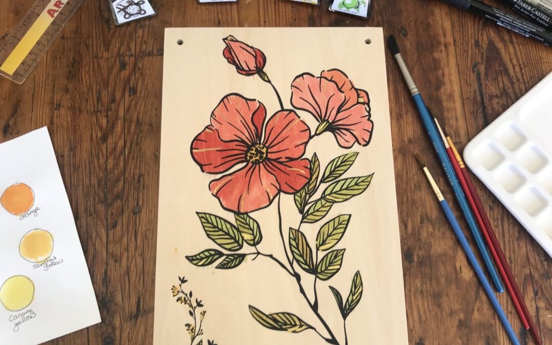
In the first week of May I discovered the YouTube channel Daily Nature Journal and I was inspired to start a nature journal. Alex showed some pressed flowers that he was using in his nature journal and I was so interested, I decided to order a flower press for myself from Amazon. I plan to keep my flower press for years and eventually hand it down to my daughters as a family heirloom.
I chose a flower press from Berstuk.co.uk. This flower press is made with plywood, not compressed chip board, and brass bolts not mild steel (which will eventually rust) brass does not rust. You can get the same flower press which I purchased on this LINK.
The flower press came in a box, with instructions and included all the bolts, wing nuts and washers you need. There is a front wooden panel with a flower outline painted on and a plain back panel. You also get cardboard and blotting paper cut to size with chamfered corners.
This flower press comes with cardboard and blotting paper. You make a sandwich of cardboard, blotting paper, flowers, blotting paper, cardboard and repeat. You can have multiple sandwiches in the press. I hope to start pressing flowers soon.
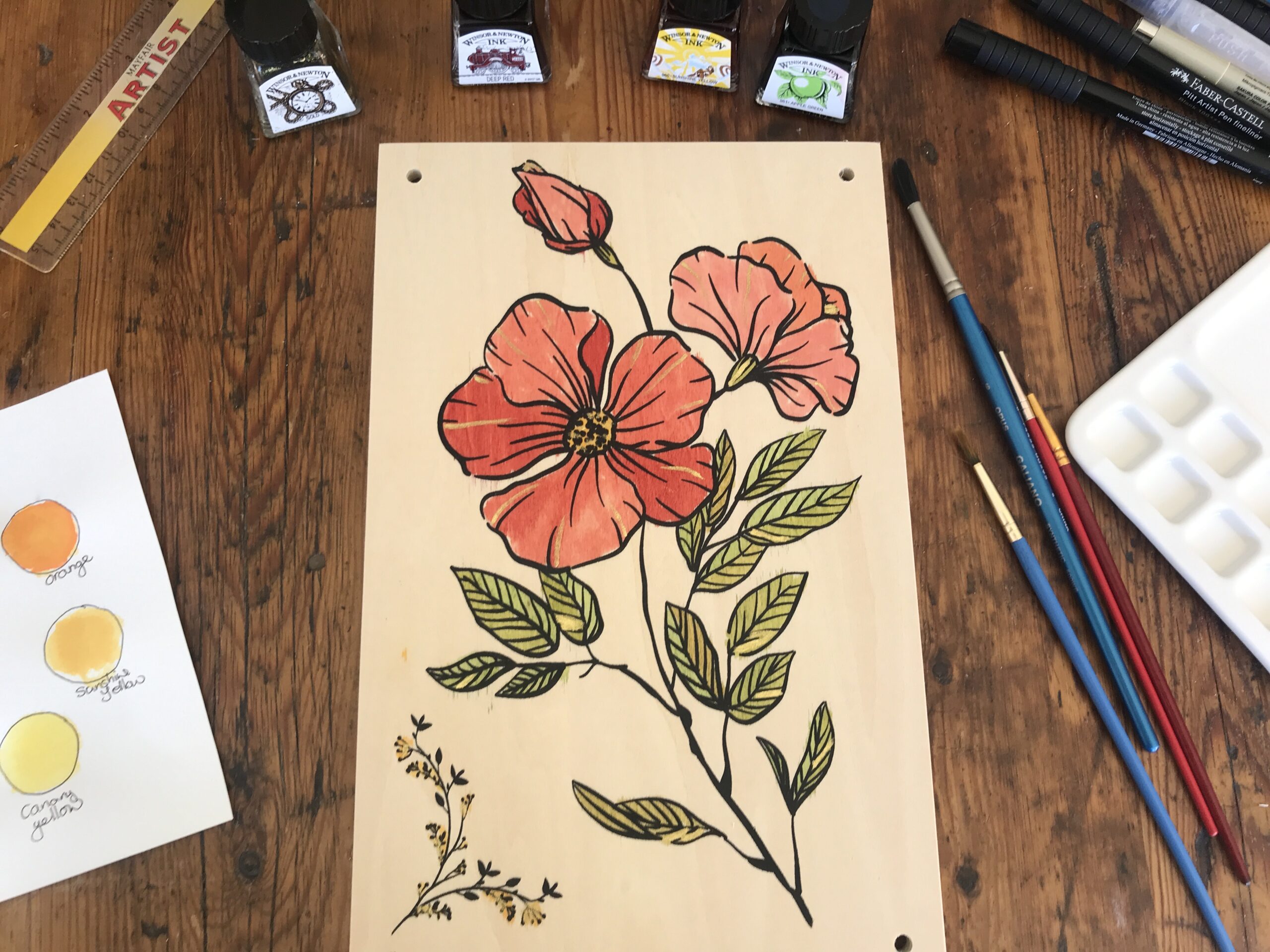
The colored inks I’m using are from Windsor and Newton. I recently got these inks and I’m enjoying learning to work with them.
The apple green is quite bright and needs to be toned down with a little yellow.
I chose canary yellow and this is used to mellow the green for the leaves. I also used the yellow for the centre of the flowers.
The red is called deep red. I thin the red down to make it more pink.
I so often use gold in my artworks that it seemed quite natural to do so here as well. Although I had not thought of doing so until the end.
First, I wiped the front panel with a damp kitchen towel to remove and dust or sawdust. Starting with the green I thinned it with water three to one and added a little yellow. This makes an olive green. I painted this on one side of a few leaves.
Next, I mixed more green and yellow and the second mix is slightly different to the first mix. I continue to paint the leaves with a few green and yellow mixes. I painted the center of the flower with yellow.
For the petals I took intense red and watered it down a little differently for each petal to give the flower some depth. Finally, I added a dash of gold ink here and there for highlights.
I let it dry overnight. I may varnish it later. I plan to keep it in the family like a family heirloom and pass it along to my daughters for their pleasure.
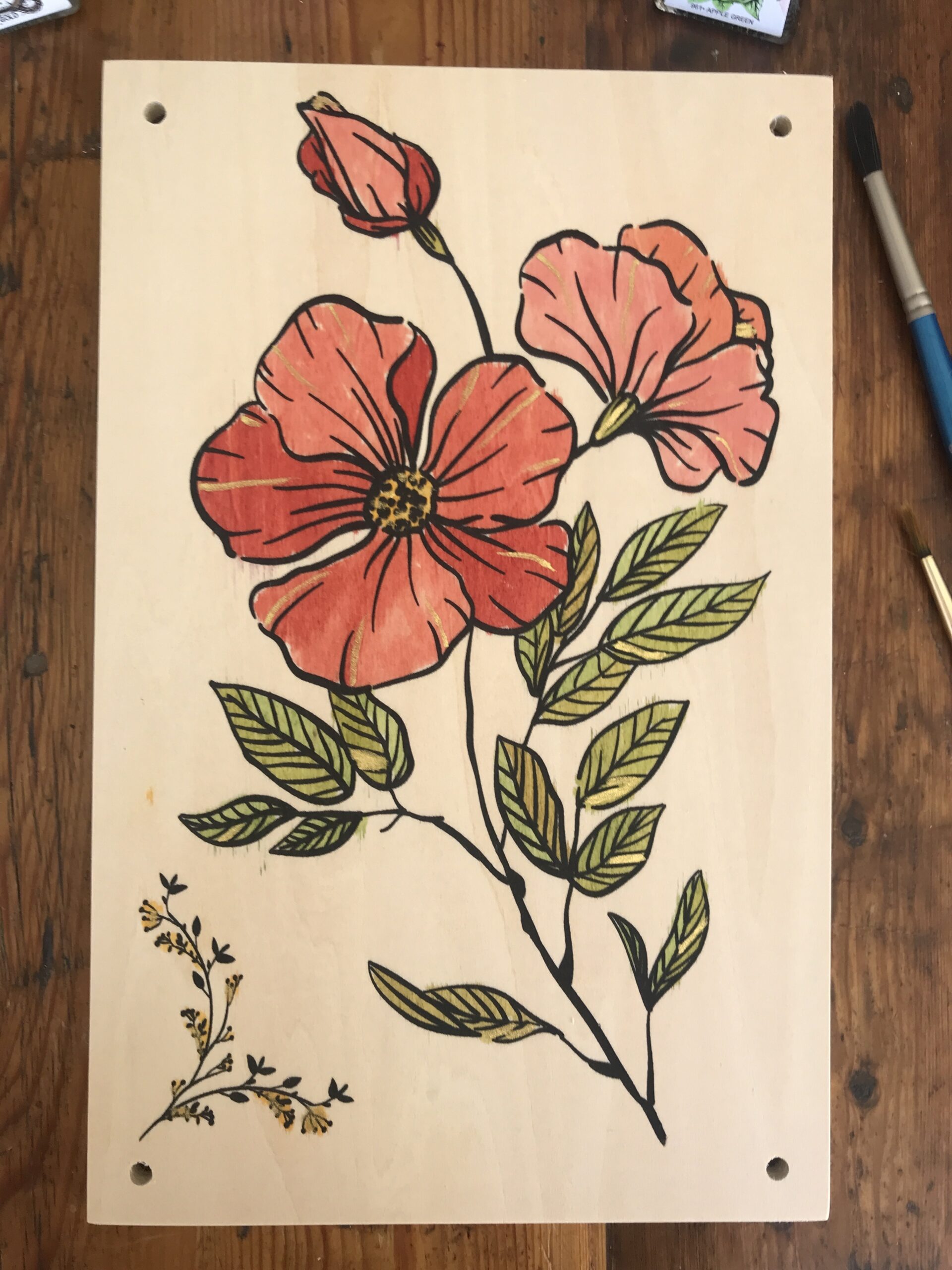
When you get your flower press paint the cover as follows:
Share your completed flower press cover with the hashtag #AHAflowerpress so we can all see what you have created.
Alison Hazel is a hobby artist and she shares her ongoing journey about becoming an artist later in life. She creates simple art that anyone can make. She hopes to inspire you to reach your creative potential in the area that suits you.
The page you requested could not be found. Try refining your search, or use the navigation above to locate the post.
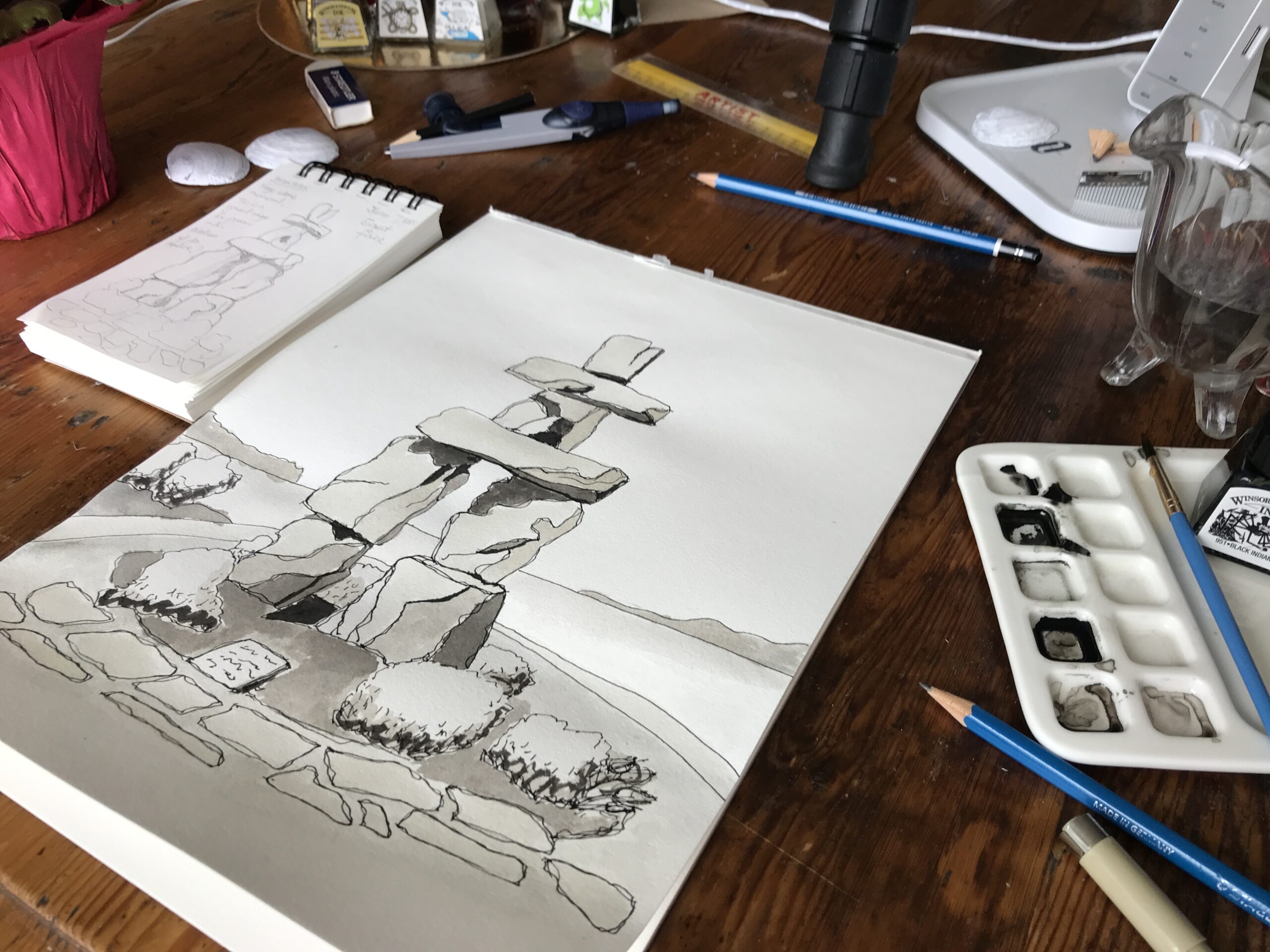
How to draw the Vancouver Inukshuk with black and grey scale drawing inks. Nature Journal. Hobby Artist
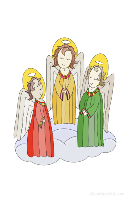
Learn to draw some simple Christian and Sacred Places art, images and symbols to add richness to your life.
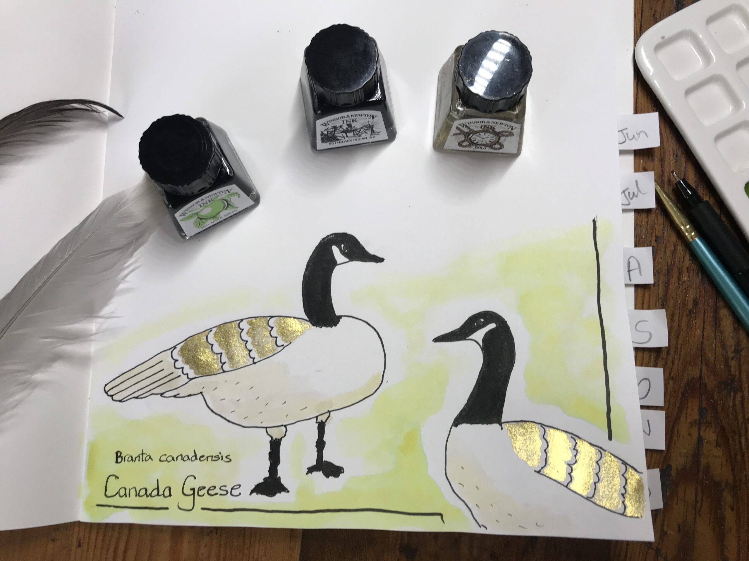
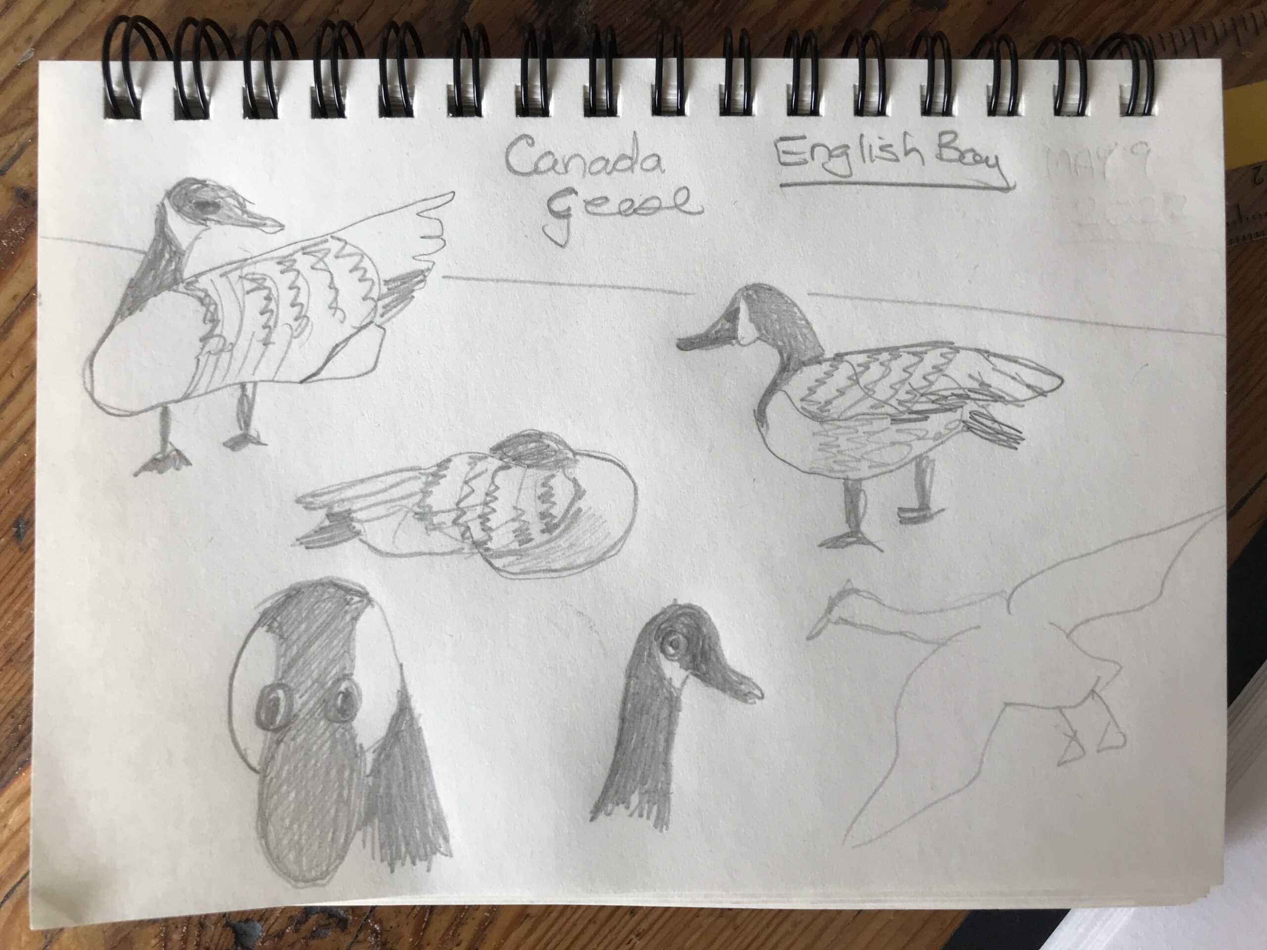
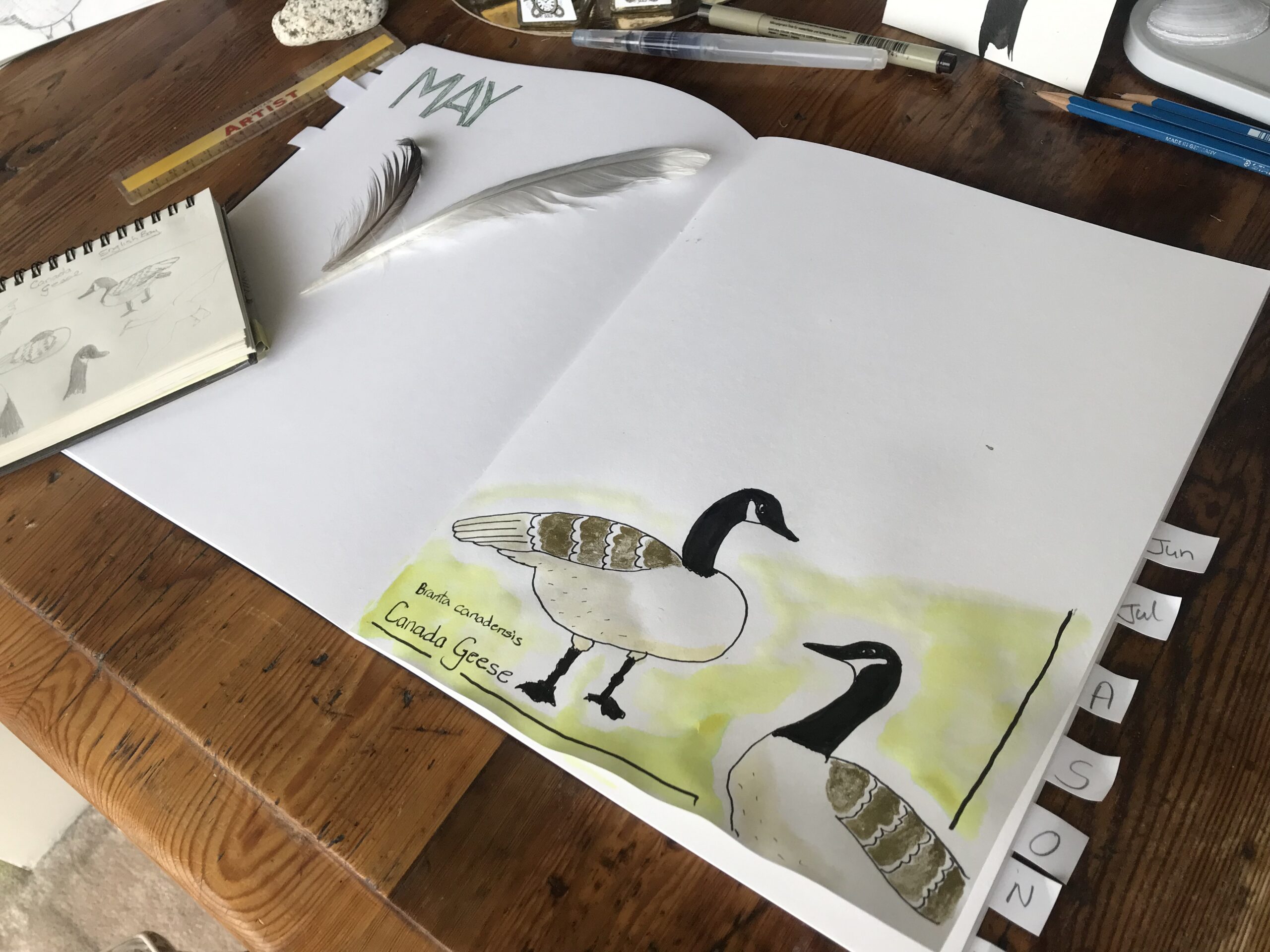
This week I went to the beach where the protected waters of English Bay laps desultorily at the coast in Vancouver.
Just behind the foreshore and promenade is a well manicured strip of parkland comprising grass and flowers to enhance the nature beauty of the area.
It is here that the Canada geese gather or is that flock?
How many do you need for a flock?
I had my travel field notes sketch journal and a pencil and the.
The plan was to draw the sea, but I did quite a few sketches of the geese.
Here they are swimming in the sea.
I’m not very good at drawing people and animals,so I thought it would be a challenge to sketch some geese for my new perpetual nature journal.
In ink
Here are some pencil sketches I did on location at English Bay in Vancouver.
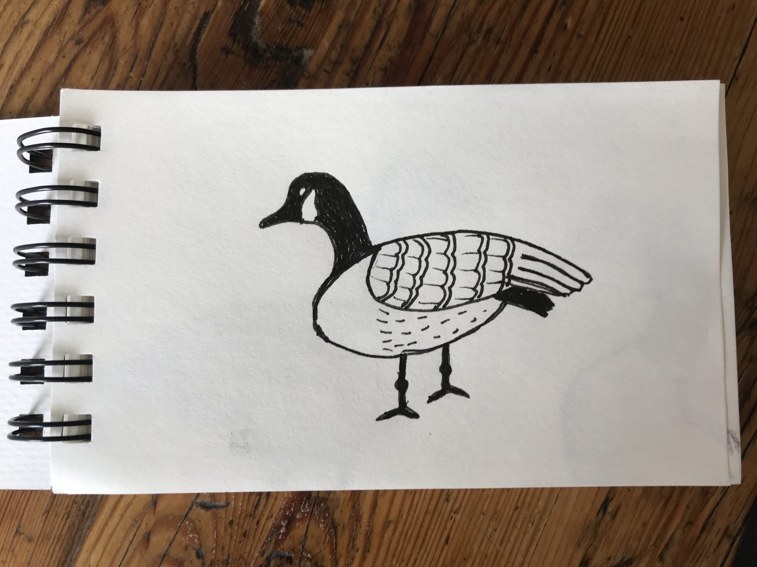
Next, when I got home,I looked at more free images from the web of geese.
I sat down in my creator studio and attempted to draw the geese again.
I tried to sketch a few poses.
After three attempts I did one in my perpetual nature journal.
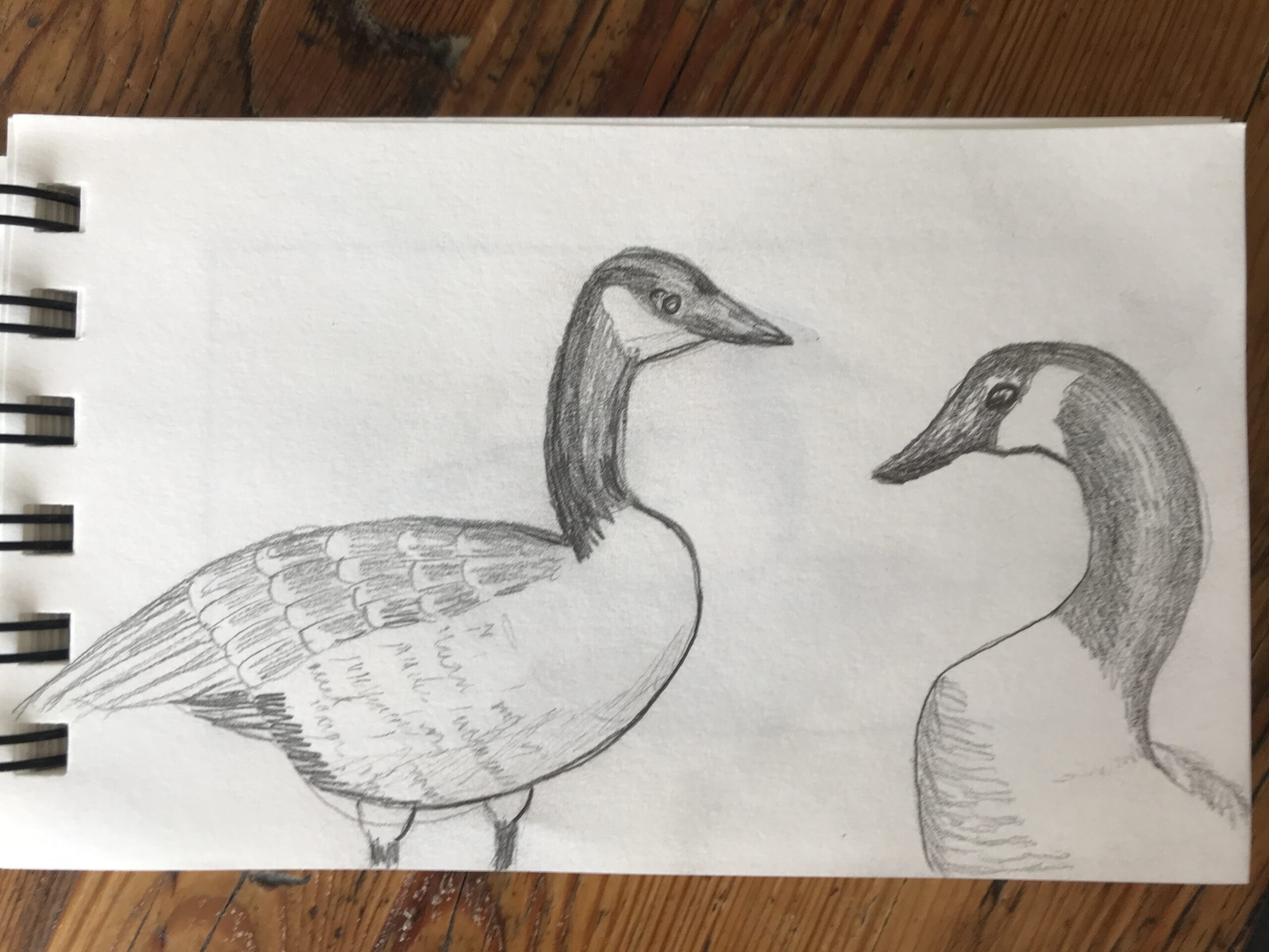
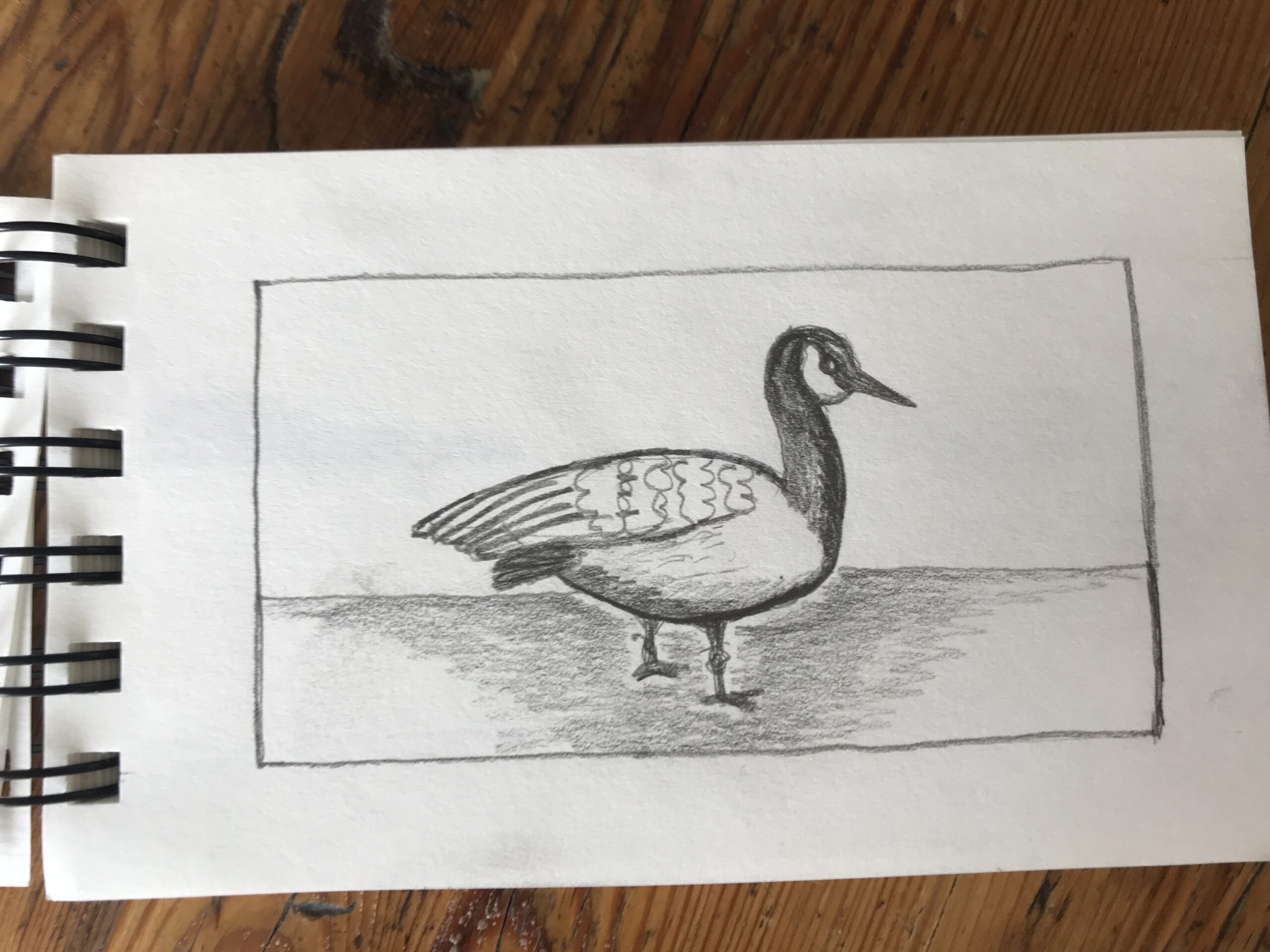
First the pencil sketch. I’m using a 2H hard pencil and drawing lightly.
The back feathers have a beige look with white curved edges.
I tried to replicate this with my pen.
Pen
Next I went over the outlines with a black pen.
It is the Faber Castell Pitt Artist pen in a 0.1mm nib.
Then it got out my black waterproof Indian ink from Windsor and Newton.
I painted the neck, beak and legs making sure to keep the cheeks white. The legs have knobbly knees and duck feet.
Gold Ink
As I wanted to try out my gold ink, and I do love a bit of bling on my artworks.
With a very thin brush I painted the back feathers in with shimmer.
Yellow Ink
For the soft underbelly I wanted a light taupe beige.
I’d decided to water down some canary yellow ink with a minuscule dash of black.
This was very thin and created a light beige.
I painted the underside of the fowl to add some dimension to the body.
Green Ink
For the background grass I blended apple green ink with sunshine yellow and thinned it with water.
I wrote the Latin name for these birds Branta canadensis underneath and also Canada Geese.
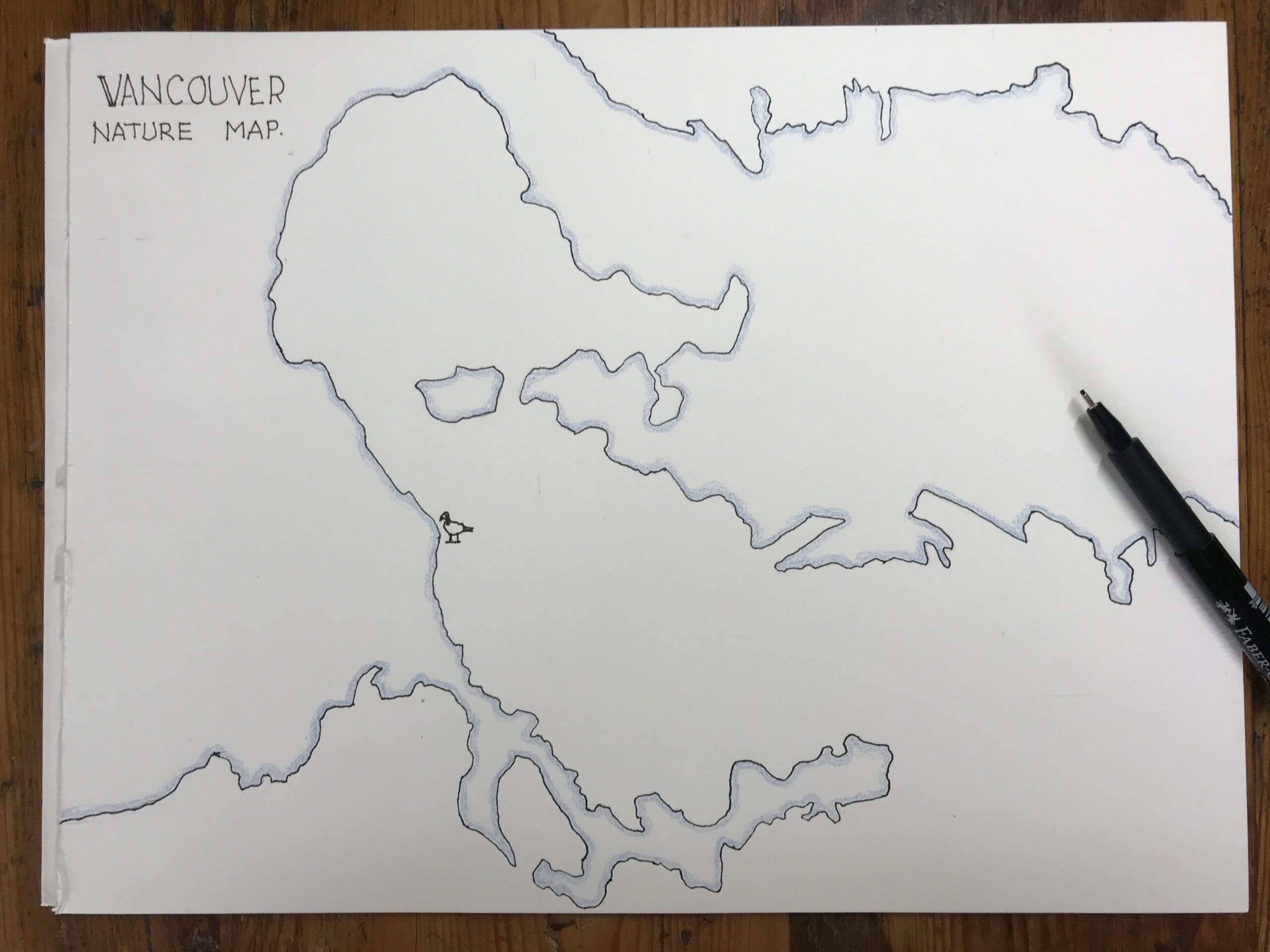
On a separate piece of paper I drew the map of Vancouver and the surrounding 10km where I live.
The plan is to add a little icon of each Natur Journal sketch on the map in the place where I drew the image.
This will grow in the future as I really get into nature journaling.
I really enjoyed creating this nature drawing in ink in my Perpetual Nature Journal.
I’ve only started nature journaling earlier this month and so far I’m loving it.

Alison Hazel is a hobby artist and she shares her ongoing journey about becoming an artist later in life. She creates simple art that anyone can make. She hopes to inspire you to reach your creative potential in the area that suits you.

How to draw the Vancouver Inukshuk with black and grey scale drawing inks. Nature Journal. Hobby Artist
To win at NaNoWriMo you must write 50,000 words during November which could be a solid foundation for any type of writing project.

Author: Alison Hazel - Published: December 2024 Artzlife Newsletter Creative art journal inspiration for hobby artists Welcome to a Place for Passionate Hobby Artists Are you a hobby artist seeking inspiration, connection and gentle guidance on your creative...
The idea of having a Perpetual Nature Journal which is different to a normal nature journal is that rather than starting at the front and working towards the back, depending on where I went and what I saw, I will be focusing on one or two nature features each month.
Then I can revisit the month next year at the same time.
You can start a Perpetual Nature Journal at any time of the year.
I’m starting mine in May 2022 and therefore my first entries will be in the May spread.
I won’t be filling the whole page I’ll just add one or two items in this month’s spread and then move on to June, July and August.
Later, when May comes around next year, I can come back to the May spreads and add something else.
I decided to create a Perpetual nature journal which is one that goes on and on year after year.
I happened to have this sketchbook on my shelf which I had not used.
It is Fabriano with forty-eight pages which gives us twenty-four spreads well actually twenty-three whole spreads and two half spreads, with one half spread at the front, and one at the end.
I decided to give each month of the year, from January to November two spreads and December has one and a half spreads.
A spread is an open two pages.
I counted through and put little tabs out where each new month begins.
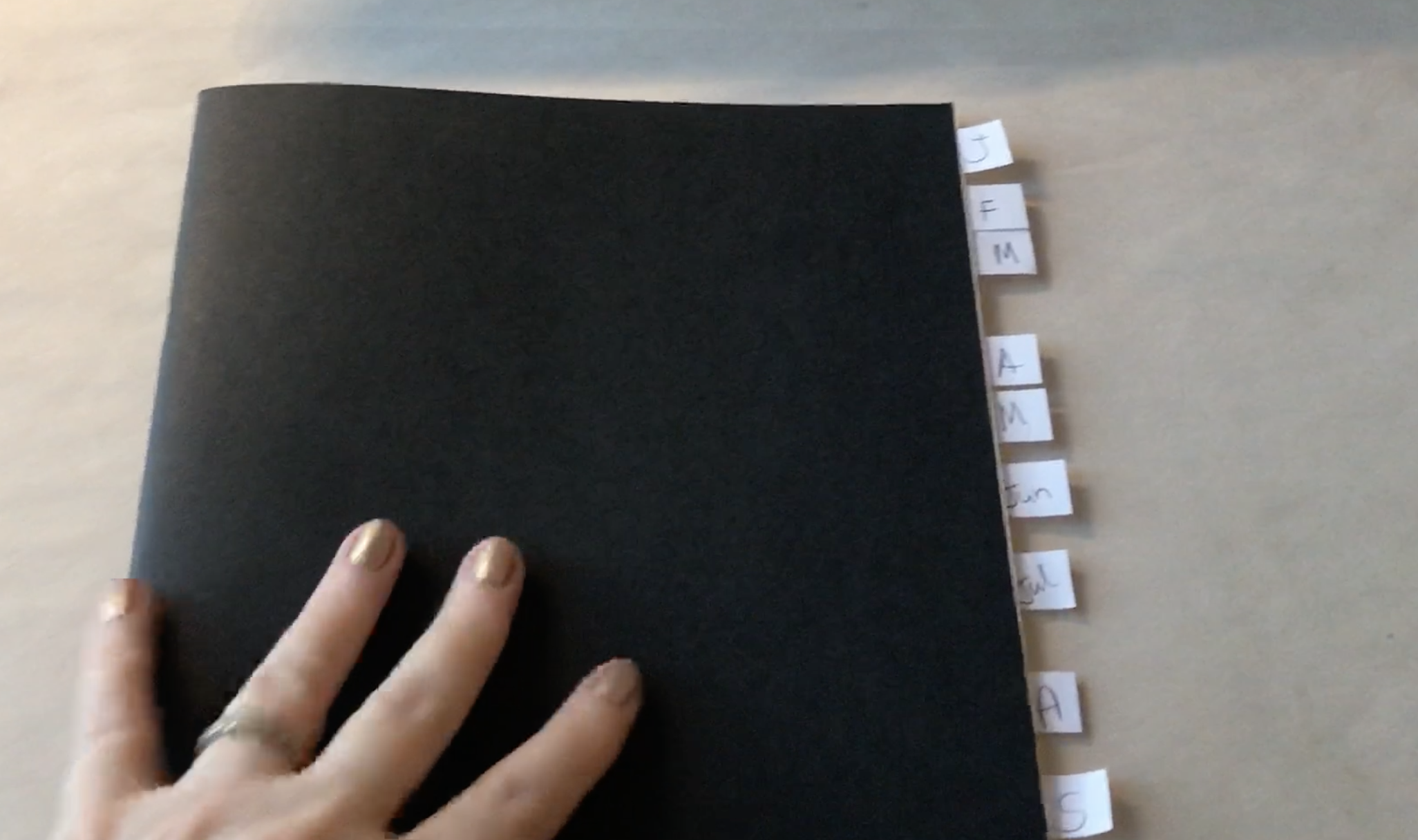
I chose to work this way for two reasons.
The first is because I watched the artist Minnie Small where she says in her sketchbooks she doesn’t start at the beginning and work to the end, instead she opens the journal at a random page and does a sketch in it there and then.
In this way when you do flip through the actual sketchbook there’s not this concentrated development of your style.
Instead, each drawing is randomly nestled in amongst everything else you’ve ever done.
In this way it’s a more a cohesive look at the type of work you’re creating as an artist.
Secondly, I took inspiration from Alex Boon of The Daily Nature Journal who has a beautiful nature journal, sourcing content from his local area, which I wanted to try for myself.
After I divided the journal the way I wanted it, with spreads for each month, I then turned my attention to the inside cover page.
I spent many days working out:
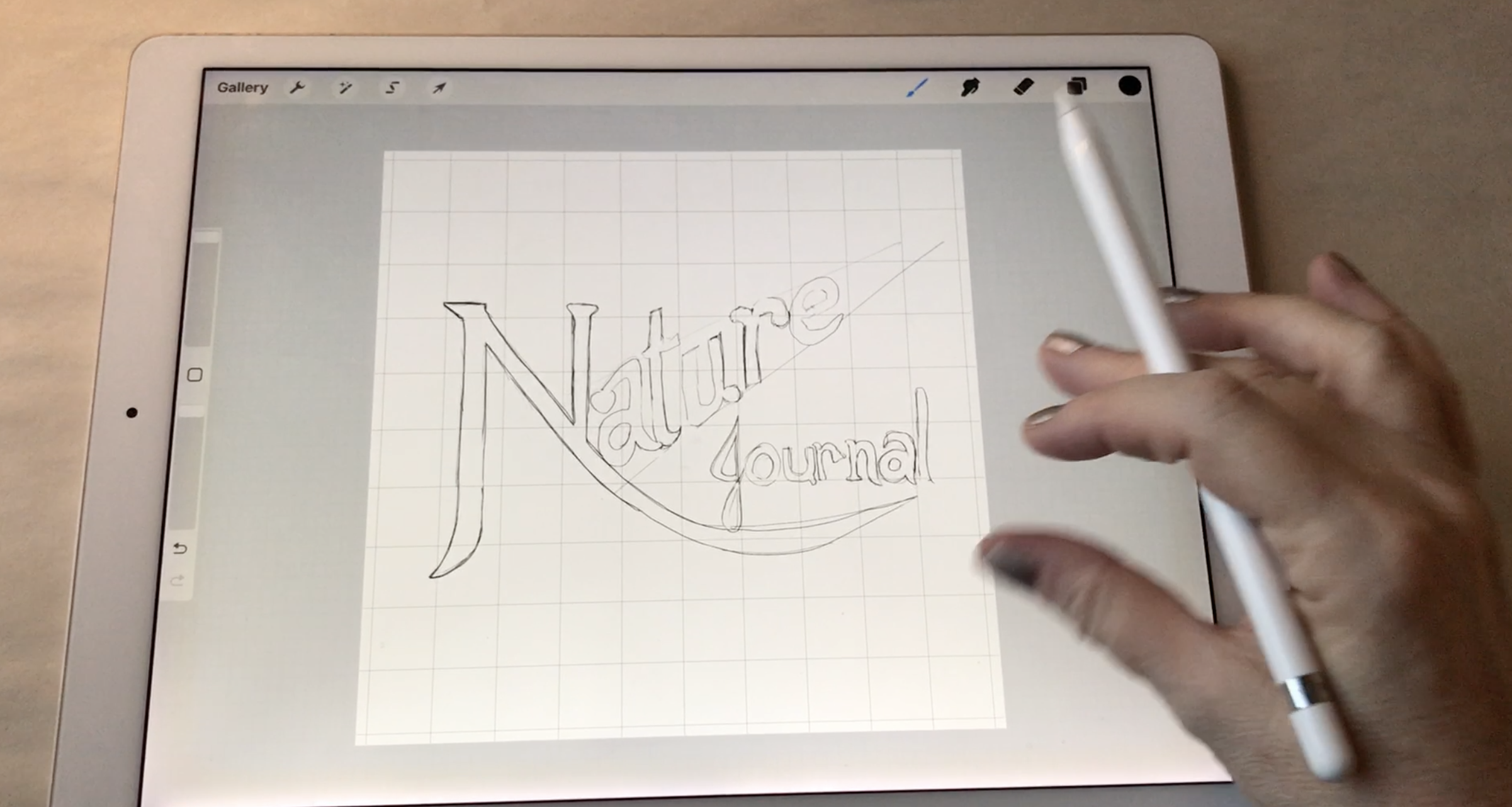
I thought that I wanted to call it “Nature Journal” (with the vanishing point on the word nature.)
To start with I did a sketch on my iPad with Procreate to lay out what I was thinking of as many ideas were percolating in my head.
I created this quick design just using a pencil brush in Procreate.
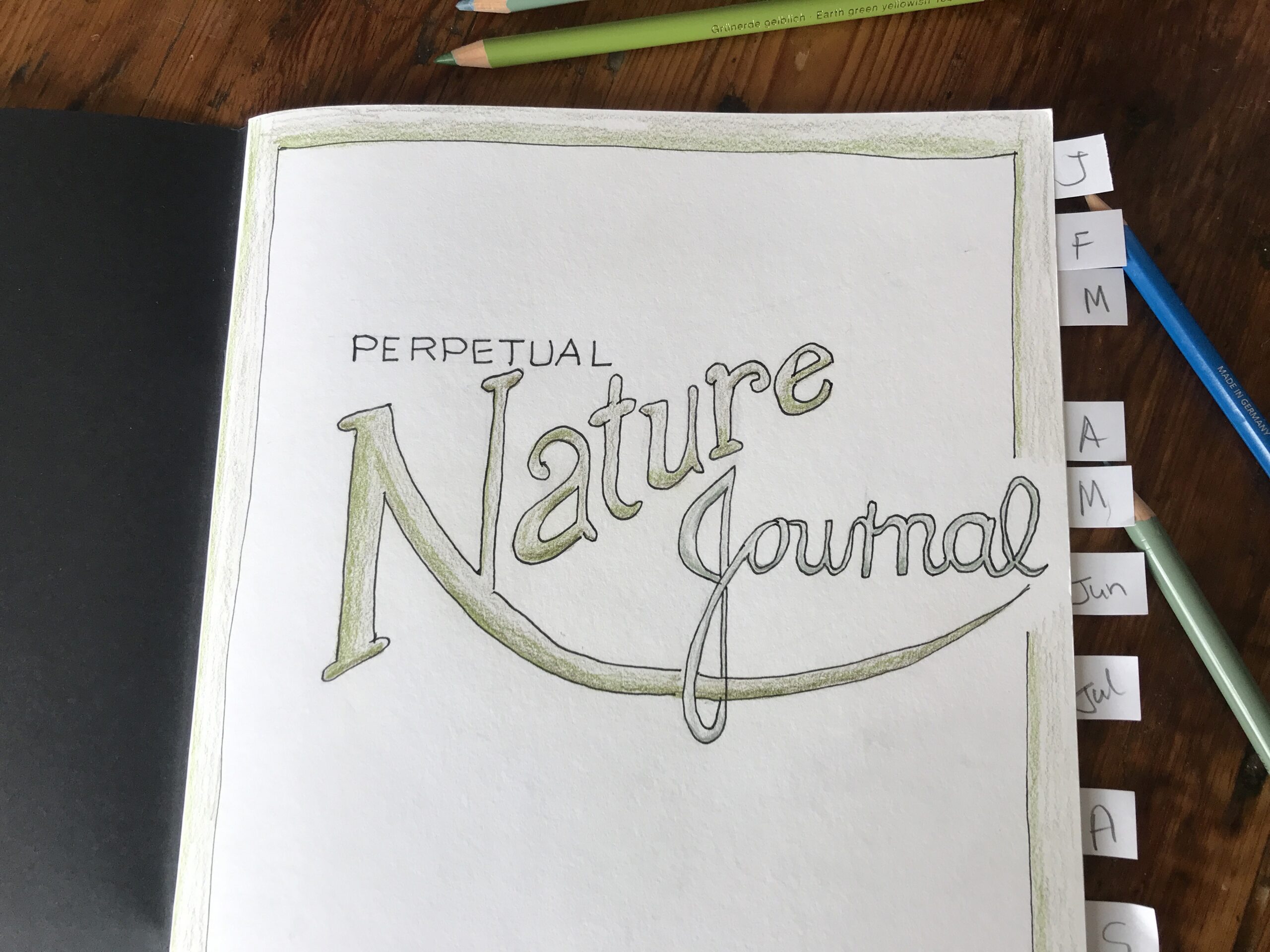
This is what I’m going to use as the guide for my Perpetual nature journal inside cover page.
In my nature journal I drew some guidelines and wrote out the words “Nature” and “Journal” first lightly with a 2H pencil.
Then I went over with an ink pen which I think is the Faber Castell Artist Pitt pen 0.5mm, but you can use what you have at hand.
I use Faber Castell Polychromas colored pencils.
I chose to color the two greens, because it’s nature.
The word “Nature” is a green called Olive Green Yellowish, and the word “Journal” is Juniper Green.
I did think afterwards I could have used markers, which would have made it a more vibrant cover page, and I may develop it into richer colors later.
Then I turned to the border and decided to draw a 10mm, or half an inch, border around the page.
I just did this freehand and then I colored that in as well in the darker green.
It’s at this point I realized I hadn’t got the word “Perpetual” in, so I drew a couple of light guidelines and wrote the word “Perpetual” at the top.
Now it reads “Perpetual Nature Journal.”
On a side note, I lined up the word “Perpetual” to start in line with the left of the word “Nature” and its top to the “e” at the end of “Nature.”
In this way I believe it’s balanced within the page and aesthetically appealing.
I then went over the word “Perpetual” with a pen as well and finally erased all the pencil lines.
This is where my cover page is now.
I do envisage adding bits and pieces as I draw more stuff during the month.
I will add more to the front page, but at this point I just wanted to get it sorted out, so I could begin to use my Perpetual Nature Journal.
I’ve never had a nature journal before and I think it’s going to be interesting book to work on.
It’s another sketchbook in my growing shelf of sketchbooks, as I’ve come to realize that one sketchbook is not the answer, because you do benefit from having multiple sketchbooks, and I’ll be doing a video about that soon.
I love the idea of the Perpetual-ness of this type of sketch book.
Let me know, in the comments below, if you have a Perpetual Nature Journal and how you lay it out or even whether you keep a Perpetual Journal or a Nature Journal or a Perpetual Anything journal.
I’d love to hear.
Love,
Alison
Create your own Perpetual Nature Journal which in time, will become a treasured family keepsake that you can share with your children and grandchildren.

In this artist interview, meet ARWYNNE O’NEILL an artist and writer from Vancouver, Canada. Arwynne creates fantasy art with goddess themes.

Author: Alison Hazel - Published: January 2024 Inspiration I'm trying to do more Christian artwork on this channel. It occured to me just to go back to basics, so I thought I could just do some simple artworks that depict the Creation in Genesis for the very...
Author: Alison Hazel - Published: February 2024 Reference and Acknowledgement Today I'm going to show you how I draw the face of Jesus as an icon. This is not my original idea as I am following along and referencing the work of Mikhail Fadi at UK Coptic Icons and...